Best Ecommerce Homepage Designs To Attract Customers’ Attention
We have collected several examples and tips on how to arrange the information on your ecommerce homepage to correctly convey a message about your store and increase the conversion rate afterward.
According to the recent marketing research, it takes only 0.05 seconds for a user to form a complete opinion about a website. The starting point of the website is its homepage, which means that its content creates an initial impression about your business.
Place The Main Product Categories Above The Fold
On average, users spend 80% of their time above the fold. Using this feature, you should engage users and make them go to another page of the website.
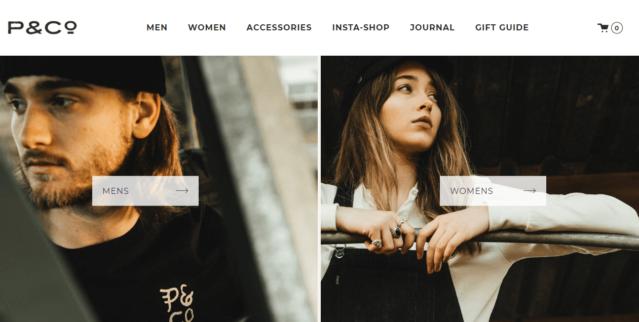
For instance, the P&Co website allows store visitors to go directly to the categories of clothing, both from the main categories in a row at the top and from banners.
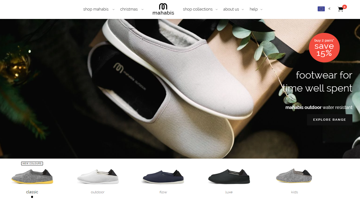
Another example is Mahabisan — an online store that produces and sells Scandinavian style slippers. All the main products are listed below the homepage banner with a possibility to go directly to the product details and add it to the cart. It’s the perfect solution for stores with small assortments. A user will see a list of your products on the first screen, which will increase CTR and conversion.
Tip #1
If the assortment of your store is extensive, and there are many product categories, present 30-40% of the important ones above the fold and combine them with banners on the homepage.
Use Carousels And Dynamic Banners
We’ve already mentioned using carousels in ecommerce in our recent article “7 Online Merchandising Practices That Will Astronomically Boost Your Conversions.” It allows you to place new products, bestsellers, special offers, and discounts in a dynamic way.
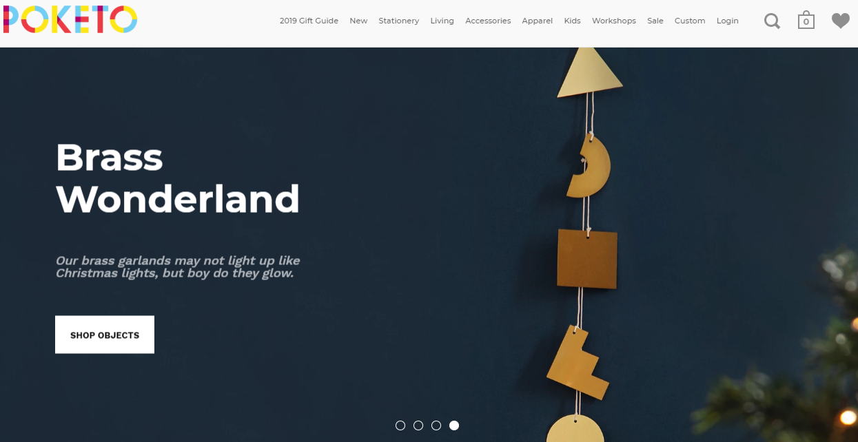
The large retail store Poketo uses a carousel on its homepage to showcase its main product categories. The final banner in the carousel is a seasonal Christmas sale. The banners are changed regularly to display relevant offers.
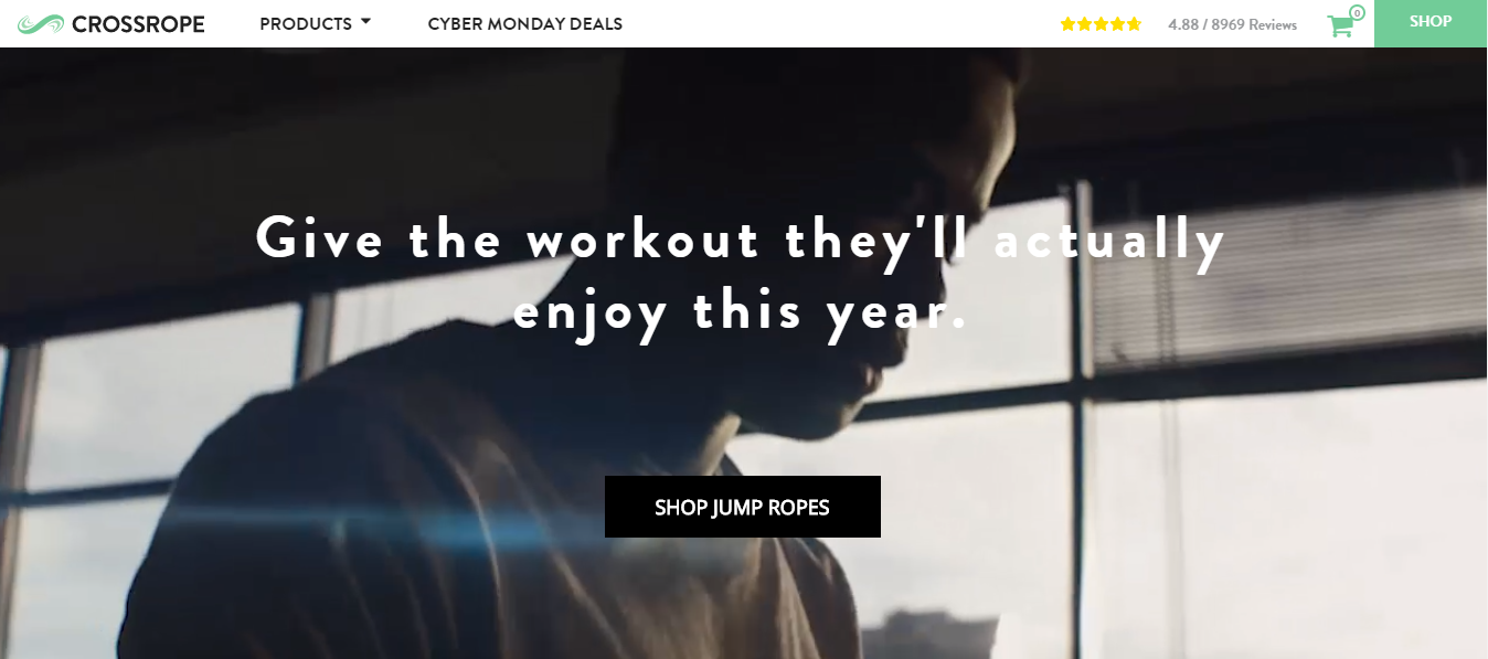
Carousels are not the only way to attract users’ attention. Check out how Crossrope — an online store, which sells jump ropes — did it! They placed a video that showcases how people are exercising in various locations using jump ropes and the mobile app.
This solution allows killing two birds with one stone: a user clearly understands how to use the product and the value it conveys, and also can go directly to the product catalog by clicking the button with a CTA. By the way, according to studies, 70% of small business websites lack a CTA on their homepage.
Tip #2
Conduct A/B testing of banners and buttons on your homepage. Track performance, record results, and adjust the website design depending on data.
Create A Value Proposition In One Sentence
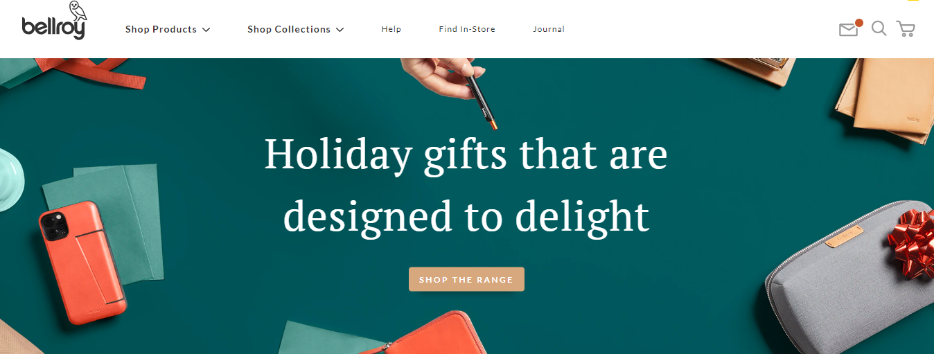
To emphasize your main competitive advantage, place it in the most prominent area on the website — for example, on the homepage banner. The bright example is the Bellroy online store, which conveys its catchy message in one sentence.
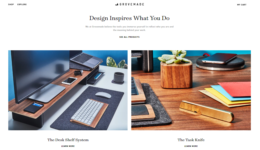
You could also place a message that will allow customers to learn more about the philosophy and aesthetics of your brand. For example, Grovemade — a brand that produces wooden accessories for home and work — does it in the same manner as shown in the picture below.
Highlight Seasonal And Special Offers
Users are more likely to get interested in discounts and would be ready to buy a product only if they found an attractive offer. Thus, it’s essential to hook a customer on the homepage and demonstrate your best offers creatively.
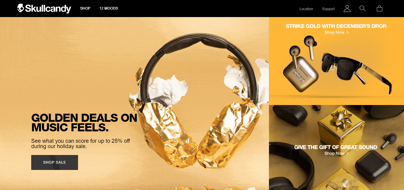
For instance, Skullcandy gathered all the offers in the gallery on the start page. In fact, one of the banners is an animation that shows the unwrapping of the headphones and forms an association with the upcoming holidays.
One of the up-to-date web design trends which you could try for your homepage is liquid animation. It entertains users and provides them with a pleasant shopping experience while exploring your online store. It’s also an excellent way to differentiate your business from others, as it’s not common yet. If you’re interested in the latest web design tendencies, delve into the article on Best Web Designs, where you could find striking ecommerce examples, current innovations, and tips.
Tip #3
Attractive visuals are the core success of your website design. Don’t overload your homepage with too many product images and offers; choose the most relevant and appealing ones.
Use Pop-ups When Users Enter The Website
In order to convert a website visitor into a subscriber, it’s not enough to place the subscription form in the footer of the website. You could show pop-ups with a subscription offer for users who visit the homepage.
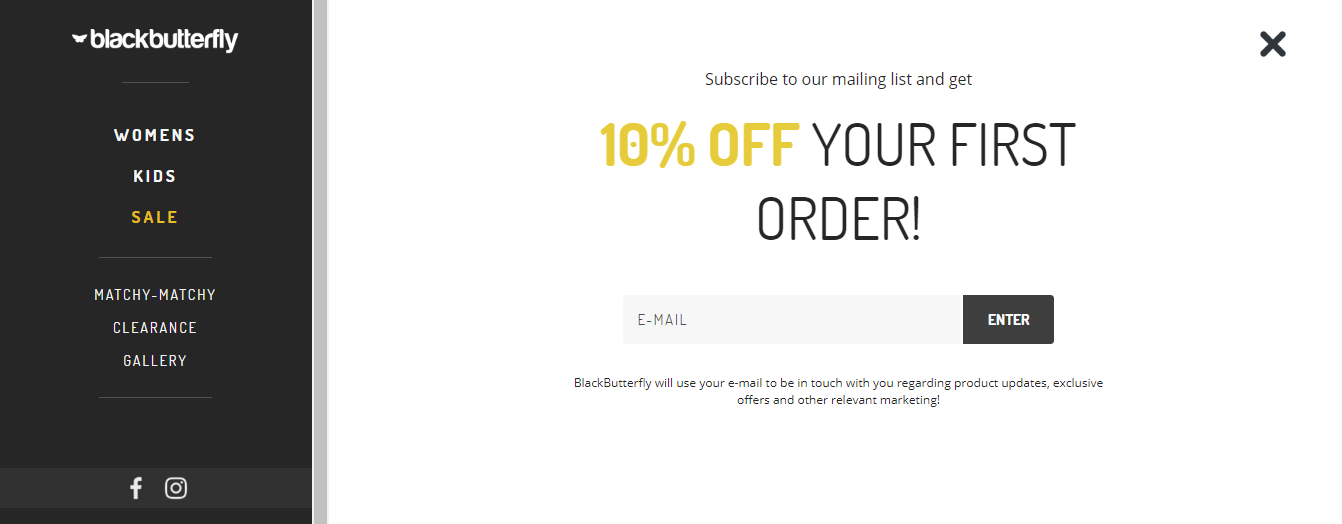
The women’s clothing store Black Butterfly gives a 10% discount for the first order in return for subscribing.
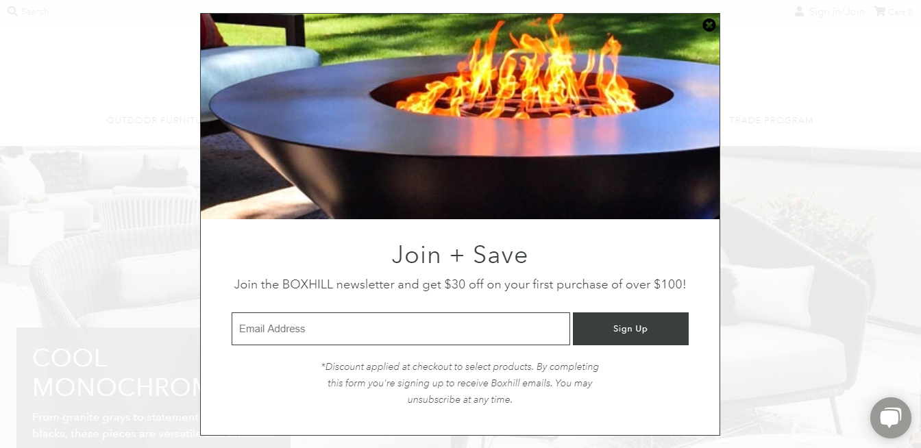
Meanwhile, Boxhill, which sells products for the garden, offers a $30 discount on orders with a total amount of at least $100.
Tip #4
Your development team could configure pop-ups for your website. You can also integrate your ecommerce store with services — Optimonk, Wisepops, Popupsmart, etc.
Put The Bestsellers On The Homepage
Blocks with trending products help to influence a customer’s decision.
For example, the Esqido store has a section titled “Our best sellers.” When a user hovers the pointer over a product, detailed information about the product and its features are displayed.

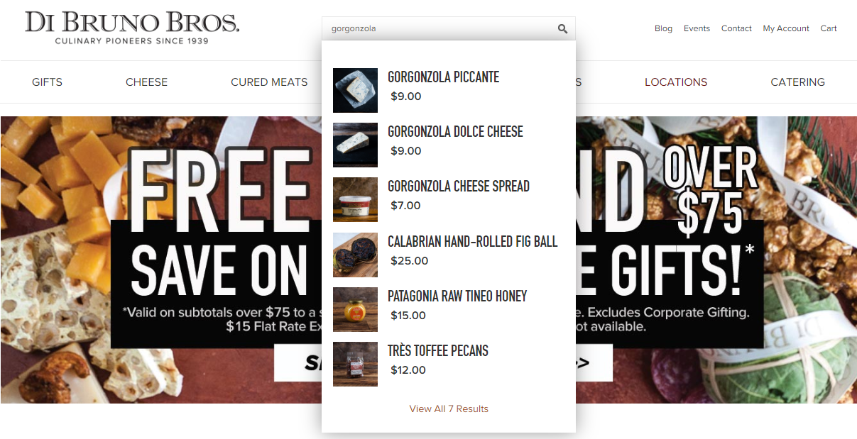
Add A Search Box In A Prominent Place
It’s an appropriate solution for ecommerce businesses with a large assortment. A user doesn’t have to wander around the website in search of necessary products. The studies show that easy and fast search could increase the conversion rate by up to 50%.
The illustrative example is Di Bruno Bros. The store offers handmade cheese and cured meats.
Tell About The Shipping Terms
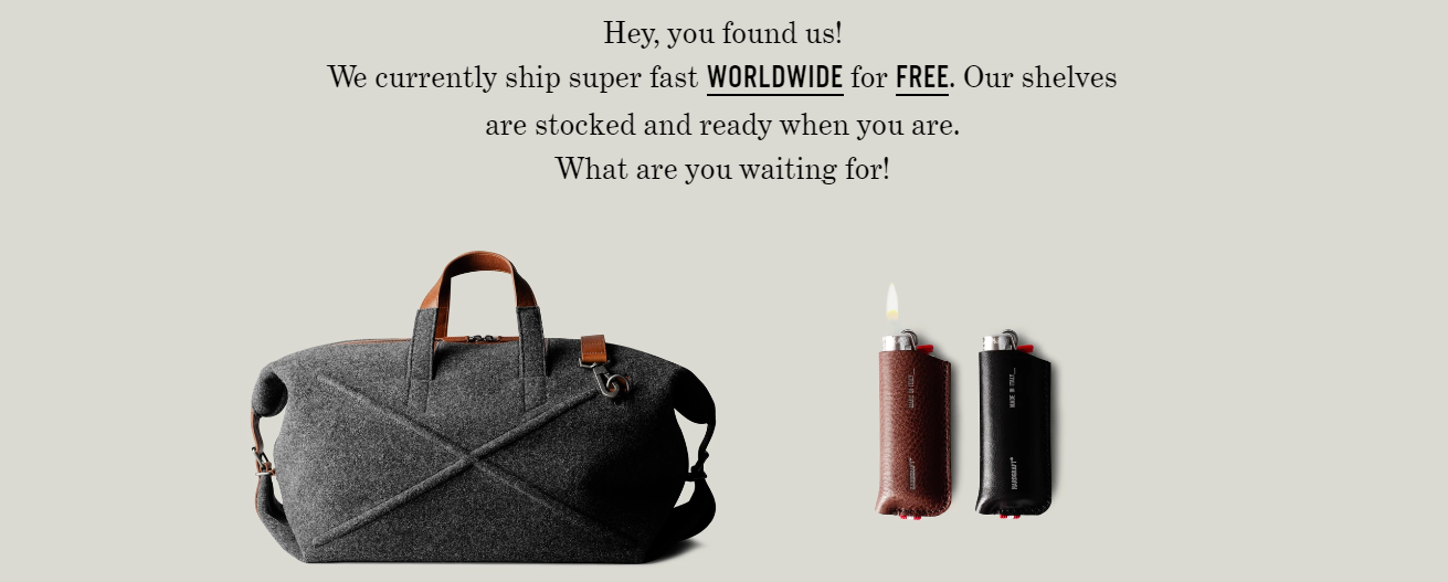
Don’t miss the opportunity to tell site visitors about the terms of delivery on the homepage, especially if you provide free shipping worldwide, such as Hard Graft does.
In addition to shipping terms, you could also add some information about returns и warranty conditions in your store.
Tip #5
Display the terms in a simple way. Users won’t waste time figuring out what he doesn’t understand. They will simply leave the website.
Make A Section With The Benefits Of Your Store
If your business has specific characteristics or you want to highlight certain aspects, then dive in!
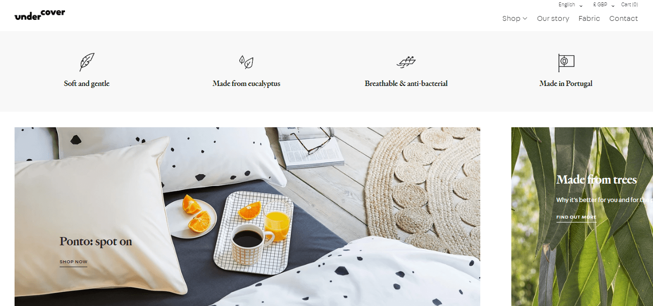
For example, bed linen brand Undercover made a block with the benefits of their product above banners with categories. They are visualized with minimalistic icons.
Tip #6
Make a practice of conducting regular competitive analysis — you should always be aware of what exactly your competitors are offering. Constantly remake your benefits section to provide your clients with the best experience possible.
Display Customers’ Reviews
According to Search Engine Land, 72% of consumers trust online reviews as much as personal recommendations. It ensures credibility and builds brand loyalty.
Look how Pilgrim — an online store that offers diffusers and essential oils — did it! They made a big section with verified reviews and video testimonials.
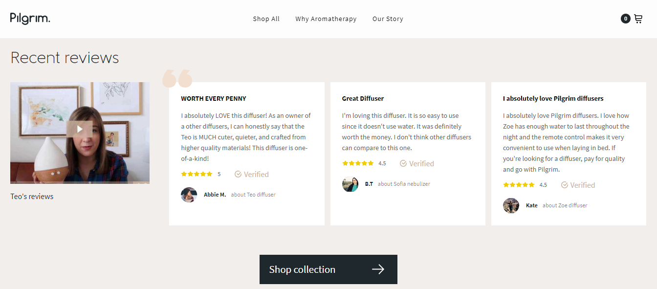
Video reviews are also useful because when a website visitor sees a real person, it increases brand credibility. If you decide to record video reviews, consider hiring a professional to ensure it is high-quality. People are more likely to be drawn to fond of beautiful videos.
Final Words
Research best practices in different industries regularly to find new ideas and draw inspiration. It will help you be aware of the latest trends and successful solutions. If you have any questions, please fill out the contact form. We will be glad to help you.
Looking for eCommerce development backup?
Share your contact information, and we’ll be back to you in no time


