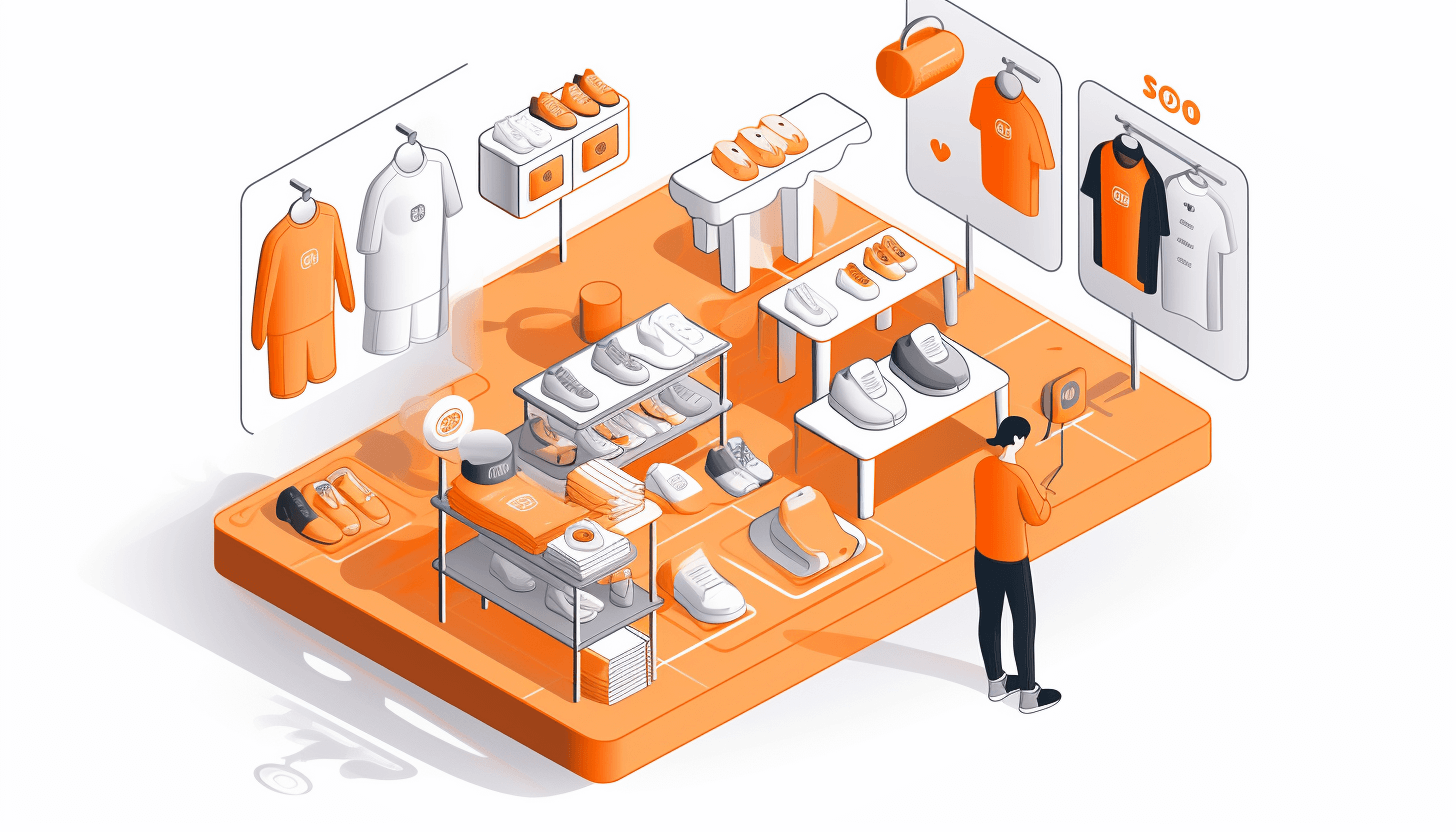
Category page (product listing page) best practices differ in that they perform their function, which is helping users find what they want. Tactics that help at this stage include narrowing down purchase options based on some criteria, sorting items, and bringing particular products that may be of interest into focus.
Category Page Design & Layout
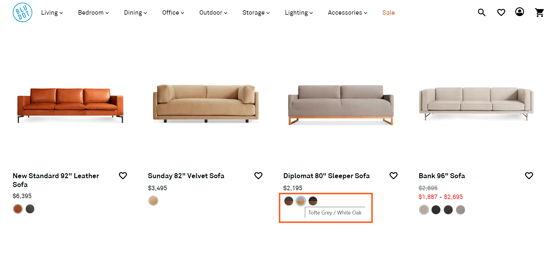
The overall design of a product listing page should give customers a comprehensive overview of a product range instead of placing variations as separate products. See how Blu Dot copies with this task: they demonstrate sofas of different colors as attributes instead of putting them as individual items, which gives users a better demonstration of a whole category from first sight. By clicking on the desired shade, a purchaser immediately sees a thumbnail of the sofa in their preferred color on hover in the listing:
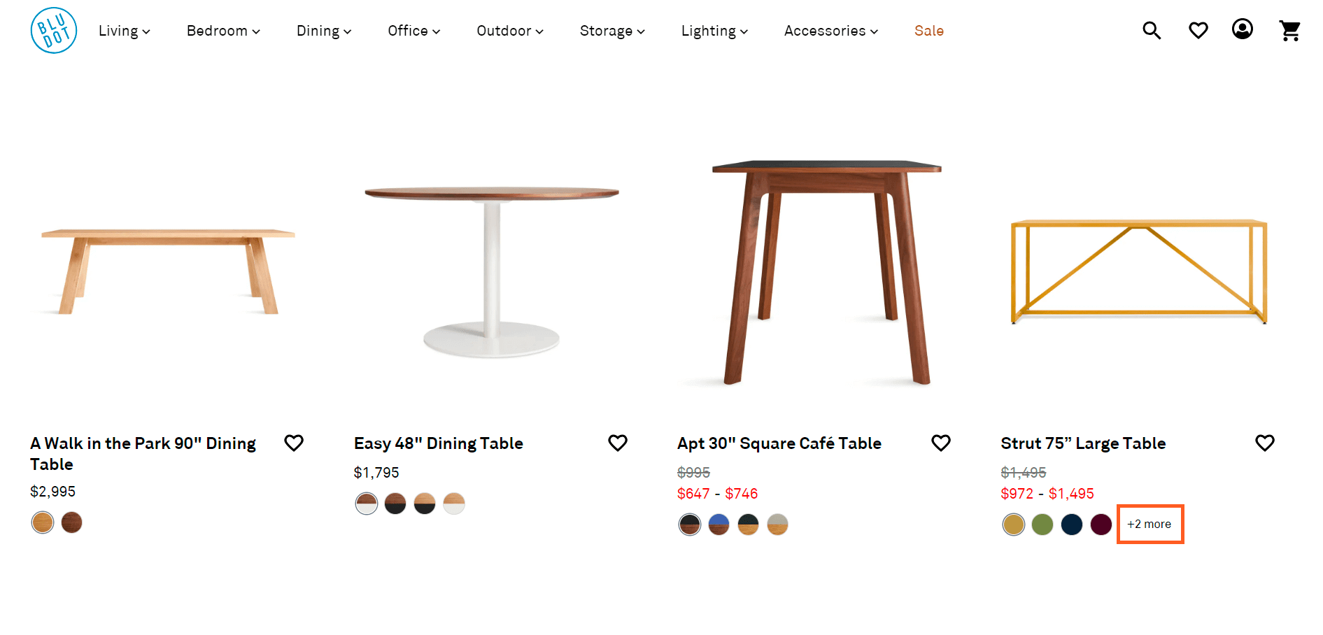
If there’re many more possible variations, indicate the number of product options on the thumbnail or list item information. For instance, if shoes are available in five more colors that are hidden instead of a plus, then put ‘+5’ next to the swatches, which Blu Dot does as well:
Deciding on the number of products to load at once in lists might be challenging since it needs to consider multiple factors like website performance and making customers’ scanning process more user-friendly. Based on research and A/B tests, Baymard Institute recommends merchants to:
🔸 load 100–150 products at once for visually-driven sites (these include sites for the clothing, cosmetics, furniture, and decor industries — what is sold through the visual component and aesthetics) for desktop;
🔸 load 50–100 products at once for spec-driven ones (these include businesses where product characteristics are more important — electronics and gadget industries, medicines/vitamins, equipment) for desktop;
🔸 load 15–30 products at once for mobile sites.
List Product Information
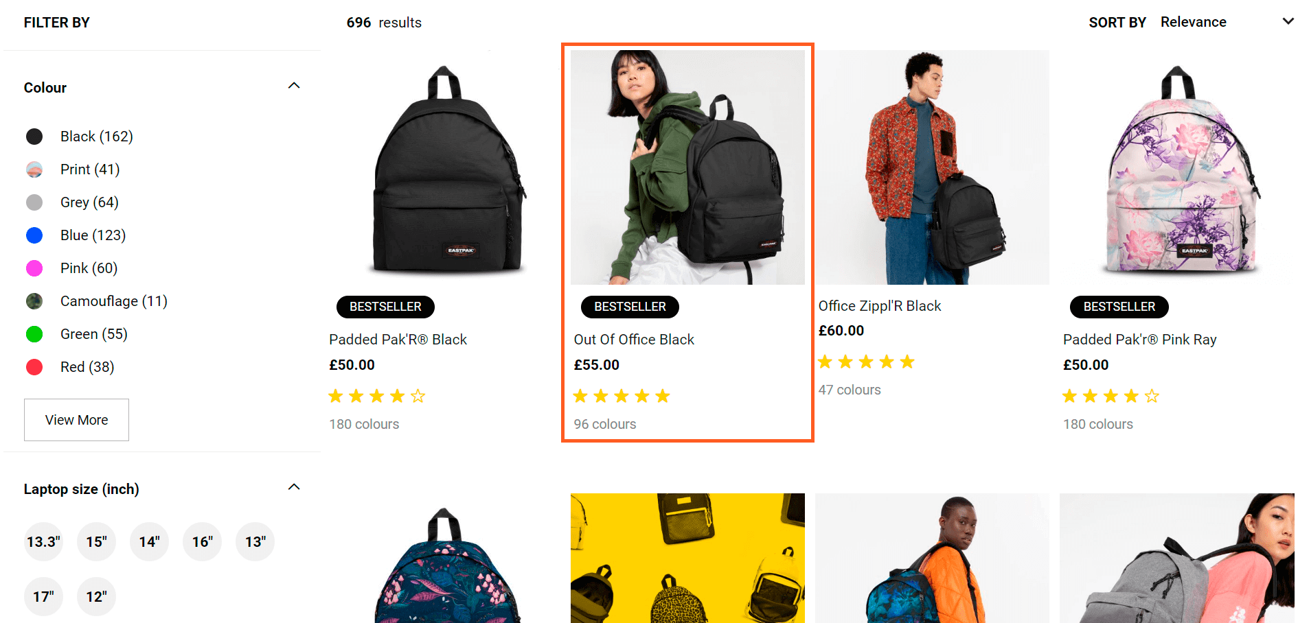
To make it possible for customers to evaluate products’ suitability to needs and preferences, at least present the following attributes: price, product title/type, thumbnail, user ratings, and variations. By the way, the functionality of user ratings on product pages is crucial from the point of view of UX/CRO and SEO. See an example:
Don’t underestimate the power of high-quality category images, especially in visually-driven industries. Also, ensure that product titles are descriptive and highlight your products’ selling points and features.
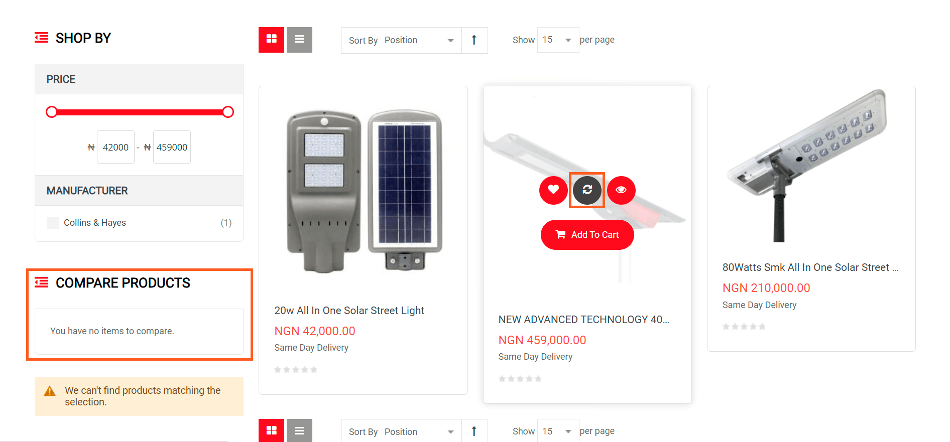
For some spec-driven sites, the decision-making process may be influenced by comparing products, which is why it’s worth providing a complete overview of a product list and an option to compare items. Me3 Energy specializes in renewable energy, power protection, and distribution and added functionality to compare items by clicking an icon on hover:
Content on Hover
Well-done category images on the white background are today’s must-have, but that’s not the limit since there’s an option to present even more content on hover.
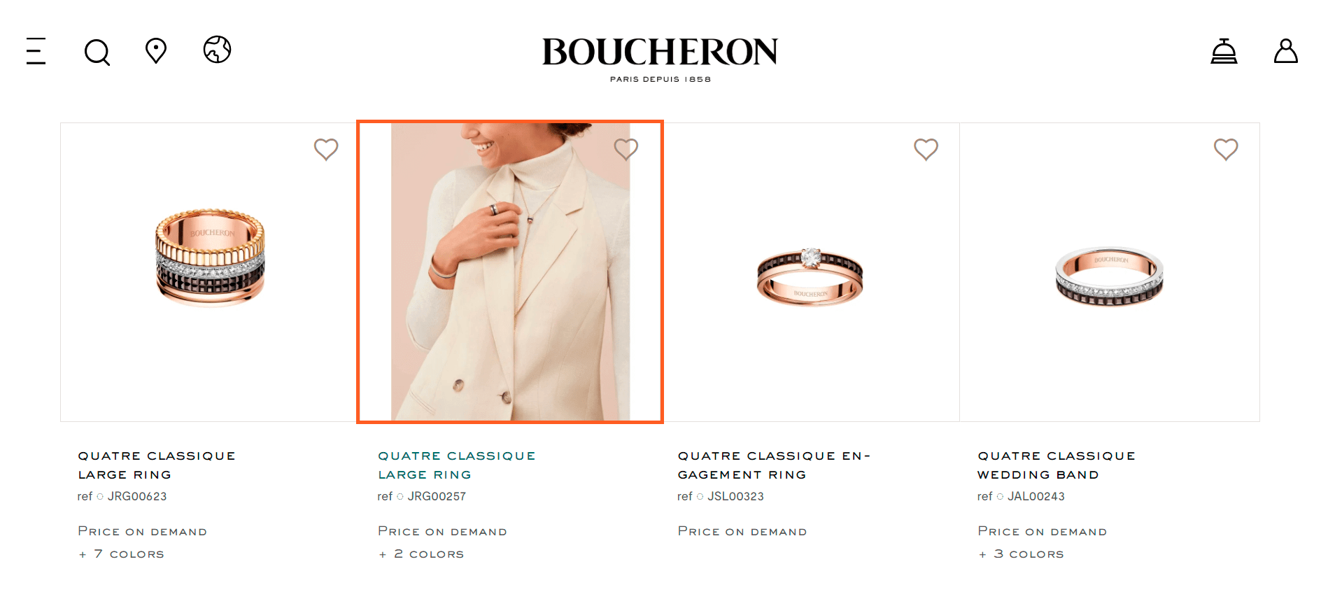
Additional thumbnails can help show customers how a product looks in the real world so that you can show a product in action on hover. For example, for the furniture and decor industry, you could showcase a sofa in the interior in addition to the cut-out image of a sofa on a white background. See how the Boucheron brand demonstrates its jewelry as a part of the outfit:
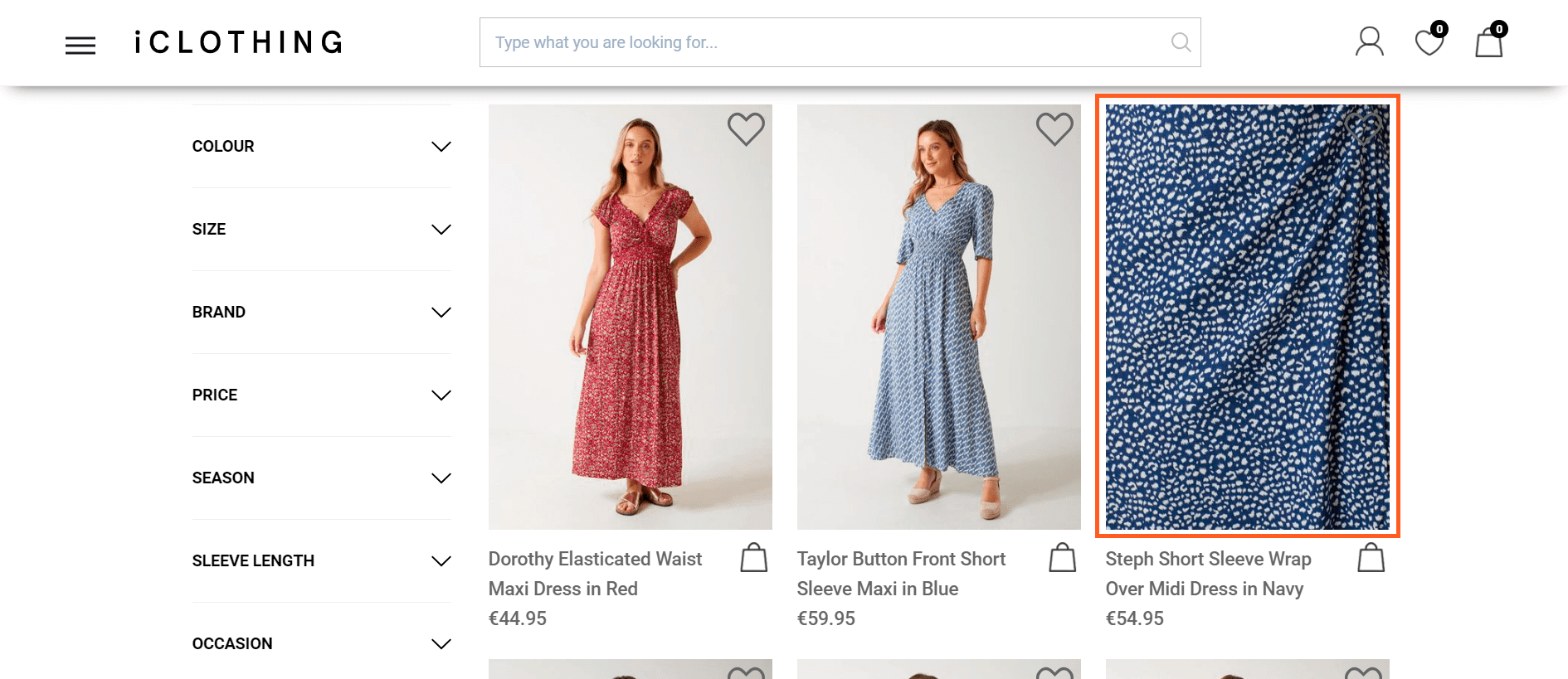
Another option for the content on hover is to highlight a critical product feature and present an image zoom on hover. For example, skincare buyers need to see the consistency of the product, so on hover, you can show its swatch. Meanwhile, the iCLOTHING brand highlights the pattern of products and showcases an image zoom of a dress on hover.
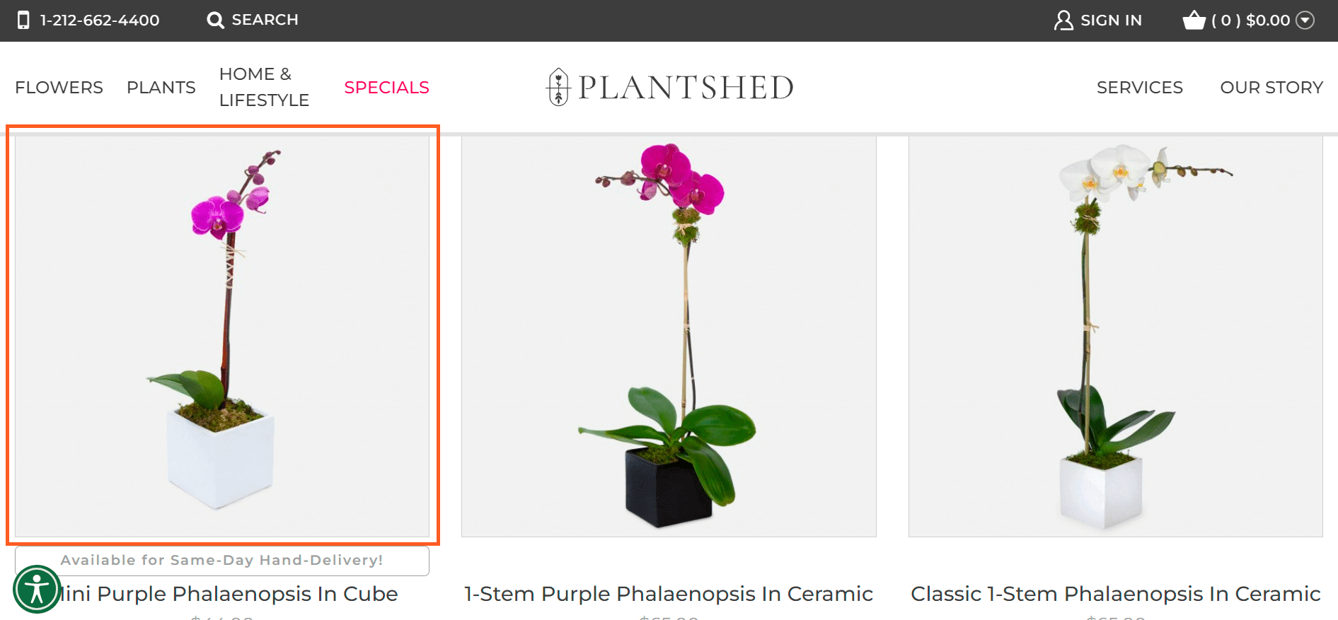
An equally effective tactic is to showcase thumbnails of other product variations on hover to highlight the width of the product range. Plantshed demonstrates a phalaenopsis in a black cube and a white one on hover:
If you doubt which implementation to choose, you can change images on hover as an A/B test and determine which brings a higher CTR.
Product Filtering
To narrow down the extensive product range, reduce customer confusion, and make sure products stand out, implement ecommerce filters, which have been a must-have practice for a long time in terms of usability and conversion optimization.
Identify the criteria that might help customers in their decision-making process and provide filters for all displayed list item info, which includes attributes like price, brand, and color.
Category-specific filters may be a nice add-on for UX in case of specific niches and industries, as the DrinkSupermarket brand does by adding filters of vintage, age, country of origin, flavor, etc.:
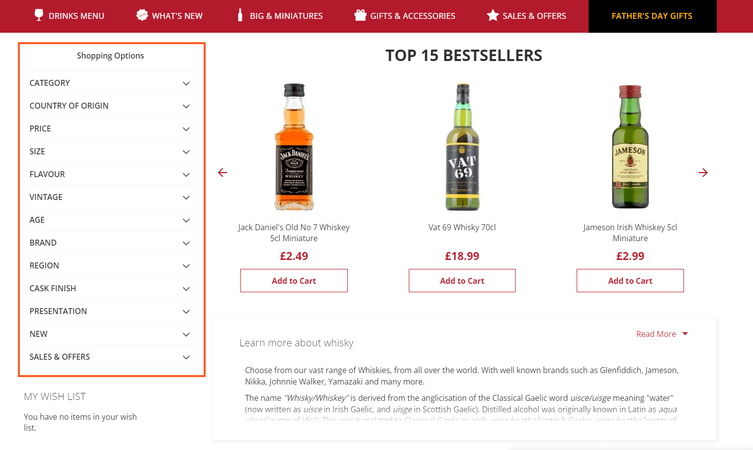
The conventional design implementation of the section is a left-side filtering sidebar, as shown in the example above.
In case you don’t have too many filters for customers to choose from, an option of placing filters on top might be more beneficial to draw users’ attention more effectively:
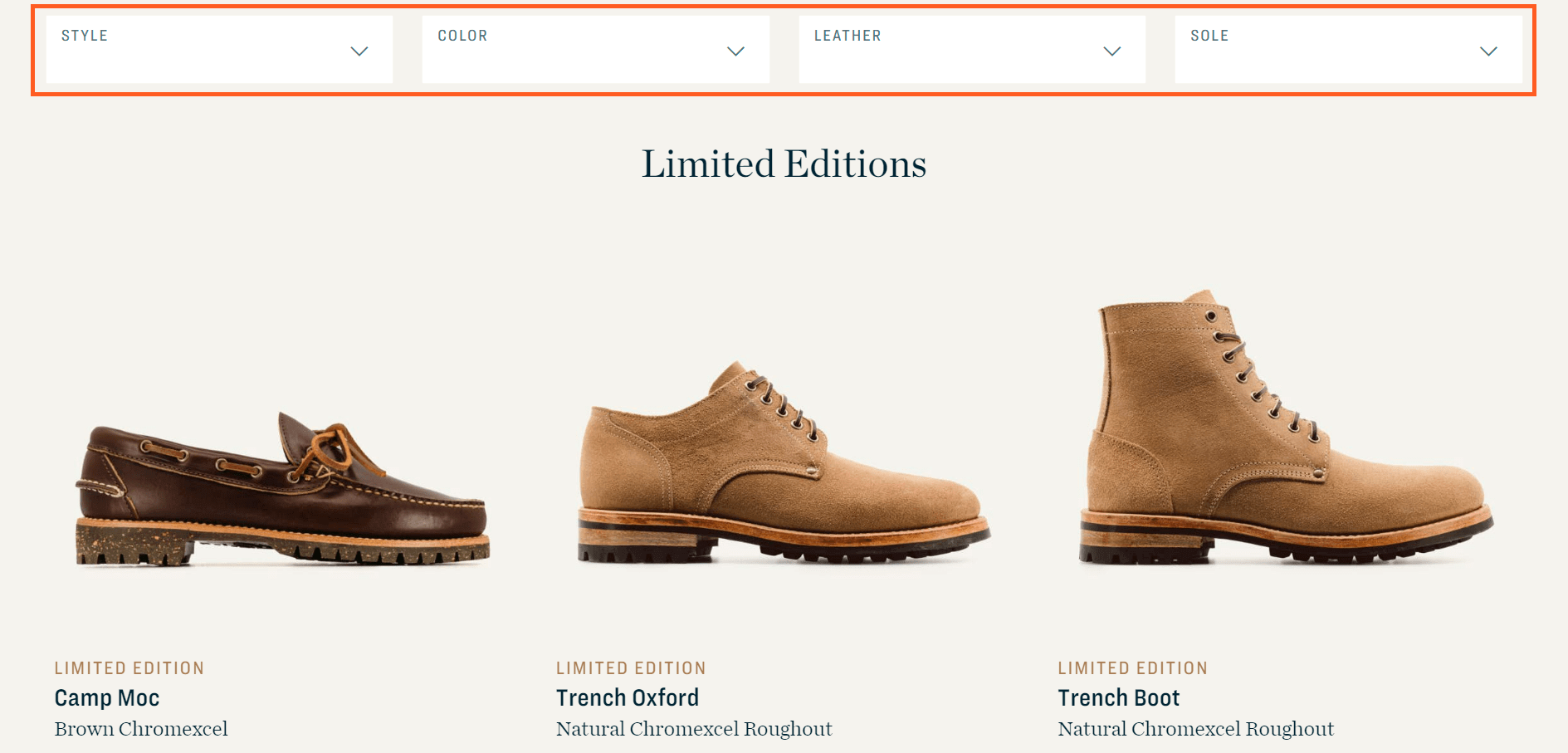
As for user behavior, keep in mind that shoppers should be able to combine multiple values of the same filter type, such as applying ‘black’ and ‘brown’ simultaneously for dresses, for example.
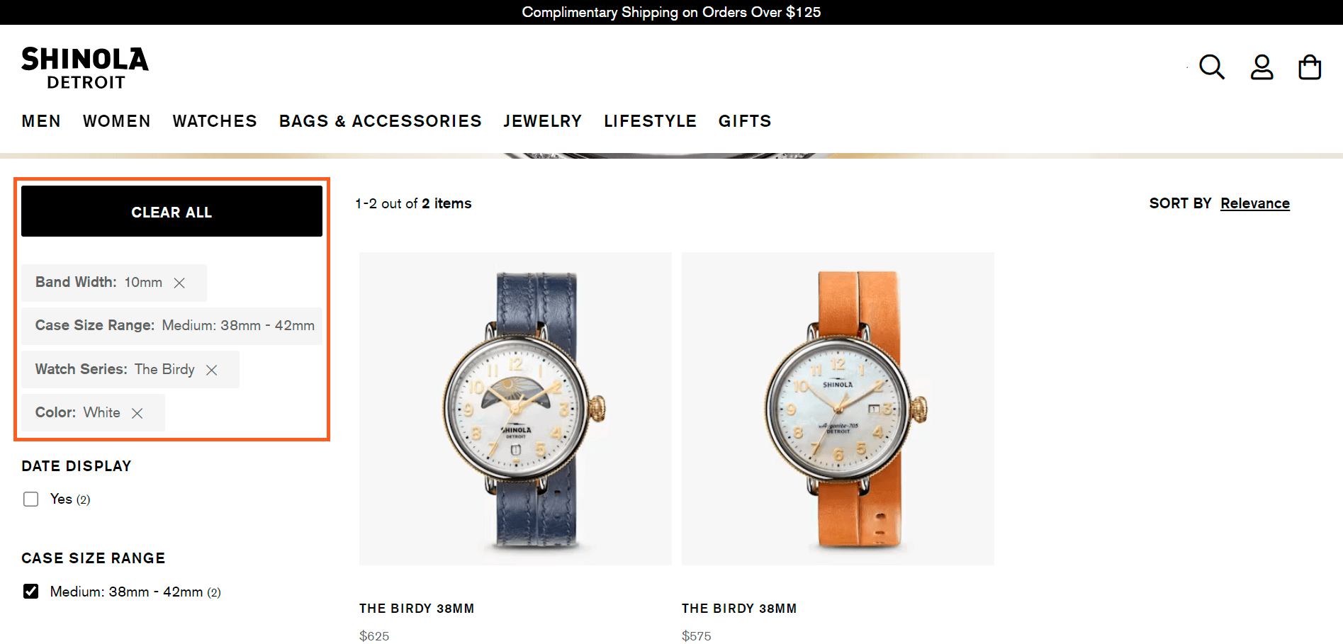
Also, pay attention to the applied filters section display, clearly indicate filter types for applied filters above the product list, above or below the filtering sidebar.
For a better user experience, it’s essential to allow purchasers to quickly remove applied filters separately and simultaneously.
All these recommendations are successfully followed by the brand Shinola Detroit:
Product Sorting
Optimization of product sorting primarily involves the implementation of user-friendly logic. Avoid when products are sorted by IDs, SKUs, or date of product adding, which doesn’t add value to the shopping experience.
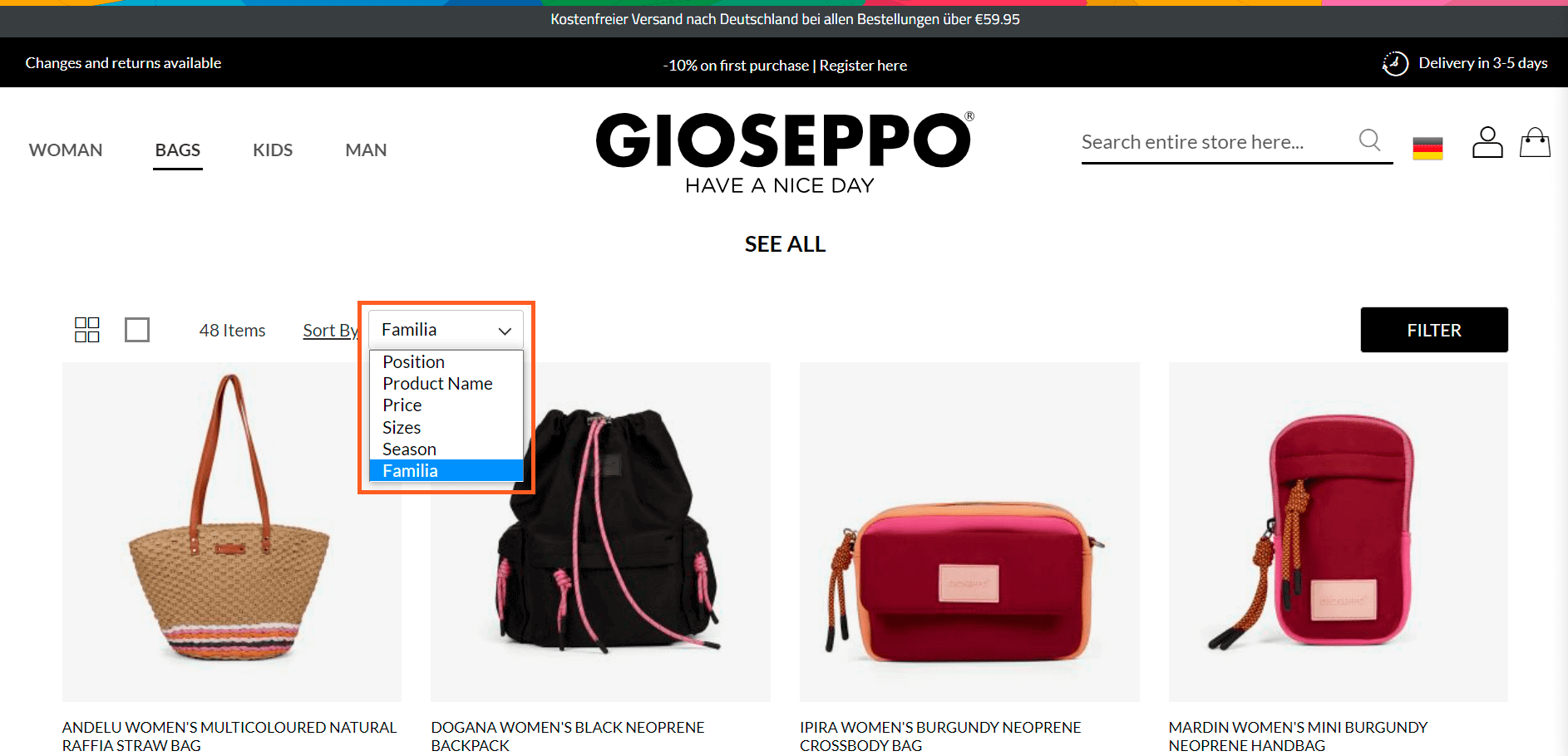
Instead, you can choose a convenient way of implementation, such as providing basic types of sorting, including price, best-selling, and newest products.
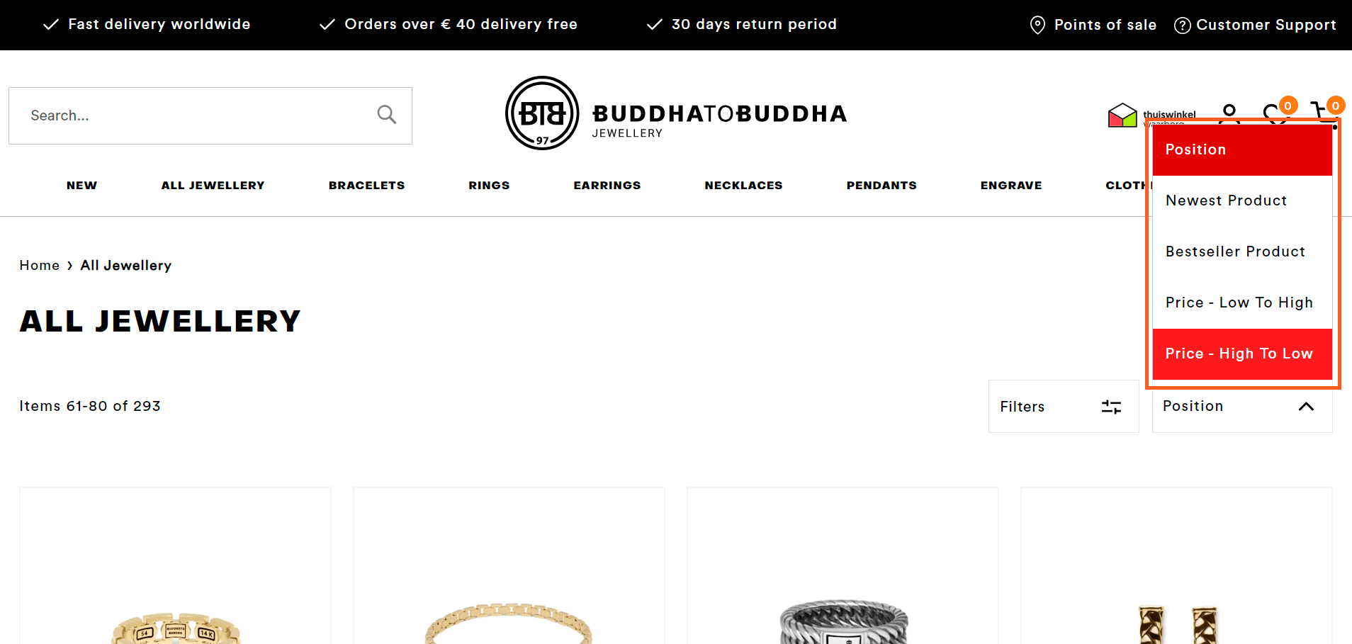
Don’t be limited by basic options, and provide category-specific sorting types as well if it’s relevant to your business. For example, you can add price sorting for wholesalers if it’s one of the target audience segments of your business.
See the Gioseppo brand’s example:
Product Badges & Labels
The primary function of product badges and labels is to enable users to distinguish products and quickly find what they’re looking for, as well as highlight those profitable products for the business to sell, first of all, for example, those with high margins.
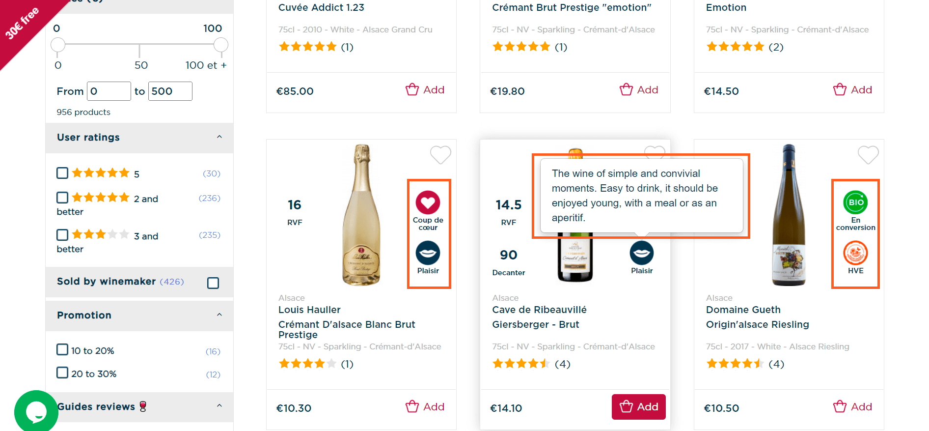
Product badges/labels should be self-explanatory and straightforward, such as ‘New,’ ‘Best-Seller,’ ‘Limited Edition,’ ‘Online Only,’ ‘Organic,’ etc.
However, don’t be afraid to experiment with labels if it’s justified. Here’s an excellent example of how the wine brand Twil deals with multiple badges as they explain each of them on hover:
Product Listing Page Personalization
According to Automat, almost 50 percent of shoppers purchase based on personalized product recommendations, even if they initially didn’t intend to buy it.
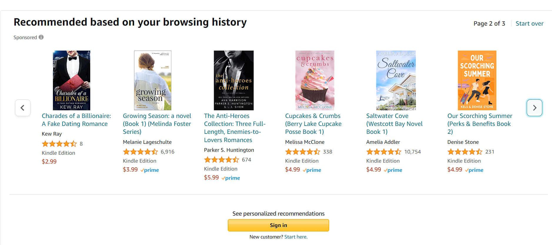
Personalization is rarely implemented on category pages but can be a nice add-on for users to discover more products and navigate the store.
Amazon displays a section with recommendations right below the product listing:
Best-Sellers Category
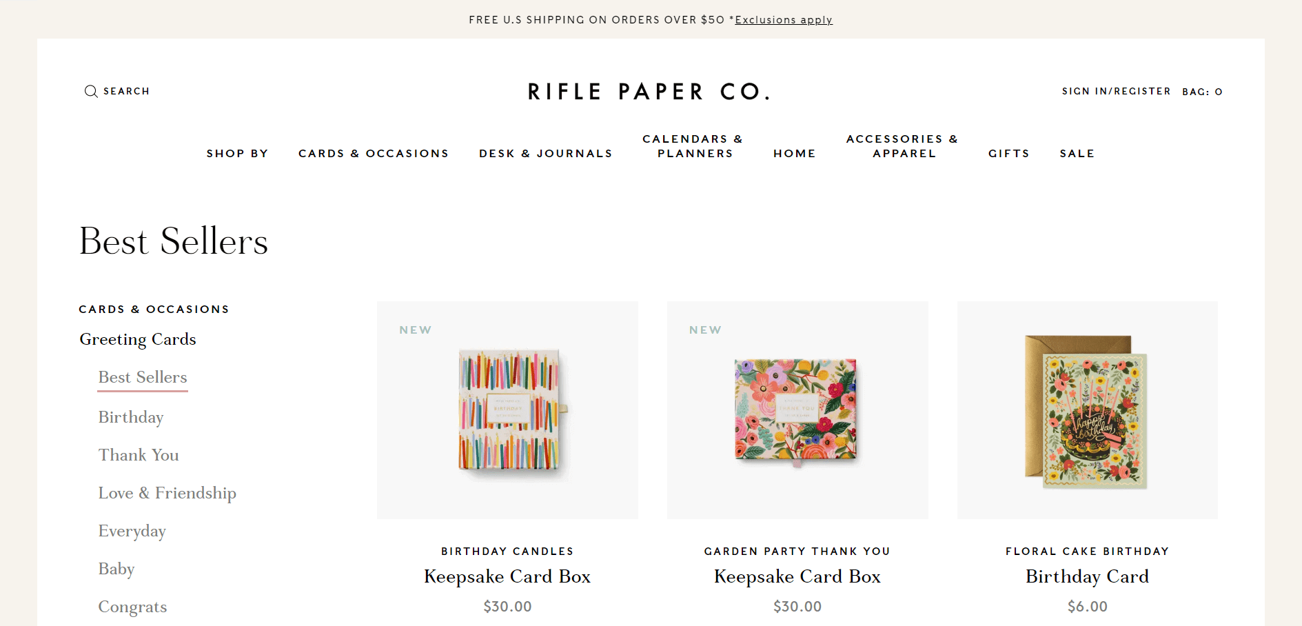
For brands that work based on the direct-to-consumer (DTC) business model, adding a category page with best-selling products is essential. It might be an efficient starting point for new users to learn about your brand’s offerings.
As reported by the Baymard Institute, 23 percent of users during their research used a best-selling category page as a first step in getting to know a DTC brand and its products more.
Conclusion: Checklist for Product Listing Page UX Optimization
Category page design & layout:
✅ Assist users in quickly finding product variations in product lists, allowing users to get a good overview of the product catalog. Instead of placing variations as separate list items;
✅ Indicate the number of variations clearly in the thumbnail or list item info;
✅ Load between 100–150 products at once for visually driven sites and between 50–100 products at once for spec-driven sites for desktop;
✅ Load fewer products for mobile sites, typically between 15–30 products.
Product information:
✅ Present a user with sufficient product information (price, product title or type, thumbnail, user ratings, and variations) to assess a product’s suitability to their unique needs and desires;
✅ Make it possible for customers to see an overview of the product list and compare products of interest to one another for spec-driven sites.
Content on hover:
✅ Show content on hover as both a thumbnail of the product in a ‘use context’ as well as a ‘cut out’ version, showing the product on a blank background;
✅ Highlight a key product feature in the secondary hover thumbnail in addition to the regular ‘cut-out’ image;
✅ Display thumbnails of additional product variations (colors, materials, patterns, sizes, or styles) on hover.
Filtering:
✅ Provide filters for all displayed list item info;
✅ Make it possible for customers to combine multiple values of the same filter type;
✅ Display applied filters in an overview, making it easy for users to get quick confirmation that filters have been applied;
✅ Show the filter type if there’s enough space to accommodate for applied filters;
✅ Display an overview with applied filters above the product list, filtering sidebar, or below a horizontal filtering sidebar;
✅ Have a quick way to remove filters that have already been applied.
Sorting:
✅ Provide four types of sorting: price, user rating average, best-selling, newest;
✅ Provide category-specific sort types for relevant product types if necessary.
Others:
✅ Introduce product badges/labels and ensure they’re self-explanatory and straightforward. If not, provide notes and explanations on hover as an example;
✅ Go the extra mile and implement personalized product recommendations on category pages;
✅ Provide a category with best-sellers (mainly if your brand sells directly to the consumer) to give users clues on where to start exploring your brand’s products.

