Shopping Cart Optimization: Tips for UX Improvements in eCommerce
If your store’s shopping cart page performance is poor, we are here to suggest some insights for its UX optimization.
As indicated by the Baymard Institute, the cart abandonment rate has reached a significant 70.19% in 2023. This figure is too huge to overlook. In today’s very competitive eCommerce arena, businesses cannot afford revenue losses that lead to their fading online presence.
Shopping cart optimization has transitioned from a nice-to-have measure to an absolute necessity. The precision of your shopping cart’s functionality now dictates whether prospective customers are converted into successful sales or if they choose to buy from your competitors instead.
Why You Need UX Shopping Cart Optimization
A well-optimized shopping cart serves as the key of a seamless customer journey, directly impacting your business’s results. Let’s delve into the reasons why investing in UX shopping cart optimization is not just a good idea, but an essential strategy for any forward-thinking online retailer.
Reason #1: Fight Cart Abandonment
Customers initiate the purchasing process, but often abandon the cart, which can be caused by a confusing checkout process. Optimizing the UX of your shopping cart can streamline this process, minimize friction, and significantly reduce cart abandonment rates.
Reason #2: Maximize Conversion Rates
An intuitive shopping cart experience translates directly into higher conversion rates. When customers find it effortless to navigate, add, and review their selected products, they are more likely to make a purchase. Plus, improved UX leads to increased trust, customer satisfaction, and ultimately, conversions.
Reason #3: Enhance Brand Perception
Your shopping cart showcases the reliability of your brand and your commitment to customer-centric design. So, if you ensure a positive and seamless shopping experience, you can reinforce your brand’s identity and leave a lasting impression on customers.
Reason #4: Ensure Mobile-Friendly Experience
We all shop from our mobile devices nowadays more than from laptops. A responsive and mobile-friendly shopping cart is essential for capturing the increasing number of customers who want the easiest way to buy their preferred products.
Reason #5: Data-Driven Insights
Effective UX optimization is not guesswork: it’s backed by data and insights. By closely analyzing user behavior within the shopping cart, you can uncover pain points, identify bottlenecks, and fine-tune the experience to cater to your customers’ preferences and habits. This will lead to constant improvement of your store for the sake of customer retention.
Shopping Cart Best Practices & Shopping Cart Examples
Be it the homepage, product listing page, checkout, or shopping cart, each of them demands a unique design approach to help customers in discovering their desired products effectively.
Let’s explore essential strategies for shopping cart development to enhance user experience, boost conversions, and minimize cart abandonment. We prepared key techniques and showcase real examples that highlight the way of simplifying the path to purchase.
Create Straightforward Shopping Cart Content
#1 Ensure Access to a Complete Shopping Cart During Checkout
While some websites offer only a mini cart view that pops up as an overlay or is integrated into the checkout process, it’s essential also to provide a dedicated full-page shopping cart option. This is especially crucial for customers who require a comprehensive view of their selected items, as relegating the cart to a small area of the screen can prevent customers from making a purchase.
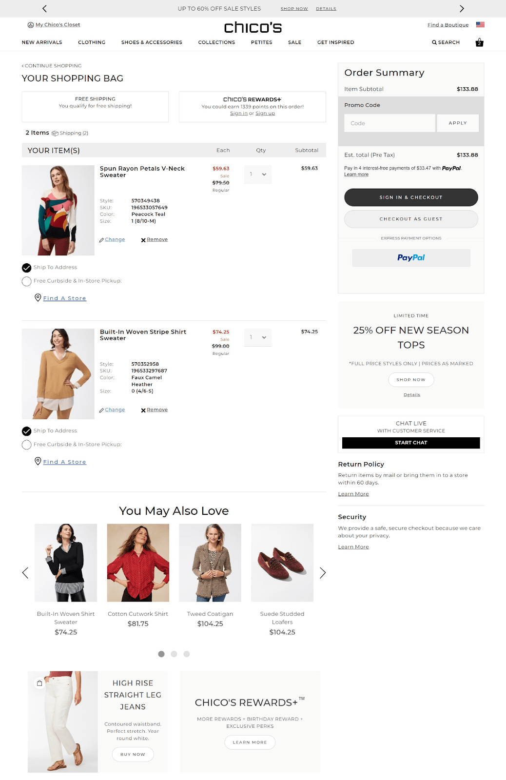
Example: Chico’s shopping cart is very informative and shows right away order and shipping details, order summary, payment options, allows changing item’s characteristics or remove them right on the page. It also highlights discounts, limited offers and product recommendations for improved shopping experience and increased chances for upselling. Return policy and security options are also shown in the shopping cart, which adds credibility to the brand.
#2 Show Product Details and Clear Images
Incorporate product images that are large enough to showcase details, enabling shoppers to distinguish items from similar alternatives. Display the product name, selected attributes (such as size and color), and their price. This can make final purchase decisions easy.
#3 Create Links Between Cart Contents and Detailed Product Info
Foster seamless navigation by allowing swift transitions from the cart to the detailed product page. By linking both the product image and name, users can effortlessly access additional information or delve into a product review.
#4 Simplify Item Removal with ‘Set Quantity to Zero’ and ‘Remove Item’
Сonsider user preferences by permitting the option to set item quantities to zero, offering flexibility in cart customization. Plus, facilitate a shopping experience by incorporating a clear ‘Remove Item’ link, which resonates well with users seeking to eliminate specific items from their cart.
Example: Hero’s brand of beauty products offers to easily add or remove products from a shopping cart with clear and visible buttons.
#5 Integrate Relevant Value-Added Services
Beyond the custom offerings of free or expedited shipping, modern retail is characterized by an array of supplementary services, such as delivery, protection, assembly & installation, repair. Incorporate these options into the shopping cart, helping customers who seek added convenience, protection, or assistance.
Make ‘Added to Cart’ Behavior Intuitive
#1 Enhance Cart Icon Visibility with Clear Badge and Subtotal Display
Make the cart icon visible by creating a noticeable badge. Consider displaying the cart subtotal near the icon, which can effectively capture users’ attention, especially when accompanied by motion or animation. This helps users identify potential errors like adding excessive quantities of items.
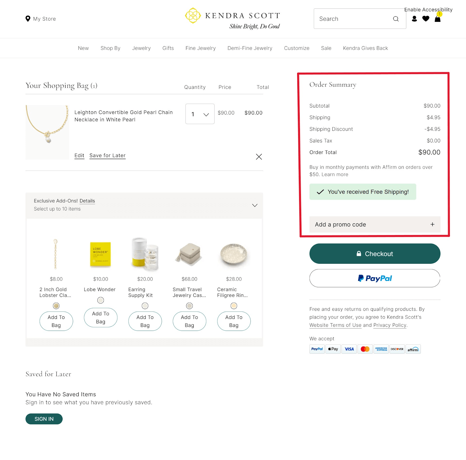
Example: Kendra Scott online shop provides concise and intuitive order summary, where the customer can see the total cost, including taxes, as well as discounts (in this case for shipping), and the option for promo code, which not only allows you to use one, but also understands that this shop can offer it to you in the future for your customer loyalty.
#2 Implement Confirmation for Adding an Item to Cart
Introduce a confirmation mechanism when adding items to the cart. Utilize overlays, pop-ups, or banners to display a message confirming that a preferred product is already there. However, for sites with limited options or users who make few purchases, an interstitial page can streamline the checkout process by keeping users focused on it.
#3 Modify “Add to Cart” Button for Items Already in Cart
To address issues where users unintentionally add the same item multiple times, consider altering the “Add to Cart” button. This modified button can indicate that the item is already in the cart, while still allowing users to add more of the same item if needed.
Implement Product Recommendations
#1 Opt for Variable Product Recommendations
Make product suggestions better by not always showing the same number. Instead, show more or fewer items that are really relevant, based on smart suggestions. This makes all the suggestions seem more trustworthy and helpful.
#2 Prioritize Direct Compatibility Items Over Alternatives
Prioritize items that directly match with the original products put in the cart, like accessories or tools, over suggesting alternatives. Make sure the recommendation system considers compatibility, giving more importance to items that go well together.
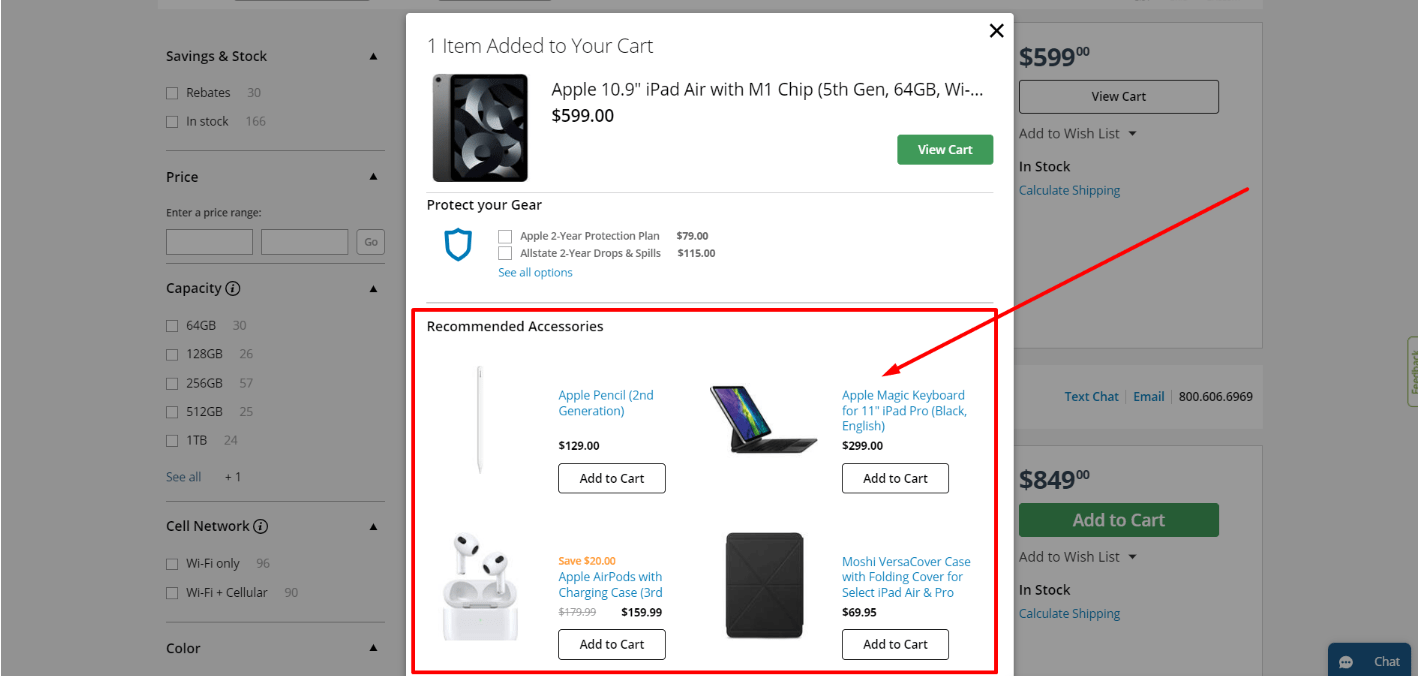
Example: When you want to buy an Apple product from B&H Video store, it only recommends accessories that go with this brand.
#3 Tailor Promotional Offers to User Context
Don’t make users annoyed with unrelated offers. Use smart rules to show the right deals, like credit card promos or free shipping, when it makes sense. For example, show these deals after users buy enough to make the offer meaningful, so they find it useful and satisfying.
Avoid Hassle with Discounts and Promotions
#1 Provide Immediate Discounts for User Actions
When offering discounts for signing up or similar actions, make sure users get the discount right away. Sending the discount code by email might distract them. To avoid losing sales, automatically apply the discount in the shopping cart or give them a code they can easily copy, so they stay engaged on the site without extra hassle.
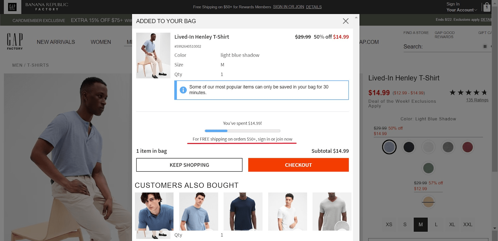
Example:
On the Gap shopping website, customers can see the free shipping option in the shopping cart, which will incite them to make additional purchases and receive the discount.
#2 Display Cart-Level Discounts and Restrictions Clearly
Enhance user experience by visibly indicating applied coupons and any associated restrictions within the shopping cart. This clarity prevents user uncertainty about price updates and eligibility for promotions. Communicate any unique limitations on discounted items as well.
#3 Update Payment Total Immediately After Applying Discounts
Validate and reflect coupon codes in the total cost prior to requesting payment details. Users should observe immediate savings and comprehend the calculation of their total expenditure. This transparency fosters user trust and understanding.
Make Gift Options Easy
#1 Enable Custom Gift Messages and Display Prefilled Options
For the right businesses, letting customers write personal gift messages is important. Also, showing ready-made messages like “I hope you enjoy this gift!” is helpful. But only show these messages after customers decide to add a gift message.
#2 Provide Comprehensive Explanation of Gifting Features
For mass merchants and similar sites with an extensive product catalog, particularly those where gift wrapping is a significant gifting feature, consider permitting users to label individual products as gifts. This is in contrast to obliging them to mark the entire order as a gift.
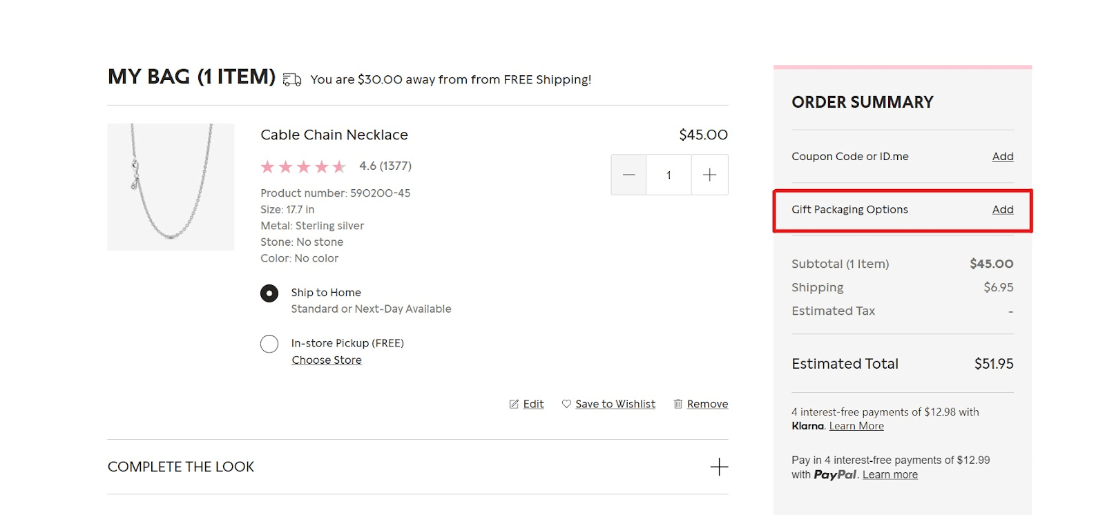
Example: Pandora knows that their customers often purchase its jewelry for gifts, so they add the gift packaging option in the shopping cart.
#3 Adjust Shipping Labels for Gift-Flagged Orders
When people indicate an order is a gift, even if they’re already signed in, the fields where they put shipping information should change to fit that. Instead of the usual checkout steps, where addresses they used before might pop up, they should be asked to put the gift receiver’s address or pick from their saved addresses. This makes getting gifts ready easier.
Conclusion
If you found our insights on optimizing a shopping cart valuable and aspire to achieve the same level of excellence demonstrated in the examples, we invite you to get in touch with us without hesitation. Feel free to reach out and explore how we can help you elevate your shopping cart experience.
Ready to jazz up your store’s UX?
Feel free to leave your contact info, and we’ll be in contact shortly


