7 Online Merchandising Practices That Will Astronomically Boost Your Conversions
Review of online merchandising tools that will help you increase your conversion rate — homepage carousel, customized promotional products, etc.
In comparison to brick and mortar stores, online merchants have much fewer instruments to influence people. While in a physical store, it is possible to spread flavors or turn on music to attract customers, eCommerce website owners have to do with people’s eyesight only.
This article shows you how you can arrange products on different types of pages to increase your revenue significantly.
Online Merchandising
Visual Merchandising is a widespread practice of placing and displaying products within a store (or even outside it!). It includes such techniques as dressing mannequins, distributing scent, bundling goods, putting them at eye level, etc.
eCommerce Merchandising is a practice of organizing products on pages to drive people to make a purchase. According to studies, only 3% of online store visits end with a purchase. The number is extremely meager, especially if we take into account how competitive the eCommerce industry is. But here comes merchandising! Having adopted its techniques, you’ll sell your products like hotcakes!
#1: Carousels on the Homepage
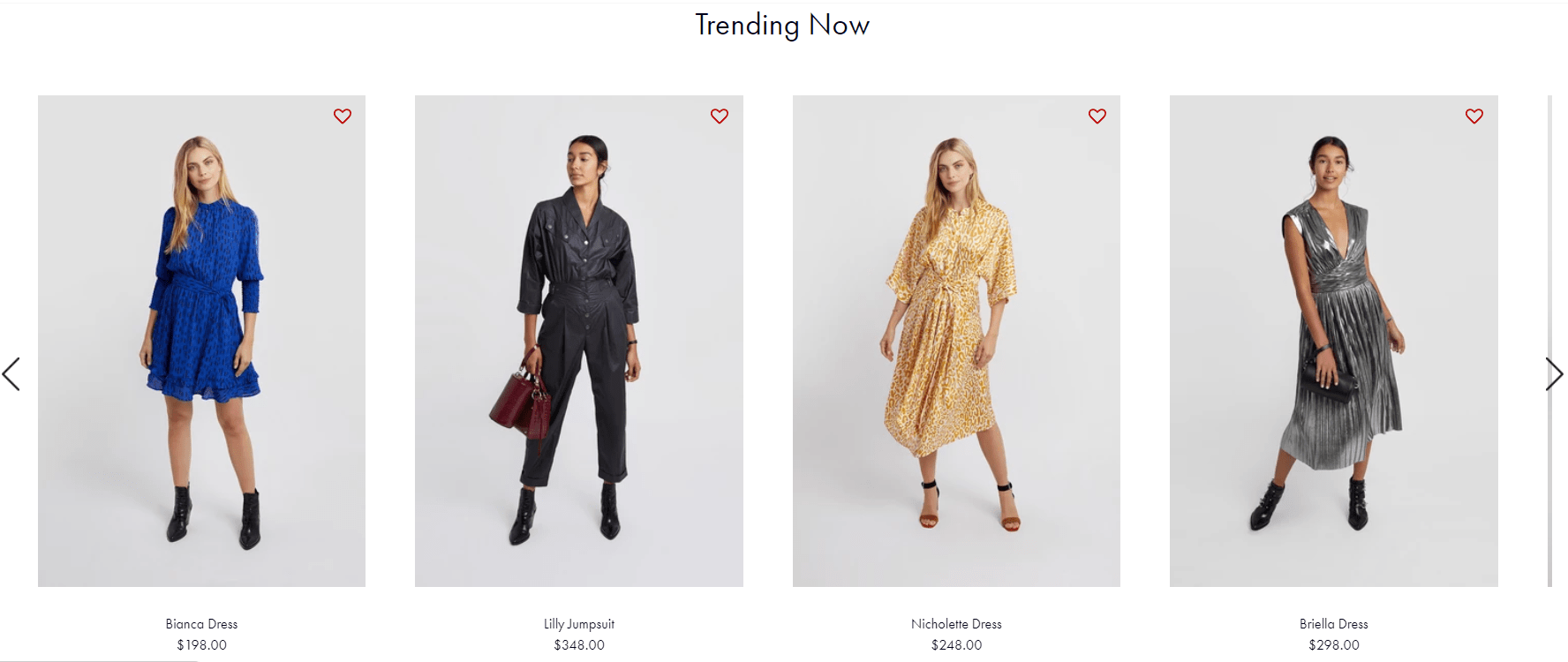
This is one of the most popular eCommerce merchandising tactics, and you’ve probably seen it many times. It can show top sellers, new arrivals, trendy items, etc. Often merchants add several carousels on a homepage to provide people with some value. The technique is also considered to be a psychological trick since such sets impact on customers’ decisions.
For example, if you display a carousel with trending clothes, you appeal to the desire of being up to date and fashionable. A “Sale” block attracts those who want to save money. Also, you can ask some influencers to choose products and then arrange them in a carousel on your homepage. The knowledge that a famous person has made this decision will convince a lot of users to make a purchase. People often follow idols. But the thing is that this celebrity has to be appropriate for your target audience.
Have a look at the example above. Rebecca Minkoff entices visitors with its stylish apparel right from the homepage. How could you not buy anything?
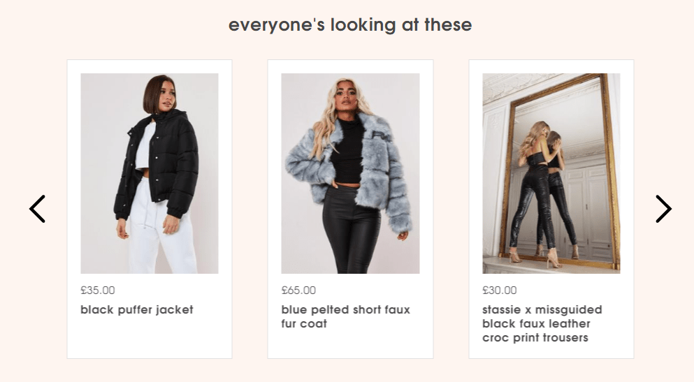
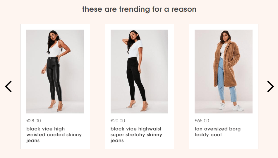
There is another fantastic example we’ve found on the Missguided website. The brand appeals to the most fashionable customers and changes the name of the block when the page reloads.
They use quite creative headings. Have you ever seen a carousel with popular products with headings like “everyone’s looking at these” or “these are trending for a reason”? Making non-standard headings can make a significant difference in your sales as well as pictures and overall design.
#2: Product Thumbnails in Search
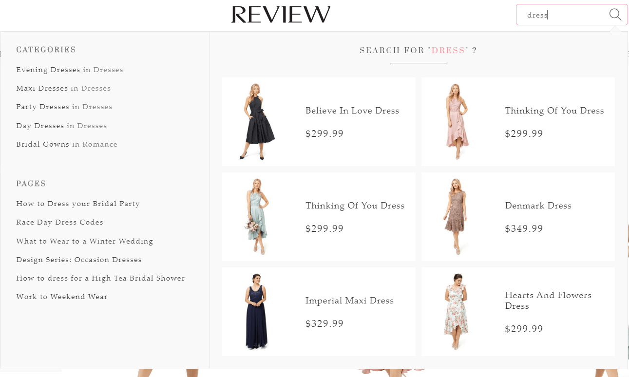
Another breathtaking eCommerce merchandising technique is adding product thumbnails in internal search hints. Usually, websites offer categories while a user is typing a search query, but a more advanced option is showing the most popular products that meet customers’ needs. Such an approach dramatically increases the possibility that a user will buy a product because it shortens the customer journey remarkably.
Australian brand Review has been benefiting from this tactic for a while, and it seems like they haven’t given up on it yet.
#3: Multiple Colors on Product Pages
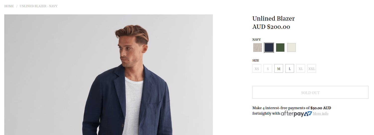
Enabling visitors to switch colors while exploring a product makes the user experience much better. It positively influences your brand image, boosts pages per visit statistics, and consequently increases conversions.
Venroy’s not only added a possibility to choose colors but also enabled users to define the size of the desired clothing. The latter is a must-have feature for apparel stores.
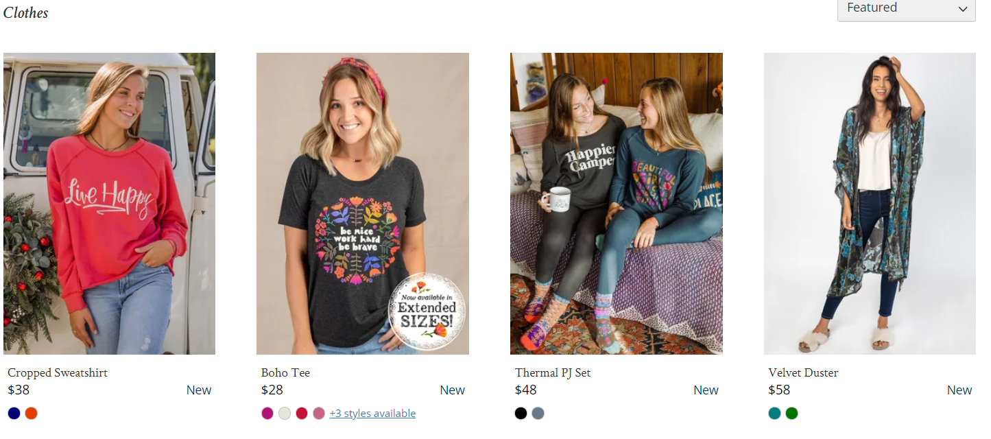
Natural Life has gone a step further and suggested that customers change the color of a product right from a category page! What a fantastic feature that saves consumers’ time!
These days people pay special attention to the convenience of the website. So, if they can interact with your online store with ease, you’ll get a competitive advantage.
#4: Different Numbers of Products on Category Page
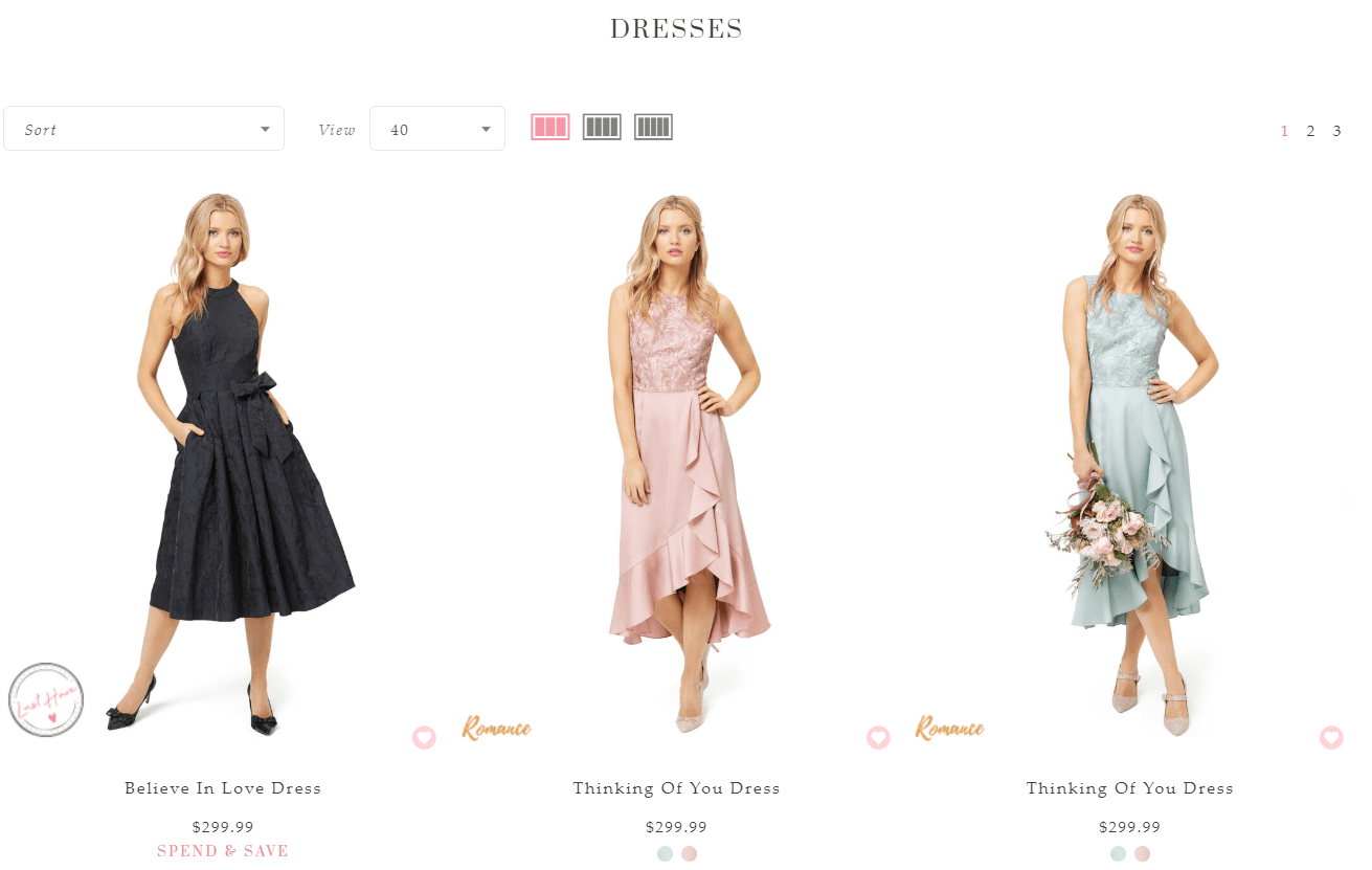
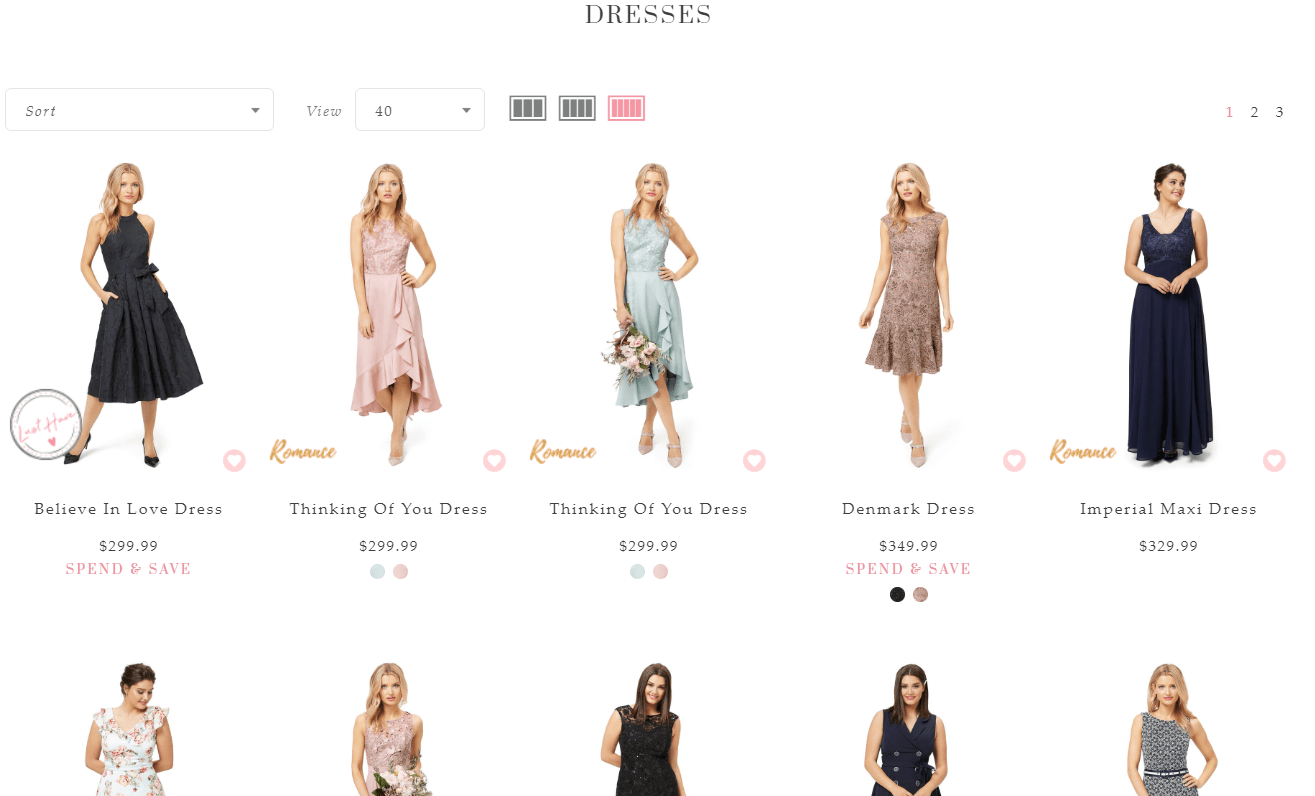
This functionality is not only very popular but also extremely convenient! Some online stores provide customers with an opportunity to change the number of products in a row on a category page. This tactic allows users to zoom in on goods and make a decision quickly right from the category page. On the one hand, they don’t need to click on every product to see it. On the other, they can zoom out a page to run eyes over it and continue their journey.
This is how Review has done it. Check it out.
A visitor can leverage the functionality by clicking on tiny buttons next to the “View” drop-down menu. This is how it looks when five items in a row are chosen.
#5: Sale On The Top of Homepage
If you are running a sale, tell your visitors about it loud and clear from the top of your homepage! Sales significantly increase revenue because they drive consumers to buy more.
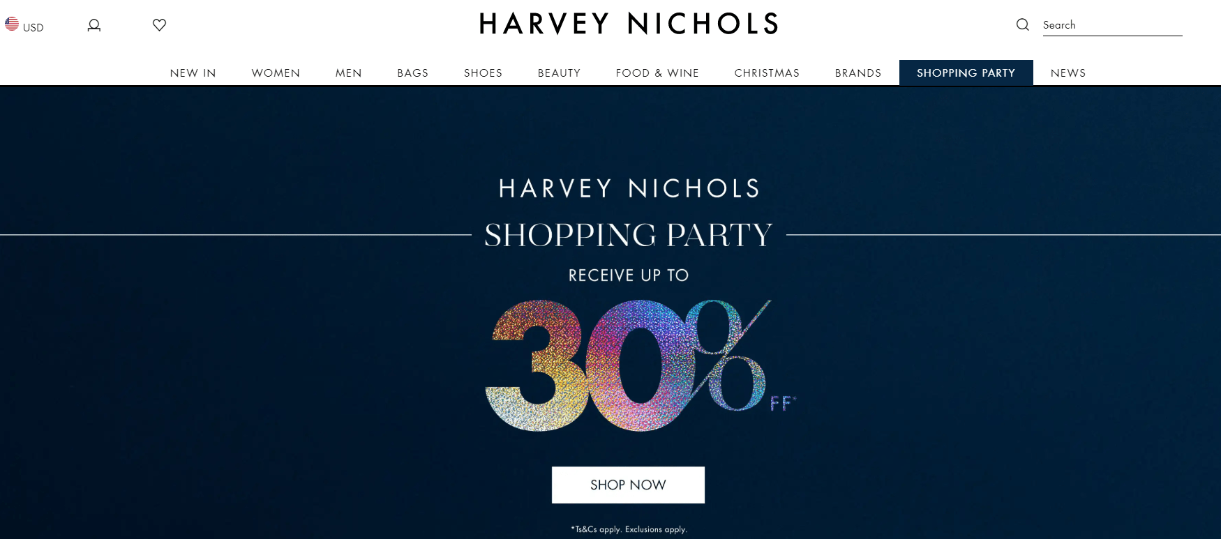
Harvey Nichols offers a 30% discount right away when you land on the homepage. Furthermore, to perform the campaign, they’ve added new prices to products. Visitors can simultaneously see the old price and the new one, which is remarkably lower, and then decide to buy now rather than waiting until the offer ends.
#6: Customizable Items
It’s time to review probably the most fabulous feature in this article. We mean the functionality that enables customers to assemble a unique product. People love expressing themselves. Allow them to do this, and you will see how it boosts your income.
Such an approach allows you to provide higher personalization. Every product becomes unique, and people enjoy interacting with your website because it’s like a game.
Unfortunately, it might be hard to implement it in some types of business. For example, if you sell readymade mobile devices or apparel. But you can come up with some bundling options like suggesting that visitors gather sets of products and buy them cheaper.
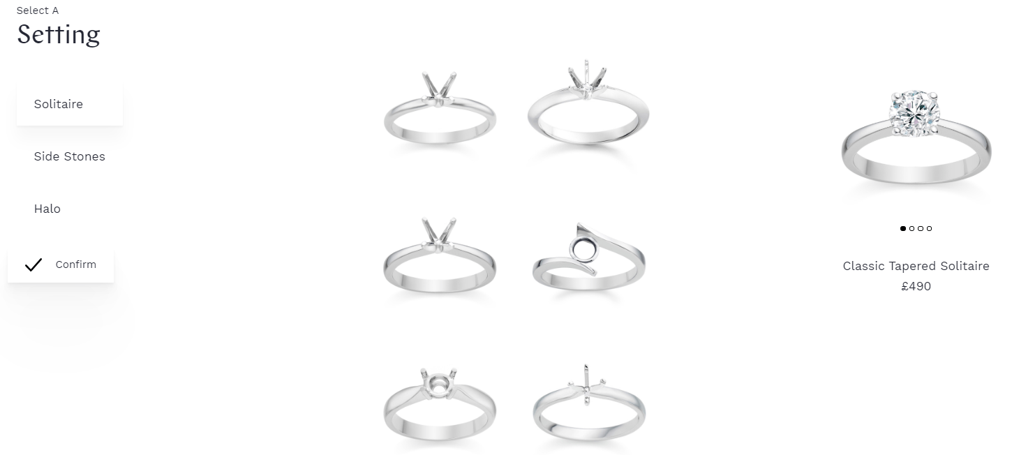
A diamond manufacturer Vashi allows customers to make their own ring. Users can choose a diamond shape, decide whether they need side stones, and even vary its brilliance. After the settings are selected, the order page shows up. Besides making an order, it offers to book an appointment to see with your own eyes how your ring will be developed.
#7: Seasonal Collections
This excellent merchandise tactic enables you to sell your ordinary products unusually. Do you have some unpopular goods in stock? Try to sell them by gathering them together in a seasonal collection. Develop a magnificent picture and show the offering on the homepage to make sure everybody sees it. Usually, such an approach to boosts conversions remarkably since it sparks people’s interest and triggers their emotions.
For example, you may bundle scarves, cups, and sweaters in an autumn set. All these things represent the warmth and coziness we all need when the weather is cold and rainy. So, this appeals to people’s needs.
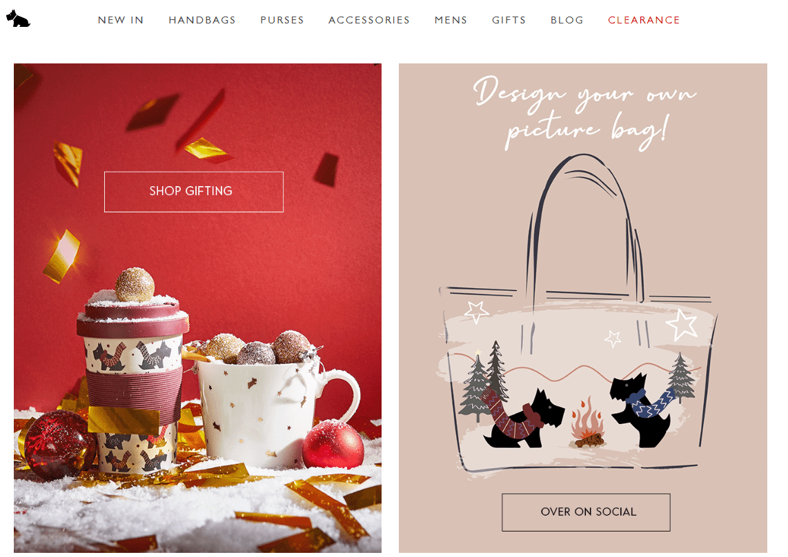
This holiday season handbags and accessories brand Radley suggests that visitors scroll a set of goods they can buy for a present. The block is displayed on the homepage. A user can get the collection page directly by clicking on the “Shop Gifting” button. Have a look at the picture they use to notify visitors about the collection. It’s bright, red-colored, decorated with snow and Christmas balls. It makes a positive impression since it has to do with Christmas.
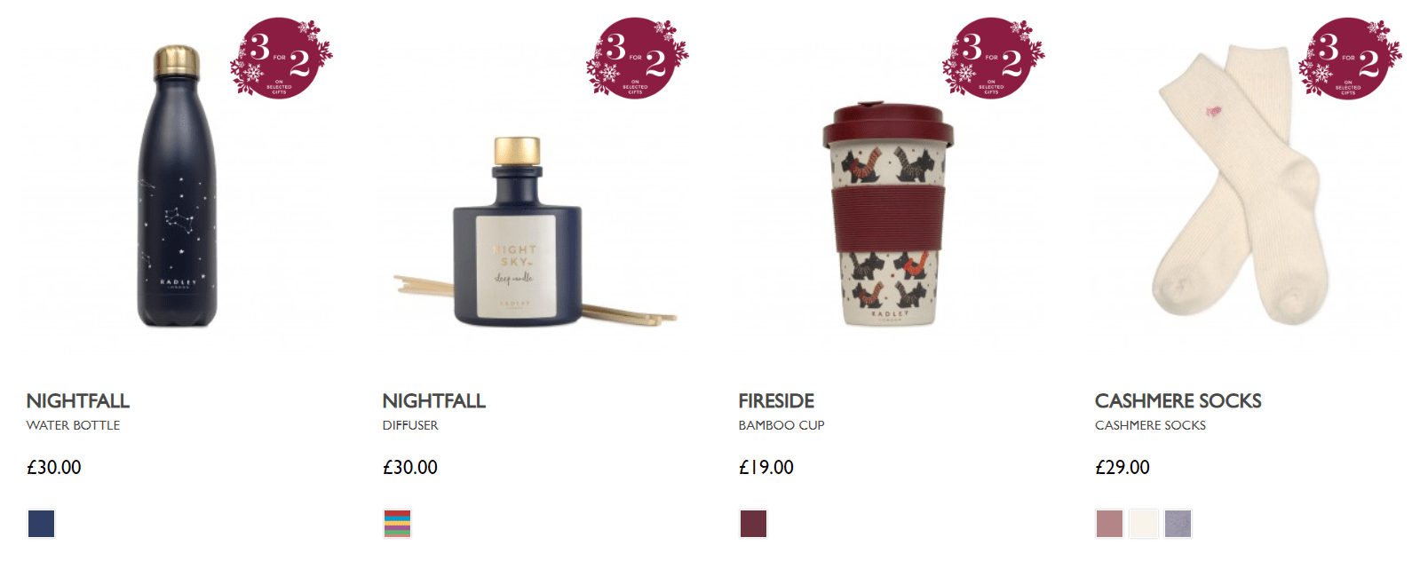
As you can see, Radley gathered different types of products in its collection. You do the same, and you’ll get an opportunity to show a wide range of goods to buyers. It will significantly increase the chances for products to be bought. Especially when it has to do with the holiday season, and everybody is looking for gifts like crazy.
Final Words
The critical principle of visual merchandising is “less is more.” The same works for eCommerce as well. A study conducted by Shenne Iyengar and Mark Lepper in California revealed that consumers prefer buying from shelves with a narrow range of choices. There were two options: either a table with 24 flavors of jam or a meal with only 6 flavors. Participants could freely choose between them.
As has been revealed, the more extensive selection attracted 60% of consumers, but only 3% bought something from it while 30% of all the participants purchased jam from the smaller range.
So, don’t overwhelm your homepage while adopting the mentioned online merchandising practices. Keep your website clean and minimalistic, and this will positively affect your conversions.
If you still have any questions feel sure to contact us via the form below. We will be happy to help you.
Looking for eCommerce development backup?
Share your contact information, and we’ll be back to you in no time
