In 2018, Statista carried out a study which revealed that only 12% of consumers consider mobile shopping to be convenient.
Consumer trends show that ecommerce site visits via mobile devices has increased exponentially over the years. No wonder, because people carry their smartphones everywhere, from a bed to work to the bathroom.
According to IMRG, in the UK, 71% of all online store traffic comes from mobile devices. Statistics of other countries show the exact tendency.
And though the numbers attest to the ever-growing importance of mobile ecommerce, mobile transactions are still low in comparison to desktop ones.
In 2018, Statista carried out a study which revealed that only 12% of consumers consider mobile shopping to be convenient. Moreover, the researchers found that mobile shopping has the biggest rate of cart abandonment – 86%.
Considering this data, companies such as Magento, HiConversion, and PayPal have developed a MobileEcommerce Optimization Initiative in order to understand what prevents consumers from buying via mobile devices, and work to change it.
What is the Mobile Ecommerce Optimization Initiative?
The Mobile Ecommerce Optimization Initiative was launched in June 2018. It suggests that merchants take part in different data collection experiments regarding the collecting of consumer data from their mobile websites.
The Initiative partners and system integrators analyze the data, and calculate results based on the findings. Eventually, statistics are prepared which shows whether or not the experiment was successful.
The main goal of the project is to help retailers succeed in mobile sales environments by testing various approaches. Store owners have the opportunity to try different features and choose those which work for their businesses. In the long run, the Initiative will help to better understand mobile consumer trends and solve the issues around conversion rates.
Authors of the project emphasize that they are not going to make a list of best practices, but all the data collected within the initiative may help merchants to customize their mobile sites more effectively. Remember, what works for one store doesn’t mean it will work for them all; your customers and your business are equally unique.
Why RPV?
Enthusiasts who run the Mobile Ecommerce Optimization Initiative suggest using Revenue per Visitor (RPV) as a key metric for an online stores’ effectiveness. This is a metric which unites two popular theories: conversion rate (CR) and average order value (AOV). Today, despite their best efforts, CR and AOV are going to pass into history as they don’t match the needs of modern ecommerce. In this article we will use RPV measurements to uncover the success rate of the experiments.
Conversion Rate measures a number of visitors who make a purchase eventually, but it totally ignores differences in costs. So, it equalizes those who spent $1 and those who spent $1000. As a result, you may observe an increase in CR, but lose money in reality.
Average Order Value helps to overcome some limitations of CR by tracking an average sum you earn from all your orders. But it’s also not entirely accurate because it doesn’t count a number of purchases which were made. This means that sometimes AOV numbers may be low, but revenue is in fact growing.
The solution to the aforementioned issues is Revenue per Visitor. This metric measures dollars you earn per visit, which is much more accurate and representative for ecommerce, and helps you to cut useless efforts.
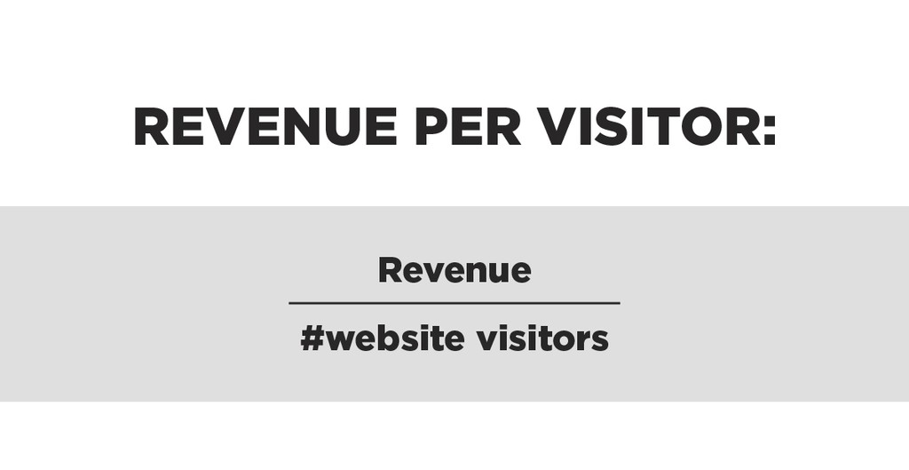
RPV is easy to calculate. Just divide the revenue you earned in a certain period of time by a number of visitors in the same period of time.
Mobile shoppers prefer simplifying checkout
Consumers spent online $125.91 billion on 2018’s holiday retail season, according to Adobe Analytics. Only 36% of those purchases were made via mobile devices while 54.3% of ecommerce website visitors viewed stores on a mobile device.
Consumers are likely to feel disappointed when they face complicated checkout process’ on mobile devices. In order to prove if this hypothesis is true researchers launched several experiments and the results were surprisingly positive.
Simplified Cart Header
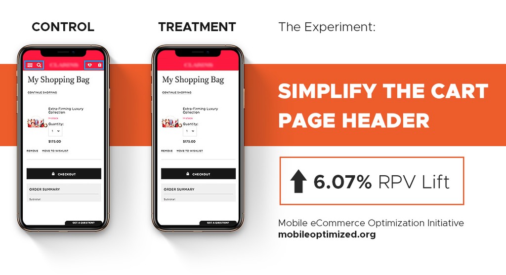
Having deleted all distractions from the cart page, researchers revealed 6.07% increase of RPV on average. When consumers visit a cart page, they want either to continue shopping or buy the selected product. By clearing the cart header of unnecessary elements, merchants can significantly increase incoming revenue.
Coupon Collapse
It is a common scenario when users leave websites in order to get a discount and start searching for special coupons. These customers often forget to complete checkout and never come back.
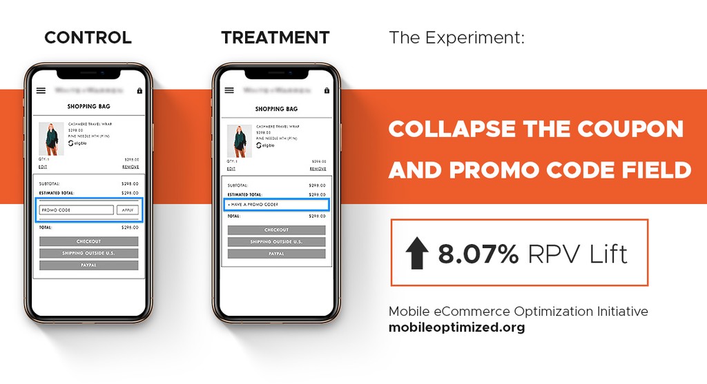
Coupon offering is a great marketing tactic which can bring you a lot of customers and boost sales, but sometimes it doesn’t work as well as expected. The Mobile Ecommerce Optimization Initiative doesn’t suggest getting rid of this activity, but making a coupon field smaller and less distractive.
As it’s already discovered, adding a feature which collapses a coupon field increases RPV by 8% on mobile devices. Users can expand the field any time they need and fill it with their code.
Auto Сart Update
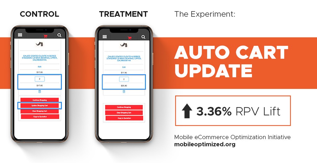
One more option to simplify checkout is implementing an automatic cart updating feature to follow changes in prices and quantities. This solution removes a step from the checkout process for the consumer and makes buying online remarkably easier. In addition to this, frontend appearance becomes more minimalistic and simplistic.
This experiment was successful for almost all participating merchants as 95% of them received an increase in conversions. RPV on mobile saw a 3% increase while desktop saw a 32% increase.
Checkoutless is the Future of Mobile Ecommerce
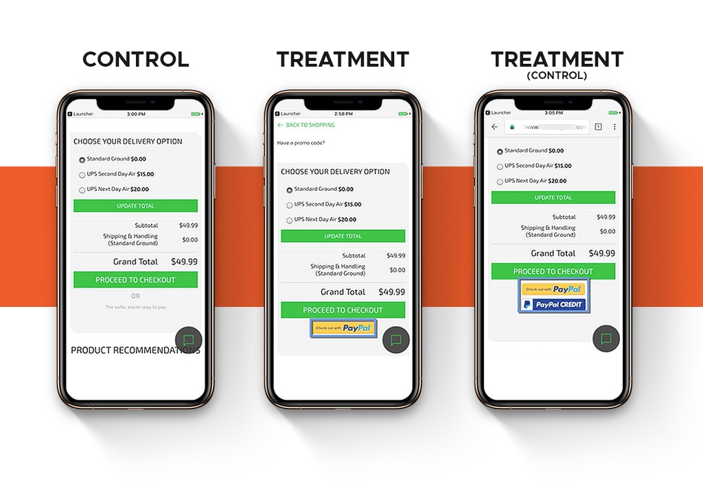
The Mobile Ecommerce Optimization Initiative went a step further and tested a checkoutless technology option. Participants installed a PayPal button on their websites before the conventional checkout stage, this way users could make a purchase on the spot either a product page or cart. Such functionality dramatically minimizes the number of clicks for a customer to complete the transaction from 80 to 2.
Besides the obvious simplicity, such a feature also heightens the probability of snap decision making to buy a product. When you provide people with the opportunity to make a purchase in two clicks they are more likely to make the purchase. Especially, when they see something which is very appealing to them.
SImple and slick buying experiences have turned out to be quite attractive for consumers. Results of the experiment confirmed 8.72% average RPV increase in most of the cases so far. In accordance with PayPal, adding a Check Out with PayPal button can increase conversions even more: by up to 34%. As you see, visitors are more likely to convert into buyers if there is a seamless and simple way to purchase.
Since the data produced so far shows growth, it becomes inevitable that more and more companies will implement checkoutless functionality onto their mobile sites in the future. But what is going on in the market now? In order to answer this question, GENE has carried out an extensive study that picked apart mobile websites of the top 250 retailers in the UK.
First, the researchers revealed that 70% of online stores don’t provide users with an ability to pay before the traditional checkout. It means that checkoutless commerce is yet to become a trend in the UK. You’d better implement the technology as soon as possible in order to get more benefits.
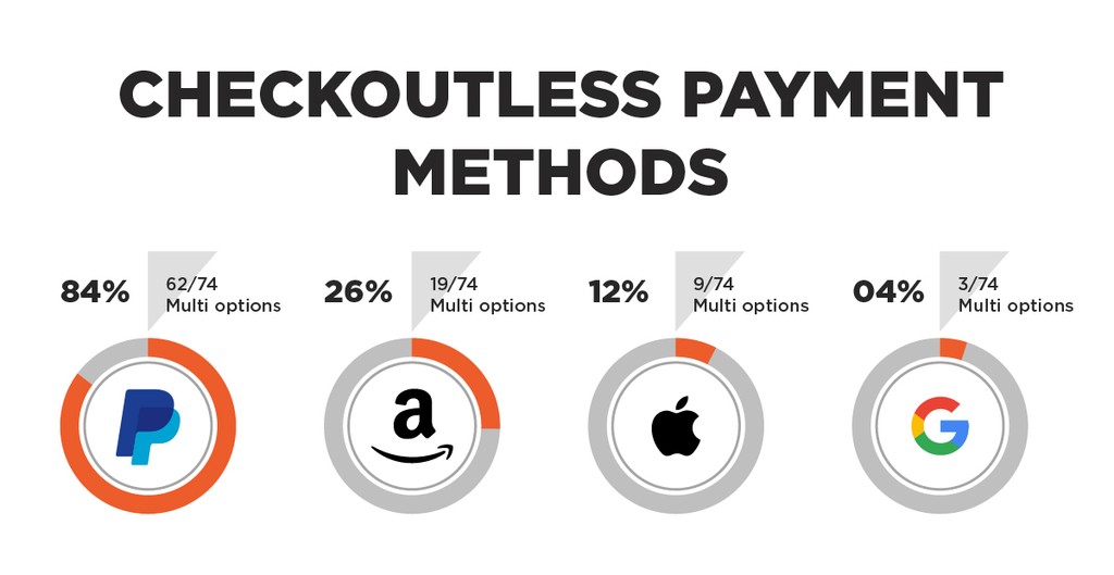
Second, the explorers examined how popular different checkoutless payment systems are. After an investigation among those who’ve already added the feature, they discovered that the most popular platform is PayPal with 84% of expansion while Amazon Pay was presented on 26% of the sites and Apple Pay placed third with 12% of the websites providing it. And Google Pay turned out to be the least popular: it is used by only 4% of merchants.
These statistics don’t necessarily mean that nobody else provides consumers with digital wallets options. The truth is that the majority of retailers place these options on a conventional checkout stage that doesn’t make any sense because such an approach makes checkout complicated. Only 29% of all merchants who have PayPal on their websites use it correctly: on the product or cart page.
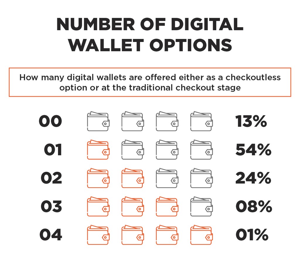
As for the number of digital wallets presented either before or on the traditional checkout page, researchers discovered interesting figures. 54% of online stores enable customers to pay via a single payment system. 24% suggest using two of them. 8% provide visitors with three options. And only 1% has added functionality of four different digital wallets.
The best decision of course would be implementing all of the digital payment options. If you are concerned that a page will be overwhelmed with logos and buttons, you can always set up a process that will track users’ preferences. When they come back to your store, it will show them only the option they’ve chosen previously.
Other Experiments the initiative carries
Within the Mobile Ecommerce Optimization Initiative more discoveries than we listed above had also been made. Let’s dive into some of the experiments we haven’t mentioned yet.
Zip Code Autofill
Most people get bored when they have to fill in numerous information fields during the payment process; something else draws their attention and they leave the cart abandoned. In order to prevent things from happening this way, the checkout process has to be extremely well optimized.
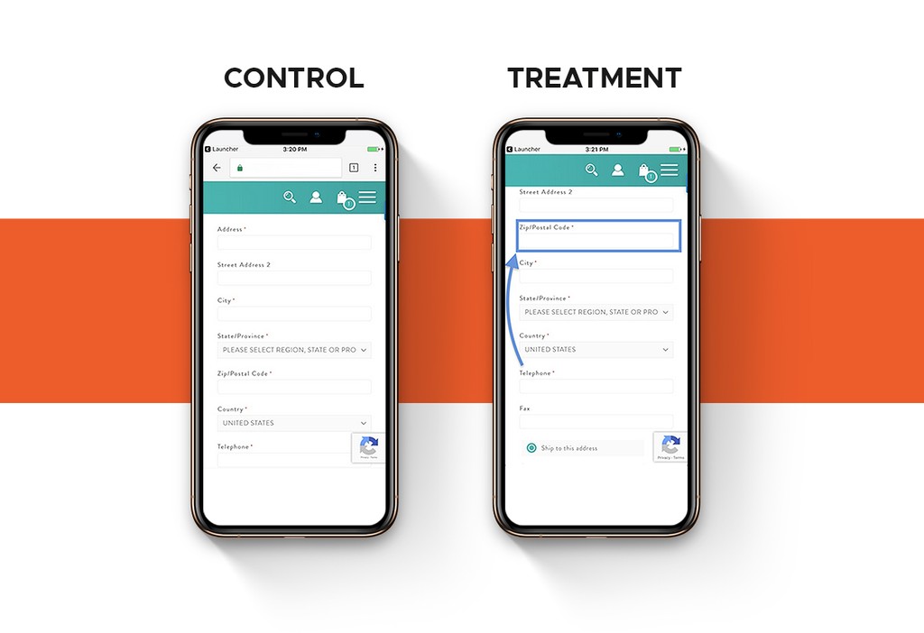
In this experiment, a widget was installed on participants’ stores. It automatically populated information about the country and city after a customer had typed a Zip code. As a result, an average RPV on mobile devices increased by 6.99%. A similar outcome was observed on desktop and tablet.
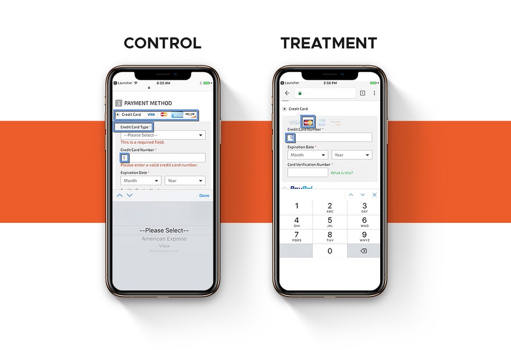
Credit Card Auto Detect
This experiment has shown ambiguous results. Removing the need for customers to choose a credit card type manually didn’t work out on mobile where an average RPV decreased by over 2%. The reverse influence was on a desktop where RPV increased by 1.19% and on a tablet where the rate hit an impressive 8.62%.
In this experiment, a credit card type was recognized programmatically based on the first digits of a card number a user filled in. But even if the average RPV on mobile decreased, the experiment was successful for 66.67% of participants; unfortunately, 33.33% of them failed. It still means that you should try this option to see if it will also work for your business.
Security Icon Placement
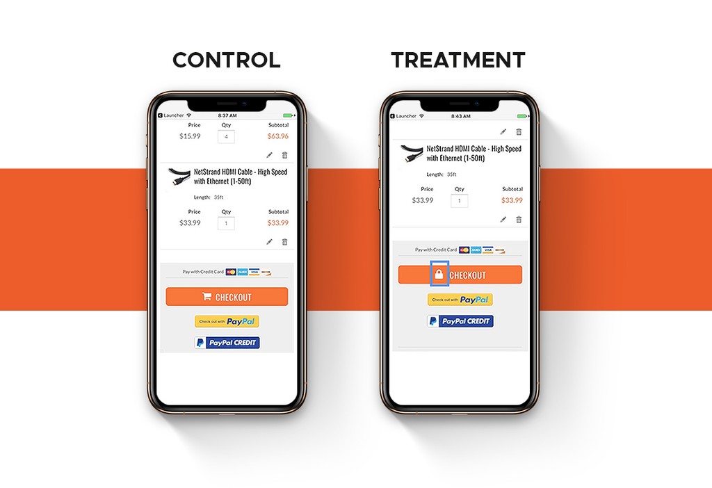
Today one of the biggest shopper concerns is information protection. Users want to be sure that their personal information required for a transaction is securely encrypted. That’s why placing a simple security lock icon on a checkout button gives such an impressive outcome.
Seeing this icon means consumers felt more confident to make a purchase, and this caused an increase in sales on all types of devices:
- Average RPV on mobile saw a growth of 17.37%
- Average RPV on desktop increased by 7.73%
- Average RPV on tablet hit a 7.86% of increase
In Progress
There are two experiments in progress now: Mini cart checkout CTA and Mobile Phone Input. In the first case, researches make a checkout available on any page of the buyer’s journey. In the second, they tailor the site’s input types to attributes in order to make a process of filling information as easy as possible.
Since the experiments in this area haven’t been finished yet, there are no results to share. But you can join the Initiative and help the community to test the hypotheses – link to the form is in the next paragraph.
Join the Initiative
The Mobile Ecommerce Optimization Initiative is a community-driven event so any merchant can easily take part in it. There is a simple form on the website which is enough to submit to get onboard and start benefiting the project.
Participants get access to the collective data of different online stores and also they can test a variety of optimization options on their website.
According to Magento, merchants who participate in the Initiative have already earned $19 million in additional revenue due to the experiments they perform. An average RPV increase of all retailers involved hit 8.6% as of the end of 2018.
Conclusion
Experiments of the Mobile Ecommerce Optimization Initiative prove that even small improvements can significantly boost revenue.
Simplifying a checkout process makes users more likely to buy via mobile devices, so ecommerce is expected to grow in this direction. In order to stay ahead, keep the following points in mind:
- The cart page should be designed in a clean, simple way as to not distract a consumer from the buying process. People are already surrounded by distractions, don’t let your purchase page be one of them.
- Make checking out as simple as possible. Customers don’t like wasting time filling in long forms with countless fields. Implement at least one digital wallet to give your visitors the opportunity to pay in two clicks.
- Test what works for your website and what doesn’t. Try different features, new designs, and keep an eye on RPV. The metric will give you valid data that reflects your real achievements.
As you can see, even if your mobile transactions keep pace, there are ways to solve the problem. You can join the Mobile eCommerce Optimization Initiative or try experimenting on your own.


