


Client reviews
Success is about outcomes. From retail services and healthcare to luxury design and automotive, our projects are built around business goals. Hear directly from the teams we’ve supported—how businesses around the world sell more with Magecom.

Affinity Digital
"Dear Magecom team. WOW what an effort you made at go the live stage!!! Many thanks indeed for all your effort over the project but especially this week!"
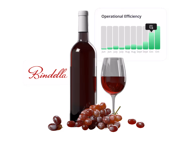
Bindella
"Great professional approach and deep technical knowledge. Magecom helped us optimize our online presence with efficiency and attention to detail. A pleasure to work with."
Code8
''Without your support and collaboration, my time here would not have been the same.
I’ve learned a lot from you and will leave with great memories of all the good times. Thanks again, it was a pleasure working with you."
Garrett Leather
"Team is professional, knowledgeable, responsive, organized, customer-focused, and quality focused. Looking forward to vast improvements in our website performance, especially once direct SAP integration is completed."
Garrett Leather
"Team is professional, knowledgeable, responsive, organized, customer-focused, and quality focused. Looking forward to vast improvements in our website performance, especially once direct SAP integration is completed."
Jaipur Living
"Hi, Magecom team - Thanks so much again for all of the help with the retheme. We are loving the new look and the ease of building out content!"
MP Biomedicals
"Big fan of the changes here — all of the options are great."
About us


How we own it
We love crafting success stories, one business at a time.
Success can mean many things. Yet, one of our favorite definitions is the peace-of-mind that comes from working with a true partner agency. With people who speak the same language to simplify the complex, and who always deliver on their promises. Our clients benefit from the highest-value e-commerce consulting and technical talent available anywhere in the market.
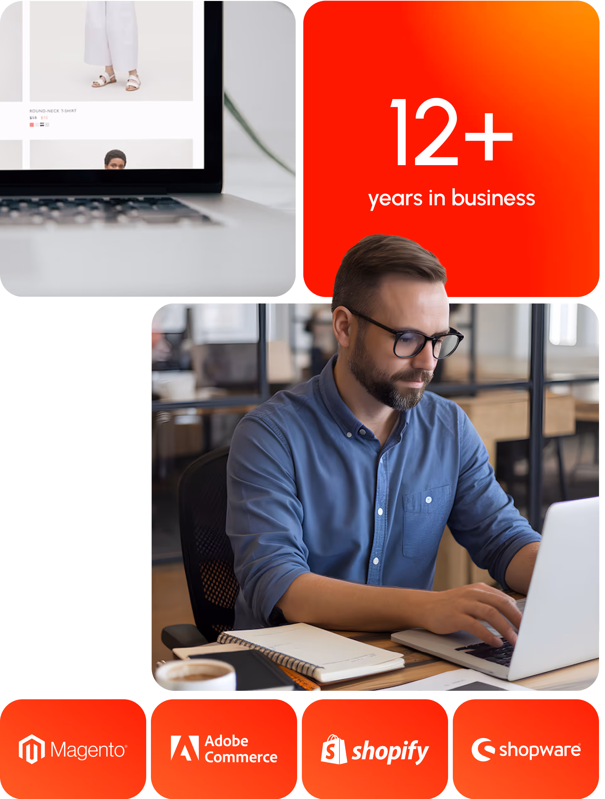
13 years in e-commerce
Organizational maturity is driven by processes.
Smart companies select a partner agency that demonstrates strong operational processes, along with the expertise to adapt them for specIfic client needs. We've enabled successful online sales operations across a range of industries and verticals, with clients leveraging our broad experience and deep knowledge base to enhance their market position and become trendsetters within their niche.
Engineering the future
We believe technology should serve people, and not the other way around.
The right technology can elevate your business to new heights. But you need an efficient and highly-effective technical partner to make it work. Our e-commerce experience runs broad and deep. From marketing automation to conversion optimization, and from business workflows to back-office system integrations, the solutions we deliver help you grow revenue and marketshare while reducing your total cost of ownership.
Let’s talk e-commerce
Every solution we deliver is shaped by your goals and the realities of your operations. Share the key details of your project and our team will provide a tailored proposal that reflects the true scale of your requirements. You’ll get clarity, not guesswork - and a pricing model that aligns with measurable business value.