Any product page aims to introduce the product within a few seconds and get the customer to add it to the cart.
Basically, it’s not rocket science to create a page that converts, but it’s where a lot of ecommerce businesses fail. In this article, we will review a Magento 2 product page and its standard elements and provide some recommendations on how it may be improved — both in terms of design and content. Let’s start with a product page that is the default for Magento 2. Built with the most effective usability uses in mind — simple and clean layout, well-structured, and clearly located product info, big imagery, and eye-catching call-to-action elements — it provides a solid starting point for presenting products. Considering that Magento offers 6 product types, there are some differences in product pages’ appearance reflecting specific characteristics of some product types (this concerns configurable, bundle and grouped products). However, those differences do not significantly impact the overall page look and feel and serve just some particular goals. Here’s an example of a Magento 2 configurable product web page:
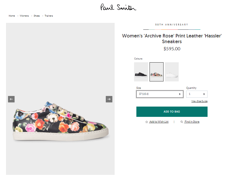
Speaking about the standard features of product pages in Magento, there is a bunch of them that should be mentioned:
- Title;
- Pricing;
- Stock availability;
- Main product image;
- Image gallery;
- Reviews;
- Short & long descriptions;
- Product options (can be set up for configurable products and as custom options for simple ones);
- Wishlist;
- Ratings;
- Comparing functionality;
- Send an email to a friend functionality;
- Social sharing icons;
- ‘Add to Cart’ button;
- Tags;
- Sections with additional info.
The Magento platform did a very nice job of introducing many useful features into the product page and still keeping it easy to read, manage, and understand. It’s an excellent foundation to start working on your own page design, but what would be your next move on the way to creating a better product page? What tools and techniques should you use to make the most of your product page? We have rounded up 15 tips that may be incredibly helpful to you.
Tips on How to Build a Better Product Page Design in Magento
#1 Keep It Simple
Pages stuffed with all sorts of information and elements annoy users. Include only essential information and features on the page. This is the case when just enough is more!
#2 Use Attractive High-Resolution Product Images
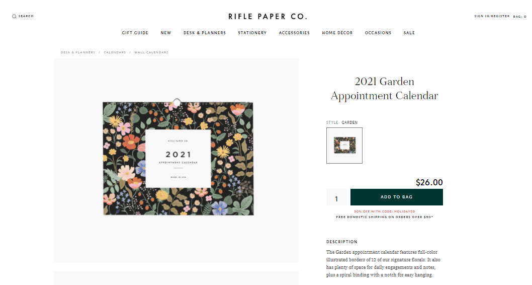
One of the primary concerns of online shoppers is the inability to touch and scrutinize products physically. This is why product images are so essential and MUST be of good quality. Also, include several pictures from multiple angles and in familiar contexts to enable the customers to envision themselves using the item. Utilizing a sizable main product pic is a good idea too since it allows users to view the smallest detail of a product without zooming in. Demonstrate all the details and features of the product, if possible, to appeal to your customer’s senses.

You can also benefit from allowing your purchasers to upload captured by them pictures to the product web page. Free visual content and social proof are guaranteed!
#3 Implement Videos to Showcase Your Items Quickly and Efficiently
Magento doesn’t offer this feature out-of-the-box. However, it is easy to implement with the help of appropriate extensions and solutions. Aheadworks did a great job developing an extension allowing your shoppers to upload their videos promoting your store items. As a part of marketing campaigns, this feature may become a great tool to earn more credibility in your customers’ eyes.
#4 Place Pricing Information Prominently
To make price noticeable, use a large font size or a color that differs from the description color. If discounts are applied, they should be even more prominent than prices. Include shipping costs into the product page. To display all available shipping methods and costs directly on the page — use product page shipping costs extensions. There is also a good solution to calculate shipping costs from CMSMart.
#5 Show Your Product Availability
Clearly If you are running low on stock, don’t wait until the checkout page breaks this news to the customer. As with prices, stock information should be noticeable. It’s also nice to have an out of stock notifications option to let your customers subscribe for email notifications about product availability and prices updates.
#6 Prepare Descriptions That Sell
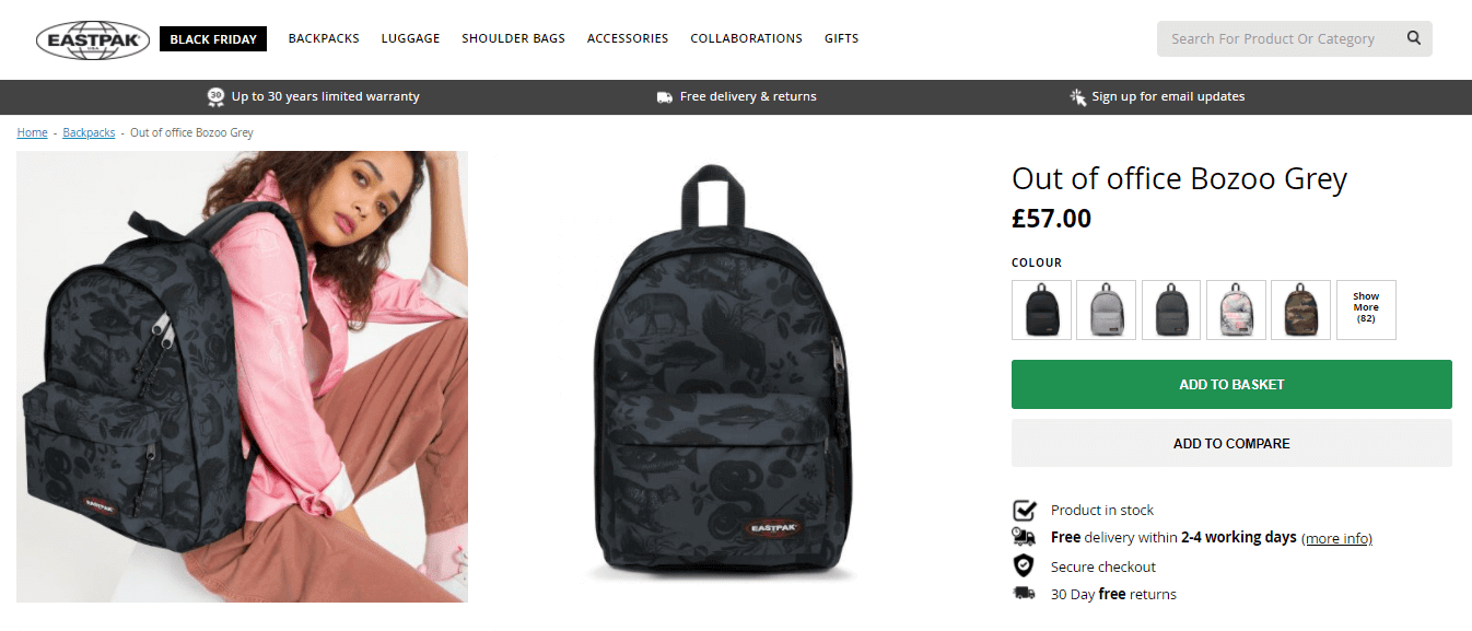
First of all, you have to determine who your shopper is and what he wants. Only after this start working on the copy. Point out product benefits and highlight why the customer should buy it. And do not forget that people love humor. A funny or ironic headline could be all you need to sell a product. Regarding don’ts: never ever use product descriptions provided by manufacturers. Even if they are extremely well-written, they can harm your rankings in search engines. Google, for example, introduced a “Farmer” algorithm that weeds out unoriginal content from search results. When the product documentation is very comprehensive, and you still need to place its content on the product web page — provide it as downloads.

#7 Showcase Each Product Variation
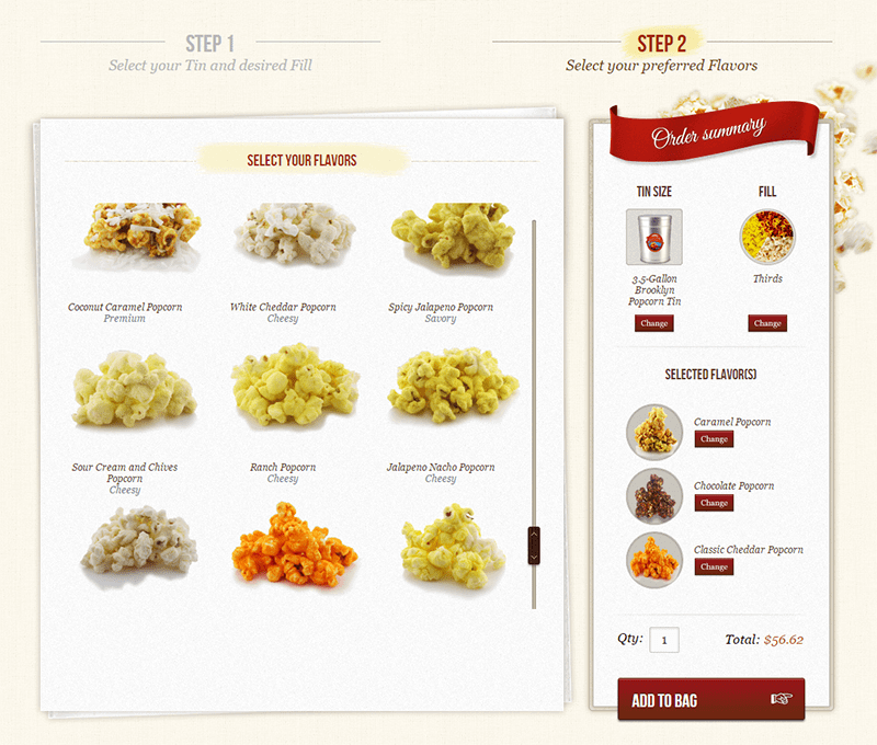
Within the Magento concept, you can incorporate this by creating configurable products or adding custom options to simple products. A more improved way to demonstrate items with multiple options is to build product configurators, making it possible for users to customize and personalize products to meet their expectations and needs.
#8 Include Product Reviews and Ratings
It is one of the simplest and most effective ways to build confidence in your products. According to the statistics provided by Econsulting, 61% of customers read reviews before making a purchase. The next massive advantage of reviews is that they are a great source of unique content — so beloved by search engines.
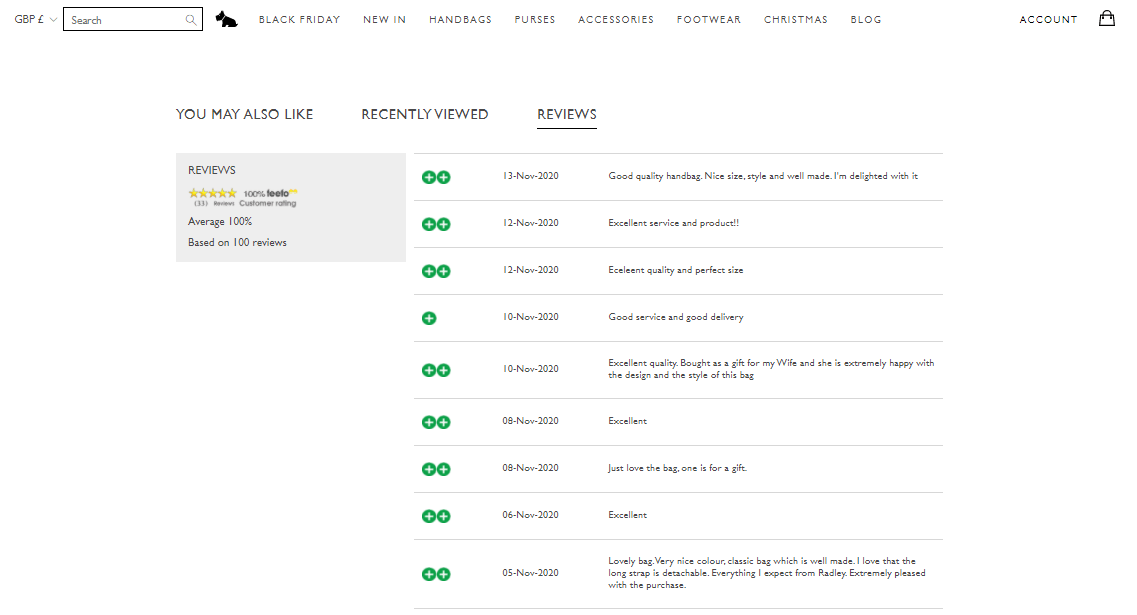
When moderating submitted reviews, do not weed out negative reviews. Shoppers want to hear both sides of the story. About 30% assume that your reviews are fake if they do not see any negative reviews. Both — reviews and ratings — are included in the basic Magento functionality. To make them even more useful, you could install a product review reminder extension to be able to invite your customers to leave a comment about the product. More to the point: you can also hire Magento developers to add rich snippet review markup to the product web pages and help those pages to be displayed more prominently in Google’s search results, increasing your click-through rate and traffic.
#9 Place Returns and Payment Information Prominently
Don’t keep your customers in the dark when it comes to payment methods, since their availability on the product page influences the buyer’s decision. A nice and simple way to convey this information is to place logos of payment providers directly on the product pages.
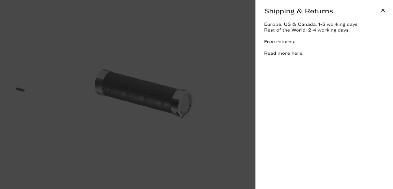
Be clear on the return policy as well. Wipe out worries and answer the question, “What happens if I don’t like the item?”.
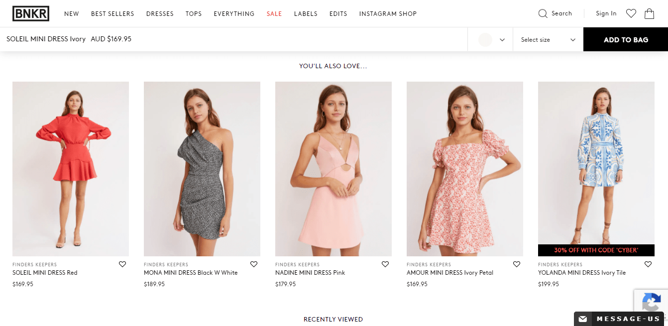
#10 Feature Related Products or Up-Sells
When people are looking at your product pages, there is a good chance they have not made a decision on which product to buy. By displaying related products or up-sells, you will let more store visitors complete their purchase without completely exiting the funnel. Lifehack: to reduce time on assigning related products and up-sells to each product, use an extension by Aheadworks to automate this process.
#11 Show Trust and Quality Badges
A small message or safety logo of a reputable company like Trusted Shops can allay customers’ fears of getting ripped off or compromising their valuable information.
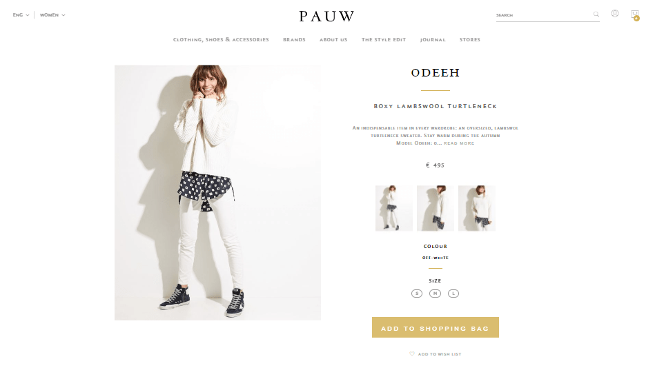
#12 Optimize Your Add to Cart Buttons
It should be easily recognizable and compel the customers to act. Since there is no universal way to style the add to cart button, you can experiment with it. But, never use the red color, since people perceive it as a warning.
#13 Reduce Product Page Load Time by Using Cashing Technique
In simple words, product page cash “saves” product page data on the server after the corresponding page has been visited once. Next time when somebody visits the page, it loads quicker. Magento offers this feature only in its paid enterprise-level version. However, you can implement it in Magento Community as well. The extension by Amasty may be pretty handy for this purpose.
#14 Answer Customer Questions
Store visitors may have questions about a product or a part of the buying process. Offering a live chat or product question option is an effective way of saving a few sales.
#15 Conduct A/B testing
A/B testing is a method of comparing two versions of the page against each other to determine which one performs better. There are a variety of tools and services out there.
Conclusion
We hope that our recommendations have given you some good ideas to incorporate into your own websites. The most important thing is to remember: what works for someone else might not work for you. So, test, test, and test! If you need professional advice or any help with building your product page, our team of Magento certified developers, designers, and ecommerce experts would be happy to jump in.


