Magento 2 Home Page: How To Create A Perfect One
In this article, we are going to slice and dice a Magento 2 Homepage. We’ll consider the main tips to create an efficient homepage and show the best practices Magento 2 stores have implemented using core functionality and customization.
According to a study by the Taylor & Francis Group, it takes less than a second for users to get the first impression of a site – usually 50 ms is enough. In most cases, a homepage is the essential page which visitors land on. That’s why a homepage has to be appealing and informative to make users go further with the path to purchase.
In this article, we are going to slice and dice a Magento 2 Homepage. We’ll consider the main tips to create an efficient homepage and we’ll show the best practices Magento 2 stores have implemented using core functionality and customization.
Magento 2 Homepage overview
Magento 2 Homepage encompasses a great deal of goodies targeted at moving your web store visitors along toward purchasing process. It has been designed with regard to the the latest tendencies and customer claims, so it is a good starting point for designing your customer experiences on your site.
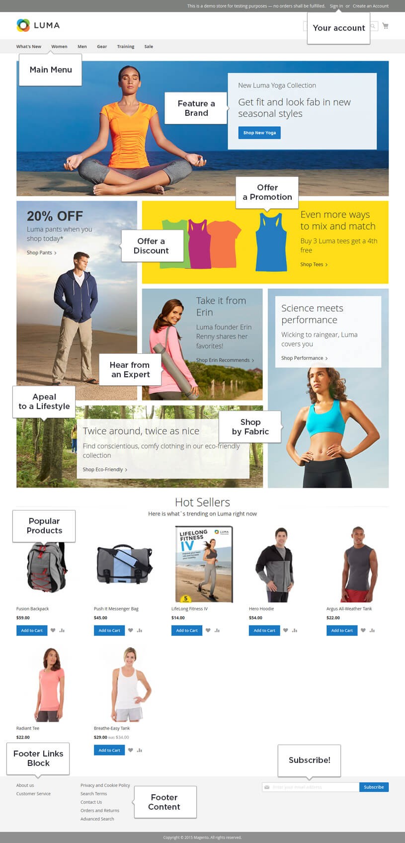
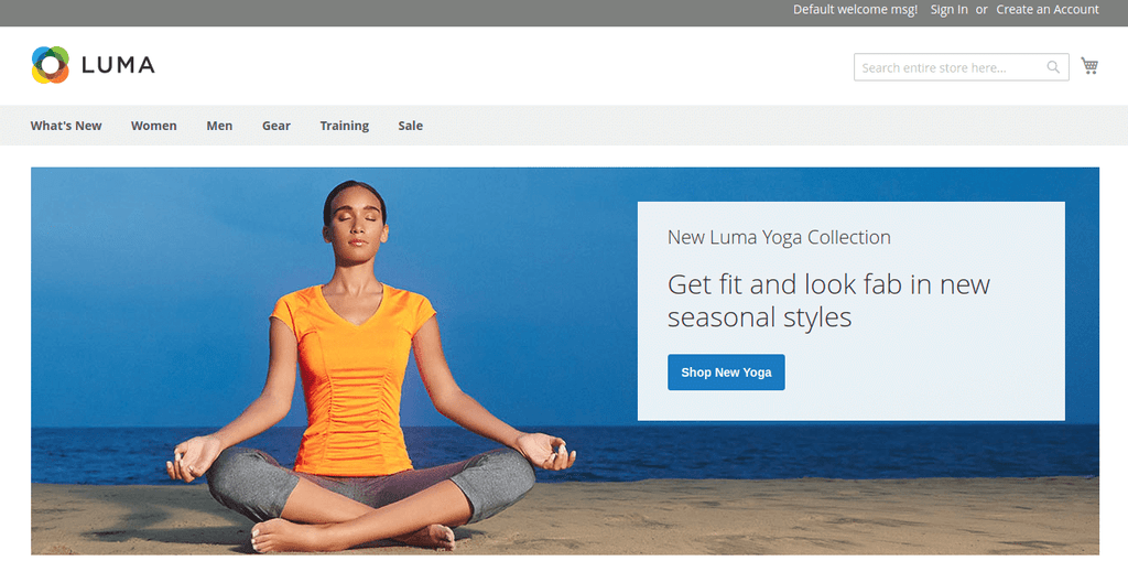
Let’s have a look at Luma Magento 2 default homepage and the components available in the front view:
Main Menu and Search are the elements any web store can’t go without and in Magento 2 they are prominently placed. When it comes to menu configuration, you can add as many categories to your site as you need. However, kindly keep in mind that increasing the number of choices will increase the time your customers need to make decisions (Hick–Hyman Law), so make your menu informative, compact, and easy to navigate. In case you have a large number of different products you may implement a mega-menu. This solution avails you to organize all the categories well so that users will easily identify them.
Monoqi Club online store
In the header you’ll also find links to account sign in or creation leading to the area where personal data of a client, their order history, wish list, and so on are stored.
The main part of the homepage contains CMS blocks with various information: highlights, promotions, sales, brands etc. We’ll review several of them to give you an idea what this space can be used for.
Featuring a brand on your homepage could be a good way to promote a new brand which has recently appeared in your stock or the one that suffers from slow sales. The same approach could be applied to products so that your customers will see once opening the site.
Another portion of Magento 2 homepage features your customers could benefit from are promotions, discounts and sales. Special offerings always attract the attention of visitors and will definitely play into your hands. You can make it appear on special days, within the specific time range and for different categories of customers – Magento offer here a wide range of options.
The Hear from an expert callout could increase sales via influencers’ or celebrities’ recommendations that for some industries, turn out really great results. However, be careful choosing a person which will appear on your homepage. It must be an opinion leader of your target audience otherwise you may not see a result.
There is a block where you can appeal to a lifestyle of your customers. Offer groups of goods for vegetarians, travellers, athletes and others. The target audience will react to such a message.
Showing popular products on your homepage is also a good way to make your customers aware of what is trendy and what products are performing best these days.
Footer, where it is recommended to repeat the main menu with all categories, is the last chance to convince a user to stay on your online store and buy more.
Subscription to newsletters is also placed in the footer section by default. It helps to engage people and to keep them aware about arrivals, sales promotions and seasonal discounts, and remind them of your store existence.
Ideas for Magento 2 Homepage Customizations
Magento 2 is a flexible platform and the look of the homepage can be modified to the extent your business needs. The most frequent customization queries for the homepage are product slider, extra subscription block, and Instagram block.
Product Slider is used to make an interactive carousel for a specific category of products. Just to ease the lives of your customers, for instance, it can be implemented for bestsellers. At some point, it became so popular that now 50% of ecommerce sites contain it, and it’s become a staple.
It is not a built-in feature in Magento 2, so some extra development magic is needed.
A good example of such a slider is made on Adore Beauty online store.
Adore Beauty online store
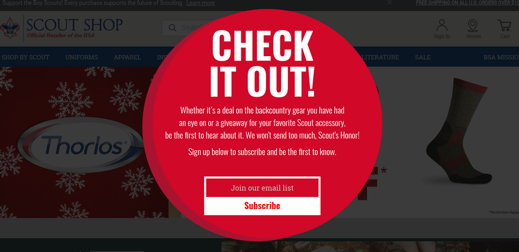
If you are going to launch email marketing campaigns it is recommended to integrate a mail web service such as Mailchimp and place a subscription block more prominently on your homepage. Why Mailchimp instead of the default newsletter functionality? Because it provides you with a richer experience and enables such features as automated message sending, personalizing suggestions based on a purchase history, creating pop-ups with a call to subscribe, and etc.
According to Mailchimp, pop-up forms increase a number of subscriptions up to 50%. Is it the reason why Scout Shop has done it on its website, isn’t it? Maybe, for your store it could be also a good idea.
Scout Shop online store
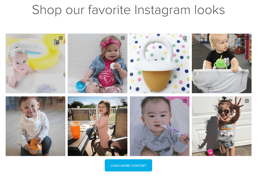
In accordance with statistics, 5% of users on Instagram take action after seeing an inspiring post. It means they visit a site, shop or share the message with friends. This fact makes the social network attractive for online merchants, and many of them want to embed an Instagram feed on their websites. If you also use Instagram for marketing goals, you might wonder how to show your posts on a Magento 2 custom homepage of an online store.
The solution is quite simple. You can find a ready-made widget which would be the most appropriate for your case and install it, most of them being free widgets. For example, consider the option from Solwin Infotech: the extension allows creating a gallery on a homepage, choosing photos to display, and restricting a number of presented posts.
Munchkin’s implemented an Instagram widget on their website so that when a user clicks on a photo, it automatically enlarges. A customer can also page images without leaving the store.
Munchkin online store
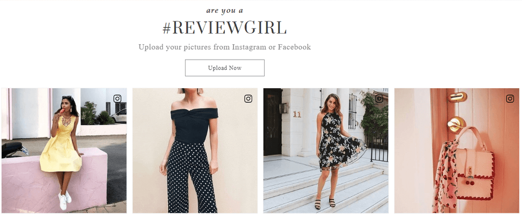
One more way to engage visitors with your site right away on the homepage is to enable them to upload images from their Instagram or Facebook pages, or from their desktops like Review did for their customers.
Review online store
Tips to make a perfect homepage
Whatever option you choose – to use a default theme and change it slightly or customize it heavily – it is of great importance to place content and features there that are relevant to your target audience.
And, it is amazing if you have a pre-existing site that needs design refresh and had a chance to analyze what works best for your customers, and use that knowledge when deciding on how to design your Magento 2 store. And if not?
For this case, we’ve gathered some general statistics for you, so you could make a more informed decision when planning on the storefront of your site.
|
According to the study, carried out by Huff Industrial Marketing, KoMarketing, & BuyerZone, where they asked customers for the information they expect to see once on the Home page, 86% of respondents indicated Products and Services provided by the company, 64% expected to see Contact Information and 52% – About/Company Information. This data was obtained for the B2B segment, however, in terms of basic elements of ecommerce website, we could consider them to be relevant for B2C as well. |
All content on a homepage is usually split into two parts:
1) Above-The-Fold – content which users see once they land on a page without scrolling it.
2) Below-The-Fold – content which appears on a page when users scroll it down.
100% of visitors see Above-The-Fold content, but while scrolling down, their amount falls significantly. So it is crucial to highlight the most important content and place it Above-The-Fold.
What should be Above-The-Fold?
Above-the-fold part in Luma
When users come across your website for the first time the main goal is to spark their interest and make them continue exploring the store. In order to accomplish it, an Above-the-Fold screen has to express what the company is and what the company does. This can be fulfilled with the following items:
- Headline
- Sub-Headline
- Call to action
- Illustration
- Logo
- Main menu
A headline has to answer a question “What problem does the company solve?” If it’s phrased correctly, it will engage people who have such a problem and they will stay on site. Note, that the message should be short and clear. One or two sentences, not more.
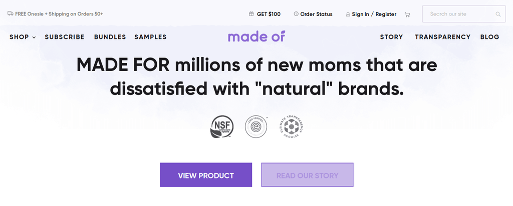
There is a good example of a headline on the Made Of online store homepage.
Made Of online store
The message perfectly hits the target audience. New moms who take care of their children’s health definitely pay attention to it.
A headline doesn’t have to describe what the company does in general, but it can feature some certain brand or new arrivals if you want to sell them as soon as possible.
Sub-headline can be implemented when it is needed to further describe what company does. It also has to be laconic if you don’t want your visitors to get bored.
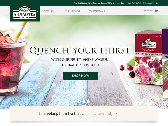
Check the instance from Ahmad Tea website.
Ahmad Tea online store
Sub-headline here explains what type of goods the company sells and encourage people to fight thirst with cold tea.
Call to action buttons actually should appear below the fold as well as above. It is needed to show customers a path you want them to follow it’s like a direction indicator on a road. When visitors see your site for the first time they don’t know where to click next, so show them a way.
Examples of call to action buttons are “Shop”, “Shop now”, “Shop men”, “Shop women”, “View product”, “Buy now”, “Order in 1 click”, “Get a discount”, etc.
Yeah, and do not skimp on graphics. Vivid, high-quality images appeal to people and make an online store beautiful. But too many and too heavy graphics can slow down the page. Just try to find the right balance.
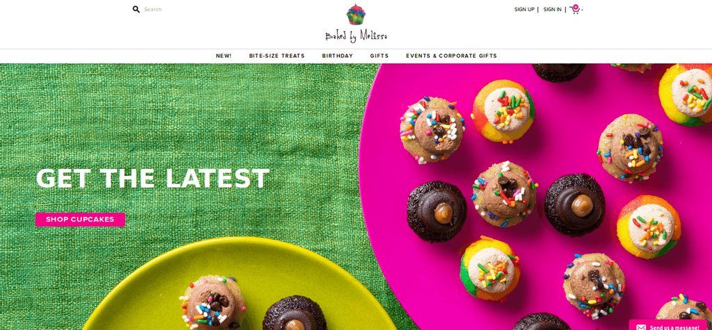
A nice example of good imagery is on Baked by Melissa ‘s online store. The bakery specializes in cupcakes and this is clearly expressed on the home image. In this instance, the illustration answers a question “What do I get here?” instead of a headline. The headline here serves as an additional call to action.
Baked by Melissa online store
You may use video or animated images to attract more attention. Dynamic content is trendy now because it makes sites look more interactive.
What should be Below-The-Fold?
Below-The-Fold parts encourage people interested in your offerings to make a final decision to purchase. Those who don’t need your kind of products probably leave the online store after seeing Above-the-fold information. But, users who continue scrolling down are highly-likely to become your customers. As you see, Below-The-Fold content is also important since it helps to finish the job Above-The-Fold started.
Here is a top-down list of items that should be represented on a home page Below-The-Fold :
- Brands, Categories of Products
- New arrivals, discounts, popular products
- Blog
- Footer links
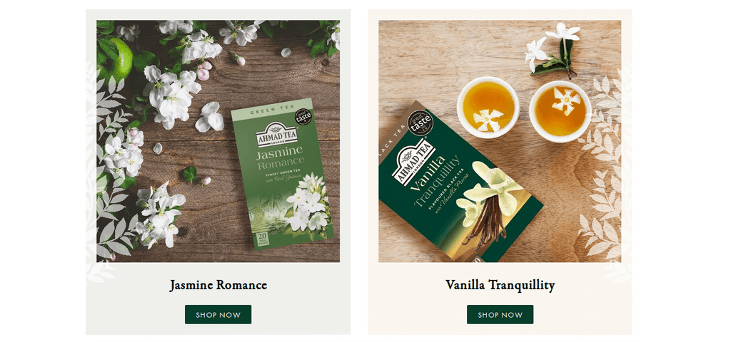
Display brands or categories of products you want users to click. If you have a wide range of goods, show diversity by choosing different groups of products. According to a study of Baymard Institute, when coming across a new online store, 25% of visitors scroll down a homepage and then go up again trying to quickly define what is sold there. This amount is even bigger for mobile users – 70% of them rapidly view homepages of unfamiliar online stores.
Ahmad Tea online store
Place two or three blocks with brands/categories on a homepage. Rest types of products you will be able to show via discounts, promotions, etc. Don’t forget about high-quality images to illustrate different products. Pictures have significant impact on a clients to buy.
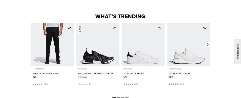
Then you can show blocks with arrivals, discounts, and popular products though this part is totally up to you. Decide what products you want to offer and how to propose them.
Adidas online store
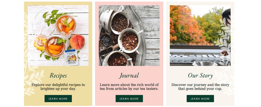
If you have a blog on an online store, show it near a footer. The best way to implement a blog is by representing several relevant articles, usually the most popular or latest.
Ahmad Tea online store
As we’ve mentioned, a footer is for such links as About us, Contacts, Privacy and Cookie Policy, Subscription, etc. Full catalog is frequently added to a footer as well in order to unfold the sitemap in front of a visitor. This is an opportunity to show the whole range of products, which makes getting to know a website easier.
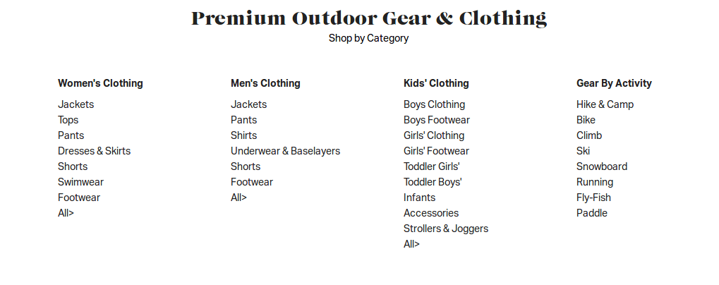
But often the whole sitemap takes too much space. In this case, either a partial category tree is added to a footer, or merchants look for other ways to solve the problem. For instance, Backcountry just laid out their categories list over a footer separately.
Backcountry online store
An efficient homepage has to be clear, easy to navigate, and represent at least 40% different types of products from the catalog. Knowing all these tips you’ll manage to create a homepage which brings in money since it helps users to find what they need.
Hunting for Magento development support?
We’ll be in touch soon if you leave your contact information
