404 or not Found page is one of the details you have to keep in mind when creating designs for your online store. So what is a 404 page?
The devil is in the details. And, 404 or not Found page is one of the details you have to keep in mind when creating designs for your online store. The primary purpose of the 404 page is to inform your visitors that the page they are looking for does not exist, at least not under that specified URL.
Imagine the scenario: from time to time, a repeat customer buys a specific product from your online store, a perfume, for example. They save the link to that perfume or remember the link by heart and type it into the browser to avoid navigating through the site. Suddenly, you stop selling that product and even remove the page, and the customer lands on the 404 page. Without a doubt, this is a frustrating experience. However, there isn’t much you can do to avoid this situation, so let’s find an intelligent way to make that experience a bit more pleasant by suggesting some solutions.
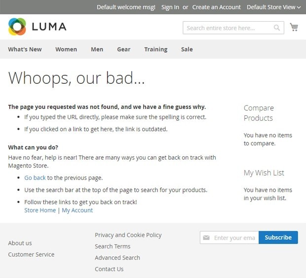
Most of the shopping carts have default 404 pages. For instance, Magento designers took care of comforting customers who land on this page by suggesting several options: to go back to the previous page, to use the search on top of the page, or to go to the home page or the customer account section.
For example, even Cola decided to make a regular default page.
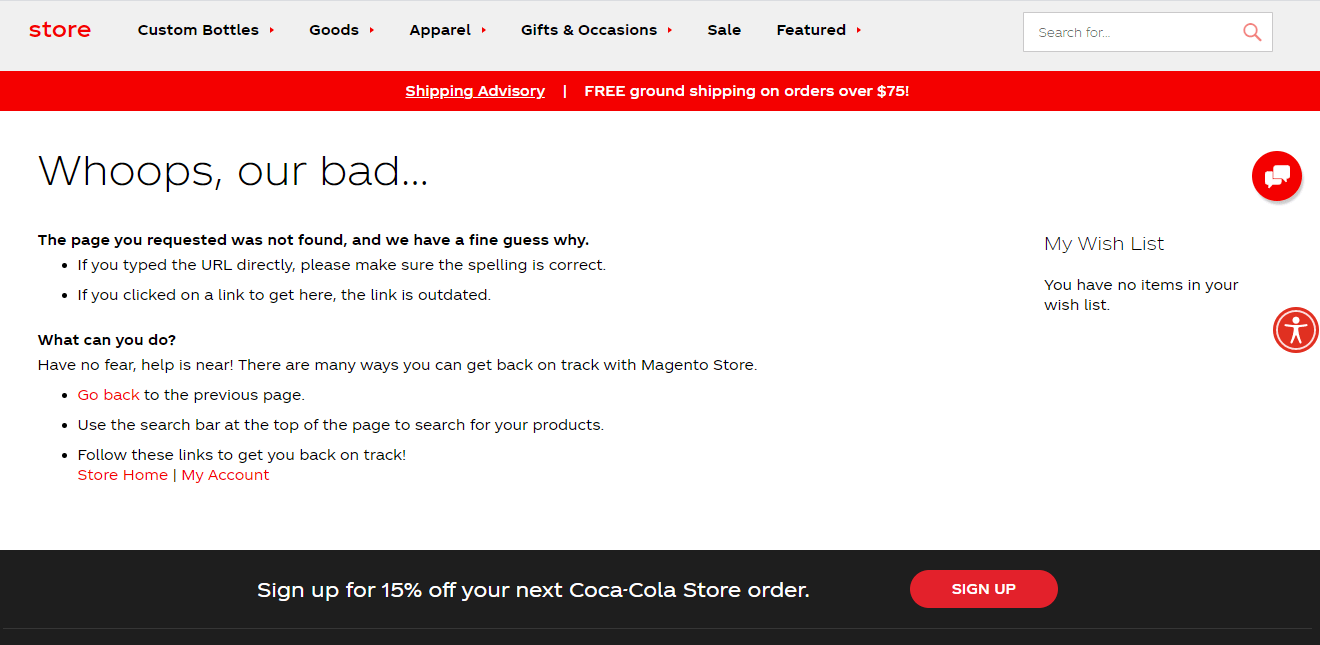
Though the default page is fine, and you can use it as is, there is no “soul” in it. To be more specific, there’s no branded message in it, it doesn’t look like it belongs to the site in terms of design, and it doesn’t navigate customers to the sections that are important to your business, etc. With this in mind, no wonder most brands develop their own custom 404 page.
So, if you want to improve on the standard 404 page that your shopping cart offers, or if you build a custom site that has no default template at all, consider the following.
Suggestions for Creating an Effective 404 Page
We’ve gathered a couple of 404 error page examples that captured our attention and may be helpful for you.
Apply the similar look
The page should look similar to your website. If your website color scheme is white-orange-black, what should create the 404 in the same colors and hues. If you use squares as design elements throughout all pages, the 404 should also be decorated with squares and not with circles.
Apologize
Most likely, a visitor accidentally came to this page, and they are far from happy when they understand what that means. At the very least, you can apologize and reassure your visitors.
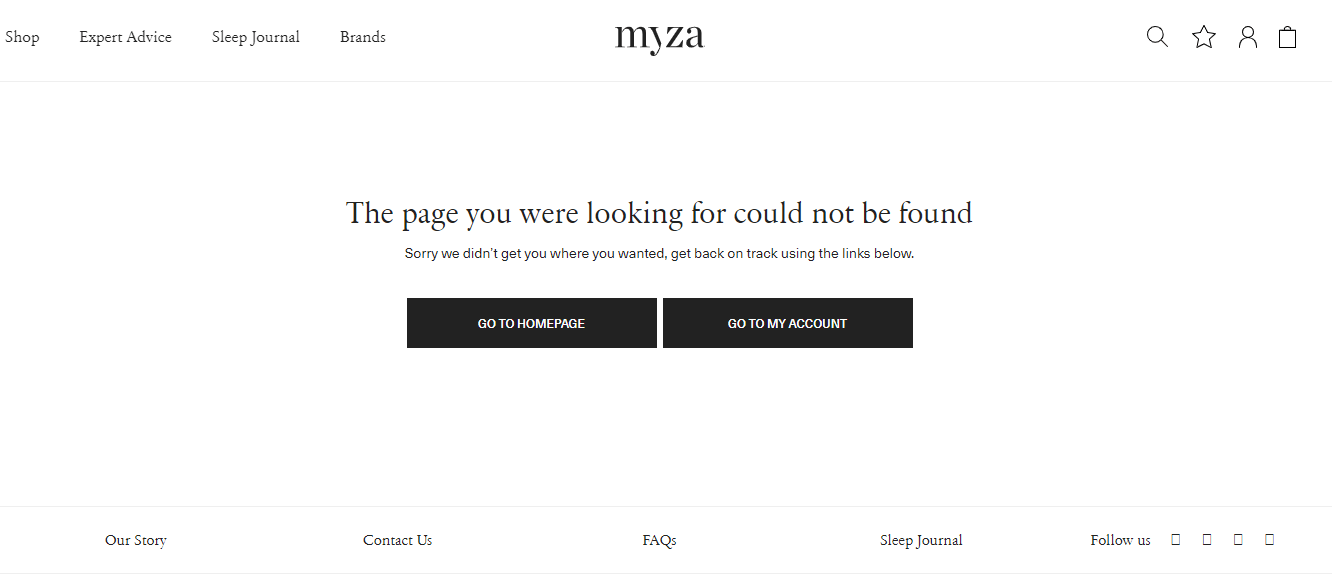
Suggest trying to search for something else or continue shopping, as a UK lifestyle marketplace Myza decided to make a regular default page. did. The calmness in one sentence:
Include the Option to Get Back to Categories
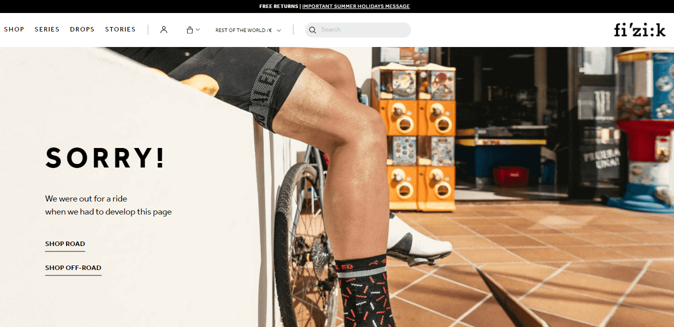
Prominently placed shop categories may save you a deal when customers fall on the 404 pages. It gives them the ability to find the required page since the page they were looking for might still exist but have a different URL or result from a user-induced typo. It also may help customers to find some other alternatives among your products and content.
Fizik, a cyclist’s equipment store, allows users to continue shopping by simply switching to the most common categories with a couple of clicks.
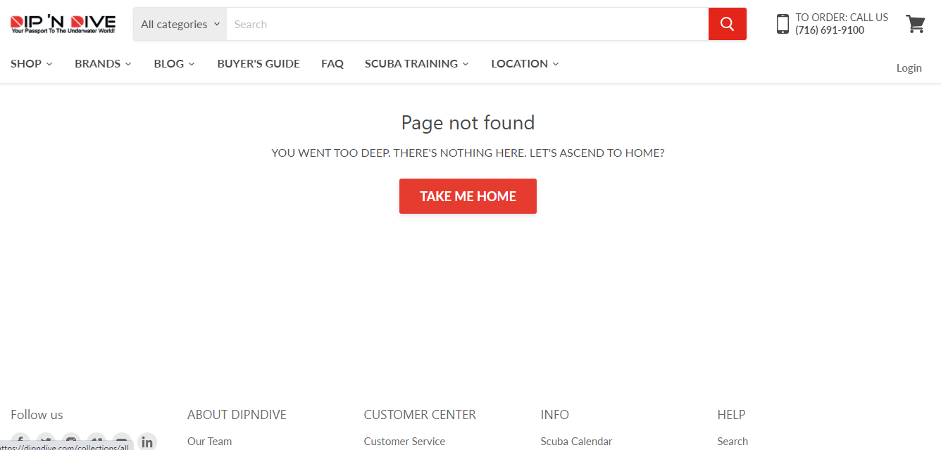
Spice the Page with Some Humor
Using humor is an excellent trick to appease your customers. Practice shows that the 404 error page that amuses the customer gives the site a chance to rehabilitate. Add a funny phrase to take the heat out of the situation and ensure the customer doesn’t go elsewhere. If the brand voice allows you, ride the tide!
A great example of such an idea implementation is our client Dipndive, a US scuba diving, and snorkeling gear store.
Suggest something else
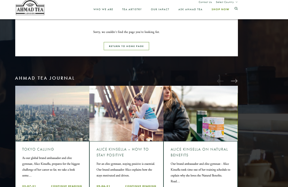
If you don’t want to stay along the beaten track, you can always go the extra mile and include a blog section on a 404 page, just like our client Ahmad did, the global brand and tea manufacturer.
Follow the principle “less is more”
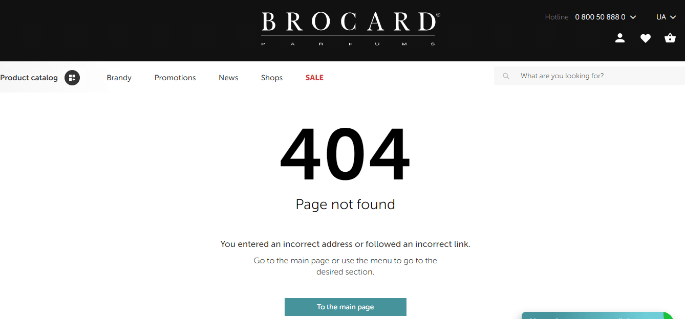
Germans have a great expression, “Qual der Wahl,” that means “agony of choice.” By offering too many options, you may overwhelm your customers. There will be no other option for them but to leave your site and find a more streamlined store to do their shopping. The page should be as clear and straightforward as possible.
So our client Brocard decided to make such a page as user-friendly as possible.
In conclusion, if you are unsure what will work best for your 404 pages, try the A/B test. Create two-page variations and find out which options are more effective in customer engagement and sales. If some professional advice is needed, drop us a line. Our Magento designers can help with creating outstanding 404-page experiences.


