Benefit from standard Magento navigation — breadcrumbs, sitemap, Magento layered navigation, and other elements for a seamless experience.
Designers try to bring as much offline experience into the online world whenever possible to ensure ease of use. However, when speaking of navigation, the experience in a brick-and-mortar store and online store are quite different. Have you ever noticed how they place the bread section you aim for somewhere at the end of the shop to make you spend more time and buy some other (not necessarily required stuff) on the way? It’s not the case with online stores: once a customer feels disoriented — they close the site and go elsewhere.
Magento Navigation Elements
Built-in navigation includes the logo linked to the homepage, clickable user account and cart elements, top navigation bar with categories, breadcrumbs, layered navigation, footer navigation, and sitemap. We have already posted an article about navigation issues in online stores. This time we will cover the navigation on Magento websites: what’s in the box and how standard Magento functionality may be improved — everything generously spiced with examples from successful online stores.

Navigation on the category page
#1 Logo
With the logo, everything is pretty clear. It’s the north star of any Magento website, the most prominent element that leads you to the home page no matter how deep into a website you’ve gone.
#2 My Account & My Cart
My Account and My Cart elements are found at the top right of the page. Site visitors can easily access the account links and the shopping cart pages anytime they need it.
#3 Menu
The main menu in Magento (the first top horizontal row of links) usually contains categories, subcategories, and sub-subcategories — as many as you wish. They are easily created and managed in the backend of the site.
Mega-Menu
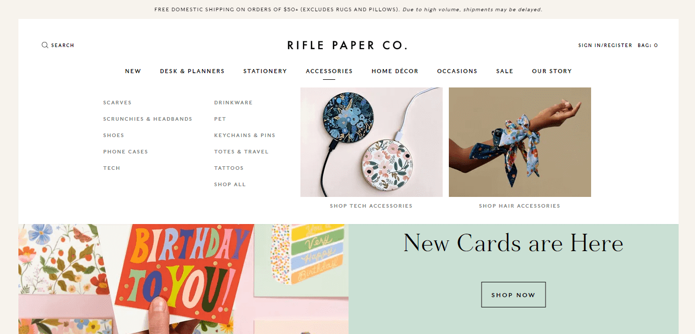
If the category tree gets too big, there are two ways to go: simplify the structure or implement the mega-menu. We will never get tired of praising mega-menu because it’s the best way to show your stuff in a very nice and compact way. In addition, it allows you to promote your products and include images to attract attention.
Look at the way mega-menu is done at Rifle Paper Co.: neat, clean, and precise. In addition to subcategories, they introduce catchy images of categories to help the customer get the idea and I’m ediately click on:
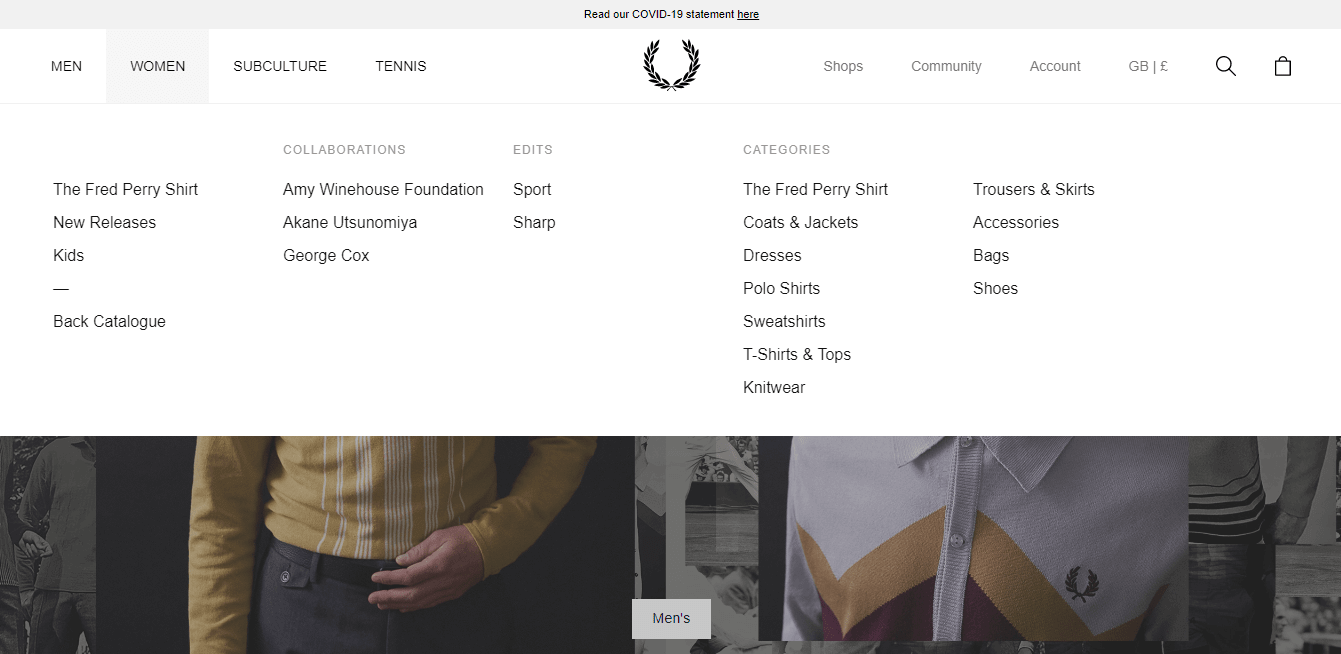
Fred Perry has an extremely neat design. They show the main departments of their store in the main navigation bar, which reveals all the subcategories on-click:
If you want to incorporate a mega-menu into your website (which you absolutely should do!) — an extension like Mega Menu by Rootways can help.
Vertical Menu Solution
The main navigation bar in a standard Magento store is placed at the top. But if you look at the sites of such leading ecommerce development companies as Amazon and Alibaba, you will see that they have the main vertical navigation. Yeah, it’s a trend. No doubt. But it’s also a very convenient way to display product categories when you have a very extensive product catalog or need to feature links to other important pages at the top of the site.
Hamburger Menu
What is also worth mentioning when it comes to main menu design — so-called hamburger menu hiding navigation options off the screen. It has been widely adopted on many websites. However, being a vital solution for mobile sites, it still attracts criticism when used on desktop devices. Though users become even more familiar with this navigation element, it is not considered to be common practice for ecommerce sites.
Such big brands like Paul Smith with a wide target audience and don’t really need to follow any best practices for usability, do as they please: huge photos of models on the first screen, hamburger menu on the left displaying the main departments. But, if you are not a well-known brand, think twice before implementing hamburger navigation on your site.

#4 Breadcrumbs
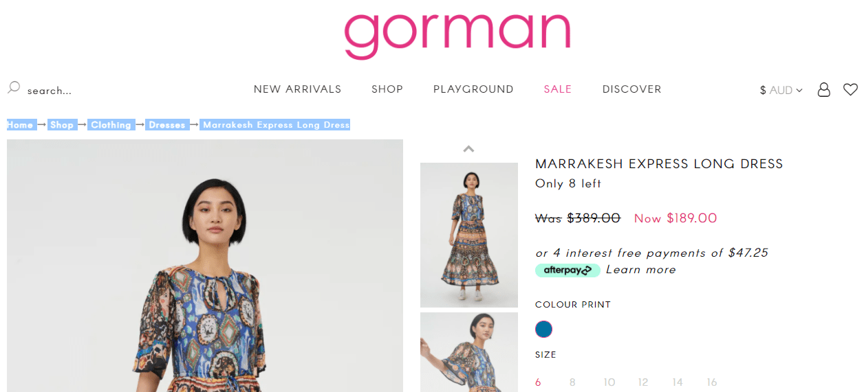
Such a tiny but significant feature as breadcrumbs shows your customers the exact place of your site they are in. It’s a standard feature for Magento, and in addition to usability, it’s also good for SEO. However, there is always room for perfection: use the Advanced Breadcrumbs extension to allow store visitors to see the full path in the breadcrumbs panel even if they come to the product pages by a direct link.
Have a look at how Gorman shows the path on each product page to make it possible for users to come back to any step they want.
#5 Layered Navigation
It’s another built-in Magento option you should make the best use of. In other words — it’s a filtering feature that is placed on the category page. You can’t even imagine how it can reduce the pain of finding the right product, especially when you have hundreds of products in your categories. In most cases, it doesn’t require any fine-tuning, so there is no excuse for not using it. Let’s look at how some businesses have implemented this feature on their sites.
Trespass sells hundreds of products with various parameters, and they do the right thing showing just the most used/most popular options in the layered navigation. Customers do not need to scan the extended lists, and they always could view all options by clicking a “Show more” link:
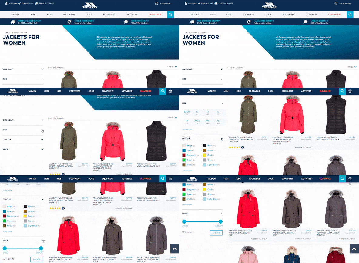
By default, Magento reloads the webpage every time you select an option in the filters, but there’s a wealth of extensions for improved layered navigation that load the items with Ajax technology.
Horizontal layered navigation at The Conran Shop crowns our layered navigation review. It’s not a conventional place for filters, but it’s usually right in front of your eyes:
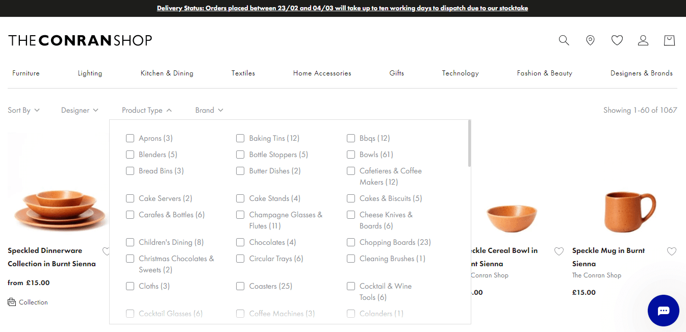
The extension developed by Mageplaza allows you to display layered navigation horizontally. Utilize and enjoy!
If you want to create an outstanding customer experience for store visitors, learn from Astley Clarke! In addition to layered navigation on the category page, they’ve placed a gift finder on the homepage. The only thing that we find inconvenient is that the finder doesn’t display what options you selected, it just highlights the parameter in a different color, suggesting that you’ve already made your selection.
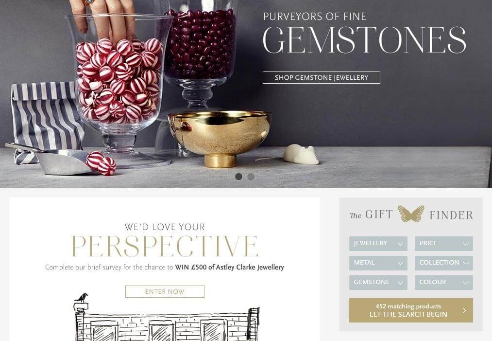
One more tip on how standard Magento layered navigation may be improved: make the filter URLs more SEO-friendly with the Improved layered navigation extension by Amasty.
#6 Footer
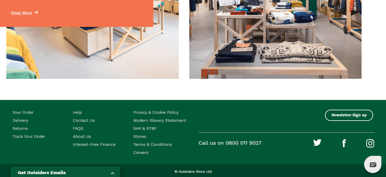
The online store footer is another place where users are looking for something they didn’t find in the primary navigation. Make use of footer space and place there less essential but still important things like terms and conditions, policies that your customers might want to check as the Outsiders brand elegantly and informatively does it.
#7 Sitemap
It’s probably not such an important element for online store navigation, but it can be useful for the shoppers who happened to get lost on the website. What’s even more important about the sitemap — it positively influences website visibility in search engines. It’s also a built-in feature in Magento, so no programming is required.
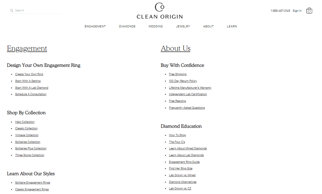
Clean Origin has a link on their sitemap in the website’s footer, which systematizes and clearly demonstrates all the necessary information.
Tips on Enhancing Navigation in Magento Stores
✔ The obvious one: plan thoroughly your online store navigation structure.
✔ Ensure that all navigation elements are easily identifiable and consistent.
✔ Try to determine what kind of users will come to your site. Put yourself in their shoes and build “for” them.
✔ Try to minimize the number of clicks.
✔ Introduce user-friendly categories.
✔ Constantly track website traffic and improve store navigation in accordance with the results.
There is no universal way to design navigation. Magento offers extensive navigation functionality out of the box, but it can be improved further with multiple extensions and custom solutions. To create clear and comprehensible navigation, you probably would need some help from web designers. Drop us a line, and we will help you create a usable web-interface keeping your visitors engaged.


