We have investigated the most common features of wine shops that make the shopping experience much more superior and are going to share them with you.
Building an online wine shop on Magento is no less exciting than developing features for a fashion store — you get to choose from so many nice things. Although beverages are not among the top 5 selling items online, there are quite many online stores to buy ordinary or exquisite liquor from.
Feature #1 Navigation
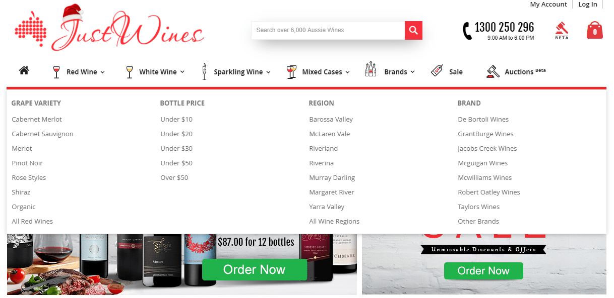
The Forrester research revealed that 43 percent of users go immediately to the search boxes, and 2-3x times are more likely to convert. First thing first — navigation, so if you still hesitate whether or not to use a mega-menu on your website — go for it. It allows showing a lot of things to your shoppers at once. It will be great if your mega-menu features various types of wine (red, white, sweet, semi-sweet, dry, etc.), regions, types of grapes, body, price, and vintage.
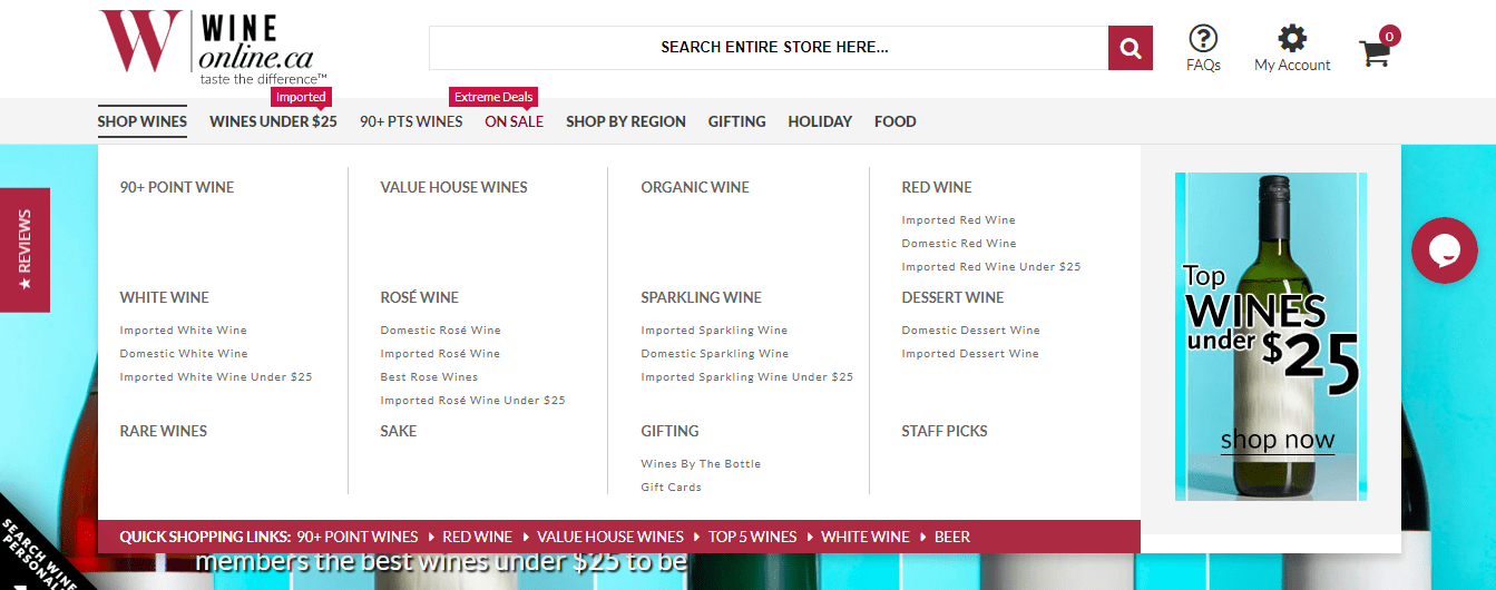
WineOnline, as an example, involves quick links as well in their mega-menu to simplify the on-site search for users.
Feature #2 Filters & Layered Navigation
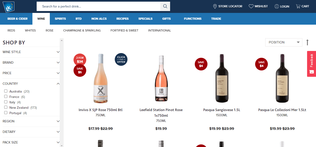
The same parameters are usually included in the layered navigation on category pages. They can be complemented with a price slider and other attributes that are not possible to fit in the mega-menu. Keep in mind that 39% of shoppers are impacted by a relevant search.
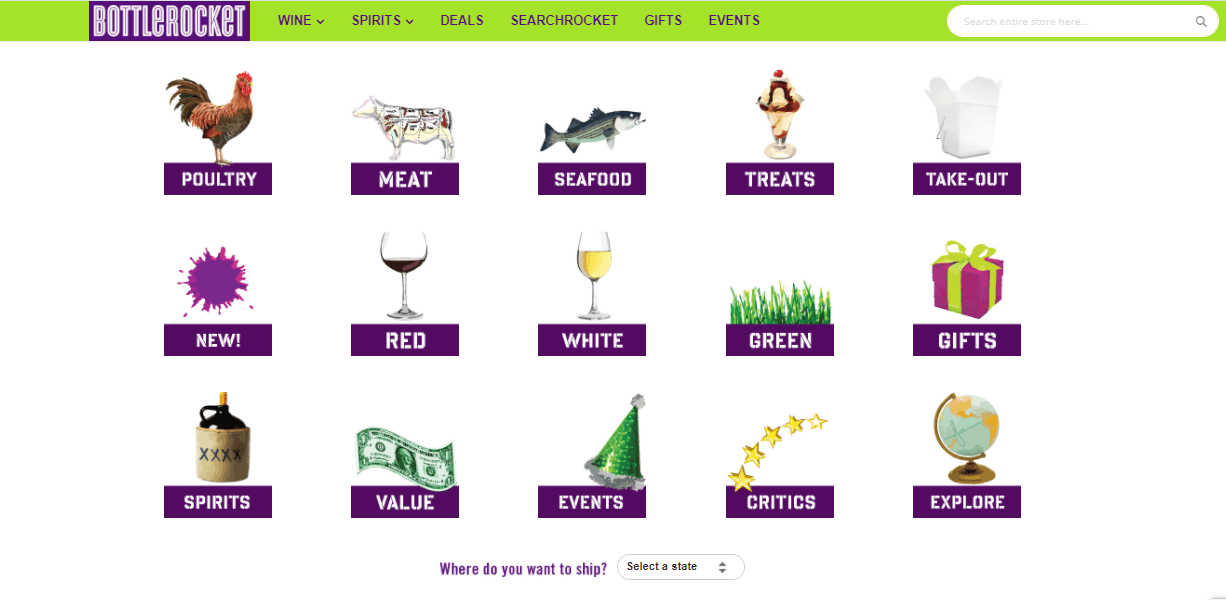
Here’s another excellent way to present filters — demonstrating them in images. The Bottlerocket brand has different attributes for wines — type, matching food, availability for take-out, etc. If buyers want something specific, they select it, and the system will filter out the wines with this attribute.
Feature #3 Food & Wine Matching
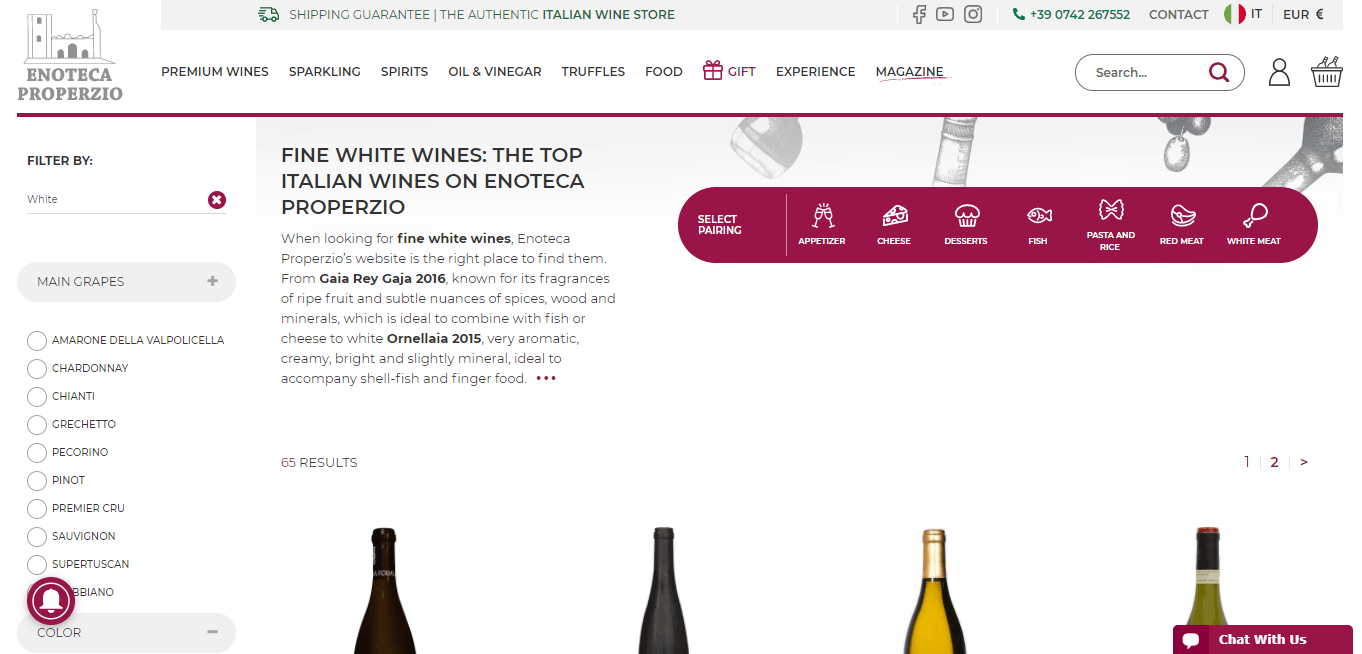
Enoteca Properzio shows, in addition to standard filters in the sidebar, a food-matching block above the product list. Besides text, there are icons for a better perception of the information, and it helps buyers make decisions and navigate the store much quicker, plus give some expert advice in case you don’t really know what wine to serve with cheese.
A very nice feature is implemented at the Winemart website — food and wine matching section on each product page. By the way, the use of imagery does a good job:
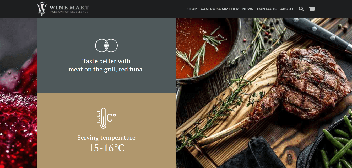
This approach really works great — the pictures are so appealing that they make you want to click them! And in addition to food matching Winemart also offer a serving temperature 🙂 The food and wine matching feature will require some custom coding if you want to build your wine store on the Magento platform. Of course, you can go with a quick-and-dirty implementation and work it all around CMS pages with images linking to specific categories; however, we can still suggest much more elegant and scalable Magento development solutions.
High-Converting Product Page
And by great, we really mean great: use big images of the bottles! It’s one of the latest trends on the web — huge imagery. And just like with food and wine matching graphic, it does the trick — people are attracted by something bright and brilliant.
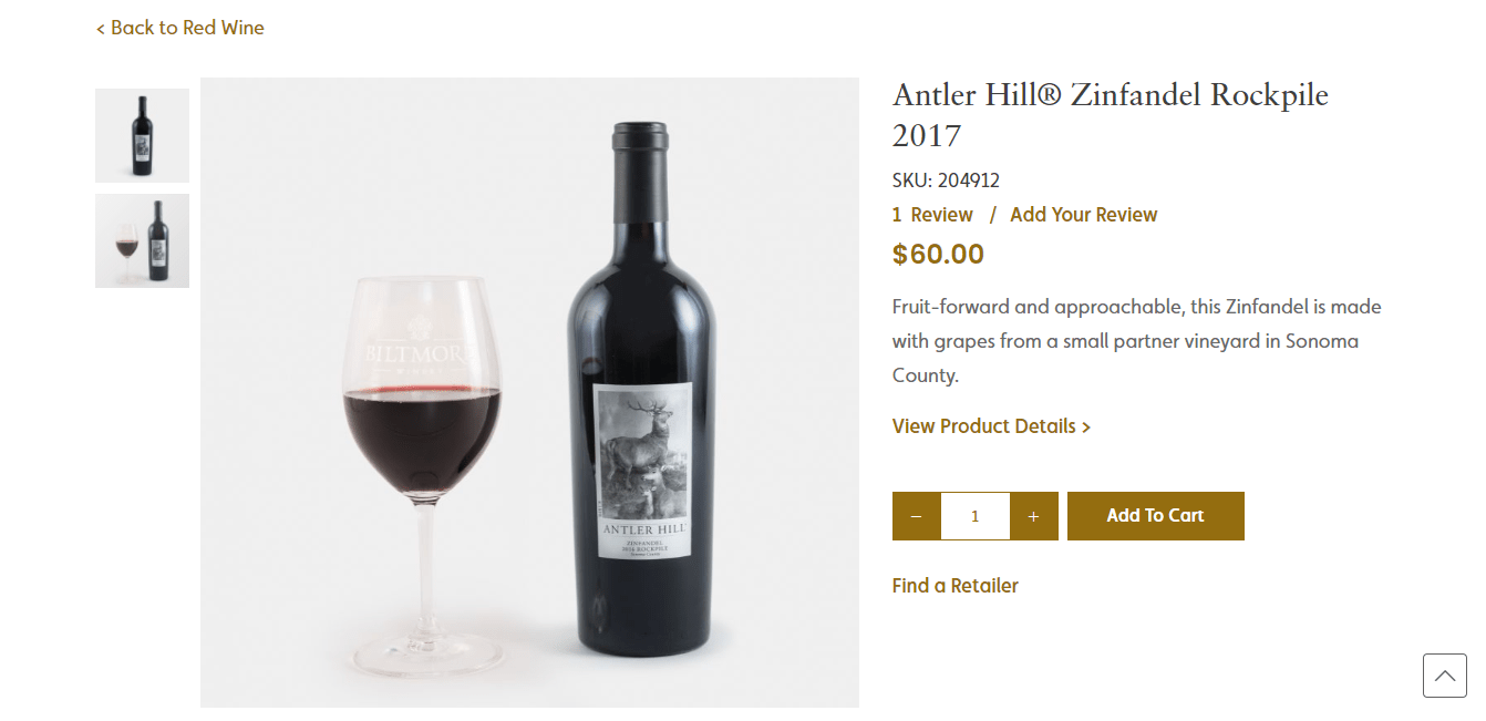
Pay attention to content when creating a product page, as comprehensive information about wines is another must-have to consider. Keep in mind that you need to build memorable product texts that describe the flavor in mouth-watering terms.
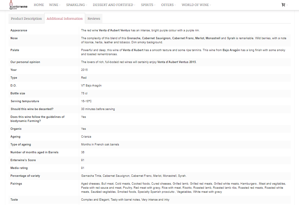
Nicks Wine Merchants also includes a score for each product according to their wide spider evaluation system, which not only helps customers in wine selection but also strengthens the merchant’s brand positioning as an expert.

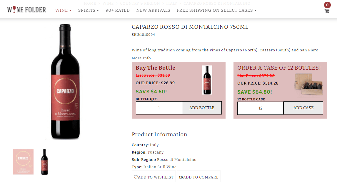
Usually, wine is sold in cases of 6 or 12, so it would make sense to use the tier pricing feature and show how much each batch will cost.
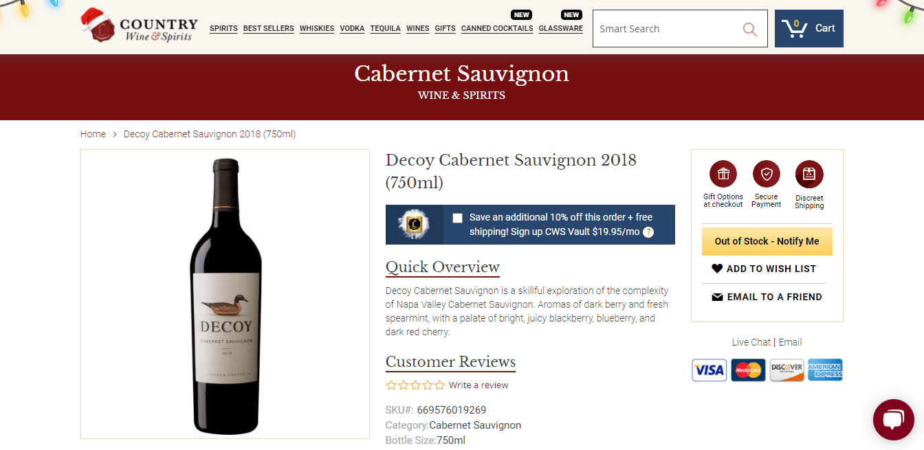
If your product is out of stock, it’s better to make an option to notify customers available. They could submit their email to keep abreast of the updates for a particular product.
Feature #5 Product Labels
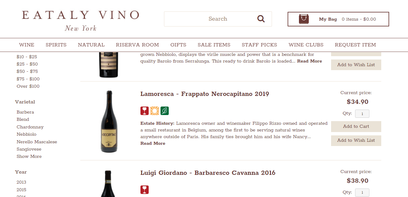
Instead of showing a lot of textual information, replace it with icons and labels where possible — infographics are popular for a reason. Eataly Vino shows a set of icons that reveal extra information about products on category pages. For example, they describe one of their wines as red, biodynamic, and grown organically displayed in easy-to-understand images.
Feature #6 Upselling & Cross-Selling
Could you imagine that more than 70% of the average ecommerce revenue comes from upselling techniques and renewals? Make sure to add related products on each product page. As a result, it could not only help to increase the average purchase size but also get shoppers into surfing your online store exploring the choice of wines.
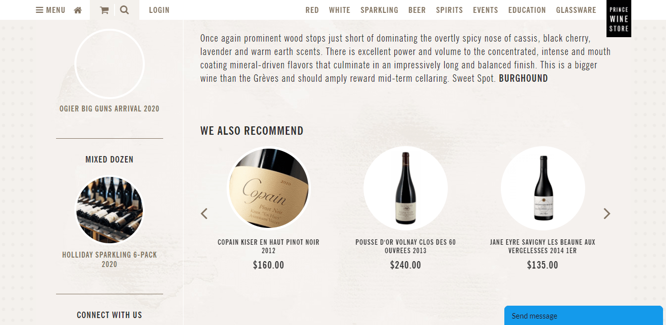
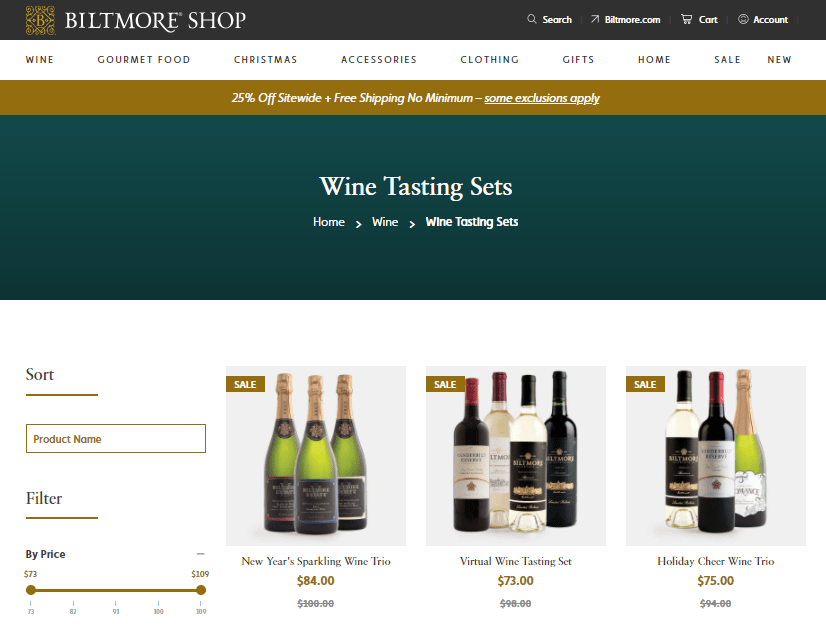
Another trick that you could also implement in your store is selling wine sets for special occasions. Customers could taste different types of wine at once, make their decision, and come back to your store to buy some additional products then.
Feature #7 Curbside Pickup
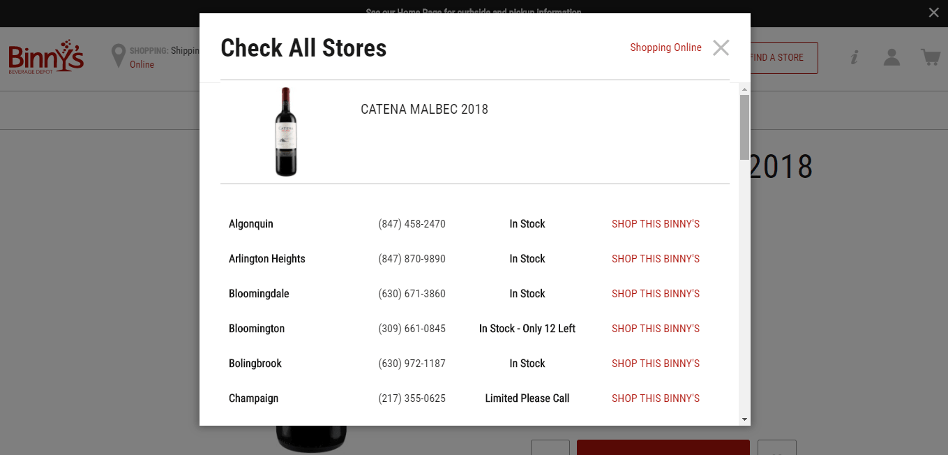
The in-store pickup, which gained popularity especially during the COVID-19 pandemic, is an essential thing in case you have at least one offline store. For instance, Target in Q2 2020 boosted its pickup sales by up to 60%. You could also follow suit and create a separate page on the website or showcase a list of stores available for pickup on each product page to make it easy for purchasers to find the nearest shop.
Feature #8 Customization Options
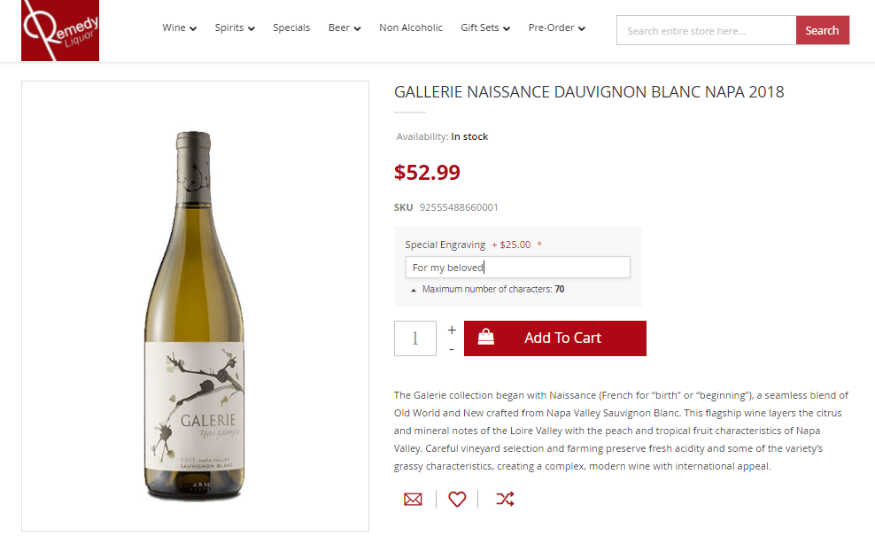
You could also give an opportunity for users to express their individual preferences and provide them with a service of custom engraving on the bottle of wine.
Feature #9 Personalized User Experience
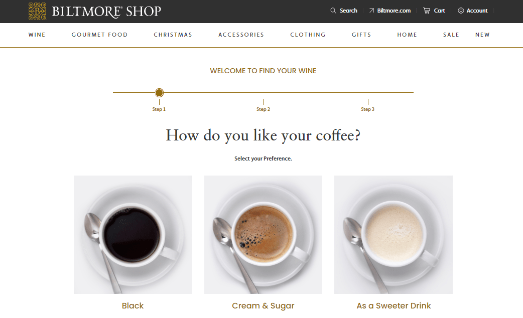
Add a personalization touch to your online store to make it more pleasant for shoppers, as more than 48 percent of consumers spend more when their experience is personalized. For example, the Biltmore Shop has a separate page ‘Find your wine’ with a simple 3-step test to find a perfect match based on the chosen options. As a result, they provide a list of personalized wines that may taste good for a website visitor.
Feature #10 Omnichannel Strategy
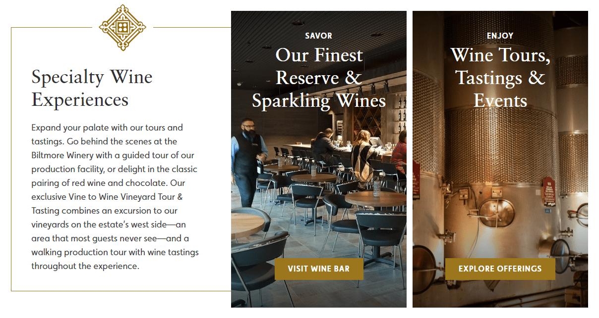
Introducing your business activities both online and offline could be extremely beneficial and deliver a seamless omnichannel experience where your brand’s online and offline presence flows in unity. If you have your own vineyards, you could perfectly highlight this part of your brand identity and create a separate page with a presentation and additional information. The Biltmore Shop, which we have cited as an example more than once in this article, has dedicated an entire page with information about their winery.
Conclusion
Food and wine pairing suggestions, easy-to-use navigation, clearly presented information, and inspirational imagery are those simple things that allow your customers to have a unique online experience. Wine online shopping can be fun, so don’t forget to hire someone good at Magento web design and enjoy your online business 🙂


